The following description is courtesy of Rever & Drage Architects.
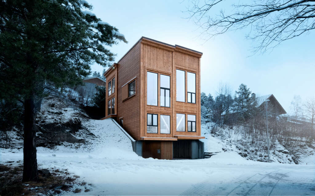
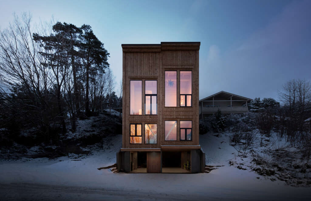
Molde, Norway – In the uninsulated ground level area there is parking and entrance as well as equipment storage and technical rooms. To make this area a pleasant space, outdoors but sheltered from the weather, daylight is let in via gaps along the building’s west- and east facades. In the innermost part of the ground floor the space opens up to a five meter high utility room for trampoline and ball games. This part has flood lighting so that you get a well-lit arena in the evenings and in the wintertime. In rainy weather, water flows down the concrete walls and out along drains into the ground. When the rain has ceased, the low sun warms up the concrete under the house and moist air is dried out through the gaps on the sides. This type of outdoor space increases the likelihood that children will choose outdoor activities and helps the family get through the sometimes difficult toddler phase!

Tom Auger 
Tom Auger
The building’s other functions are distributed on the three overlying floors plus a roof terrace. The first floor has wardrobe, a laundry room and two bedrooms. The staircase up to this level, as well as the wardrobe floors, are in oak, which gives good durability in the area where you wear shoes and boots. The staircase leading further up is in pine, which is soft to walk on barefoot. The first floor is built in framework, while the top two floors are built as a log construction. For this reason, the staircases, which rest on the framework, are constructed independently of the upper floors such that the log construction can compress, without being hindered by the static parts of the building.

Tom Auger 
Tom Auger
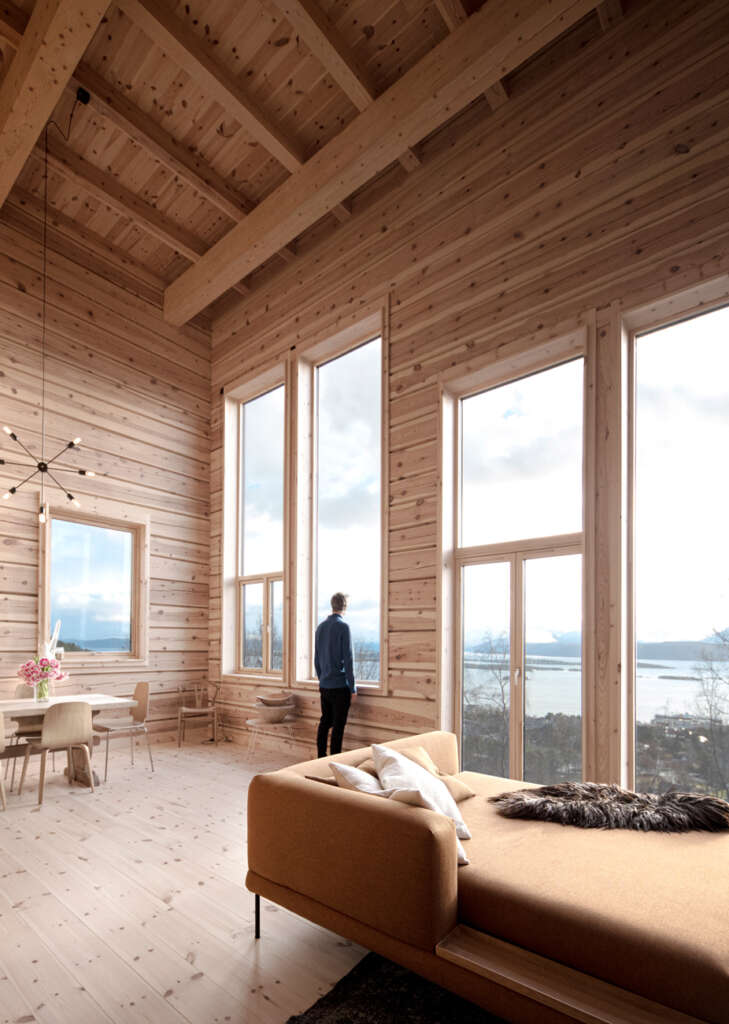
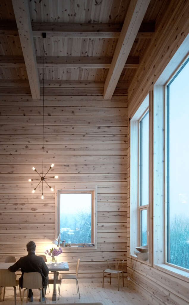
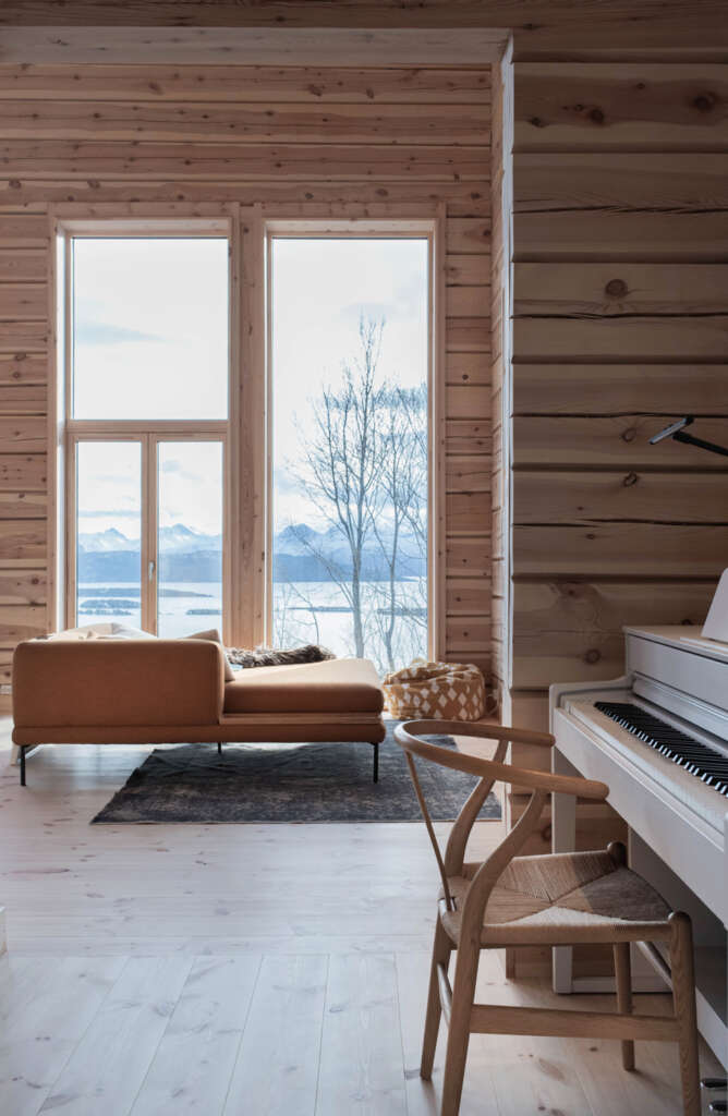
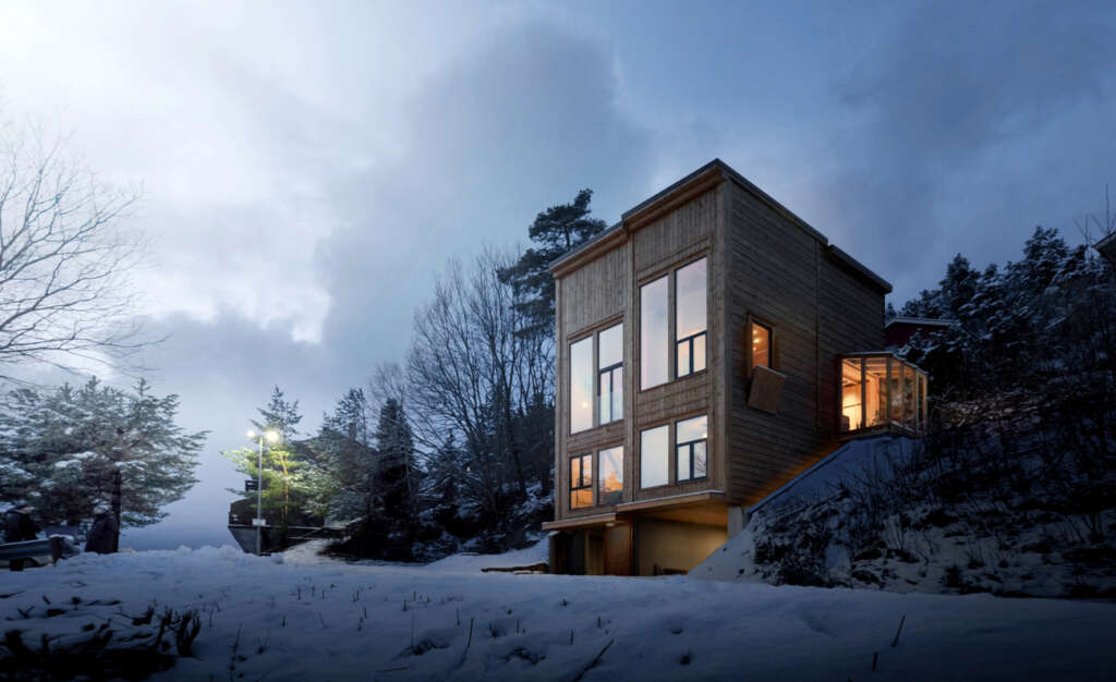
The second floor is the building’s main floor with kitchen, living room and library. It is designed as a floating space with ample daylight from west, south and east. Lighting and views changes according to the different outlooks the rooms are facing. The tall windows in the living room face the scenic views of the Molde panorama with fjord and mountains to the south, the conservatory in the kitchen faces the sheltered garden to the east, while the library faces the close-up effect of a green pocket (white in winter time) to the west. The high window on the west wall of the living room provides a view of the sky and tree tops from the sofa area. The window to the east in the living room has a flower box outside on the sheltered side of the building. The living room has double height and serves both as a banquet hall and also catches and stores the sun´s energy during the daytime. In the spring and autumn when the sun is both low and strong, the family can retreat to the kitchen and library in the daytime, while the inner log wall is warmed up by the sun and stores heat for the night.
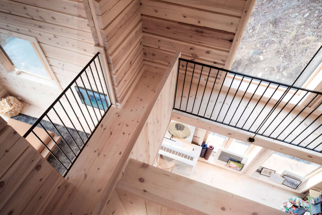
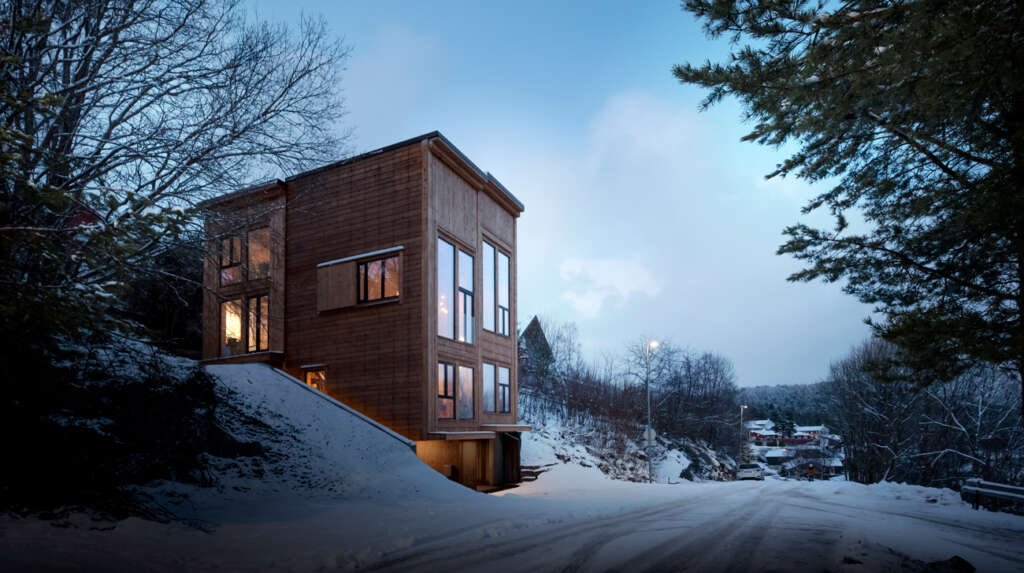
The third floor has a bedroom and a bathroom as well as a gallery as part of the library. There is also a Romeo and Juliet balcony towards the living room for home stage performances. From the gallery you can proceed to the roof terrace for extra evening sun, starry sky and northern lights. The upper bedroom window has shutters designed to provide visual shelter from a footpath northwest of the building, as well as letting in the morning sun.

Tom Auger 
Tom Auger
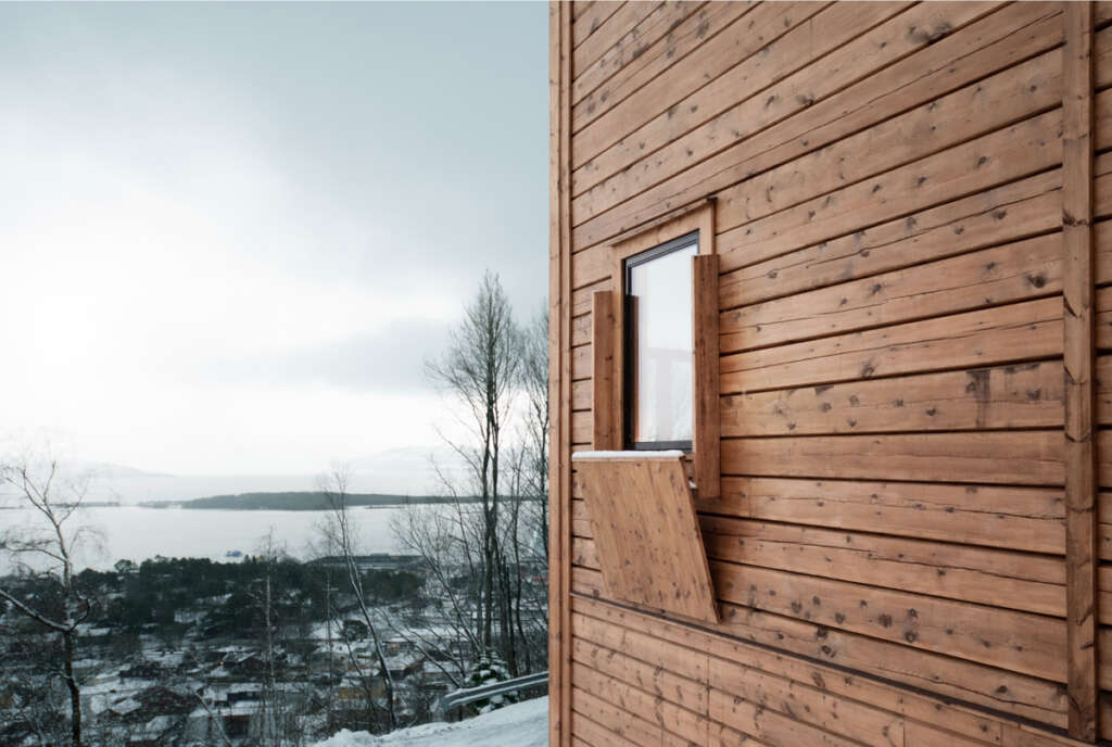
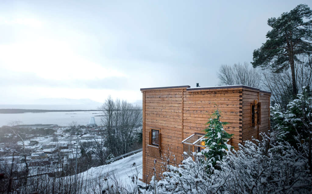
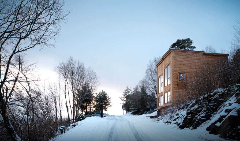
In the exterior the facades are separated between fronts’ and ‘sides’. The fronts have standing panels and a higher degree of articulation, while the sides have horizontal panels and a more sober articulation. The south facade has two fronts whereas the western one is slightly lower to shield the ground floor from predominant southwesterly rain. The library has its front facing the green (white) pocket to the northwest, while the kitchen has its front towards the garden. For the northern facade the details, like the window shutter and the dovetail notch corner, are more prominent than the composition as a whole. In this way, it’s a typical rear of a building. What one attempts to achieve in differentiating the facades in this way is, first, that the building can be read as four volumes rather than one, thus softening the otherwise rigid rectangular prism effect, and secondly the fronts gives an external indication of the inside rooms’ directions. The moderate contrast between the fronts and the sides, as well as the unison use of material and colour makes this distinction not too obvious. Somewhat more surprising in the final result is that as an expression the building lies somewhere between a collection of your grandmother’s cupboards and traditional Amsterdam houses placed, in a sharply carved meadow!
Project Details
- Project name: Zieglers Nest
- Architects: Rever & Drage Architects
- Design team: Tom Auger, Martin Beverfjord, Eirik Lilledrange
- Built by: Lervike AS
- Complete: 2020
- Location: Molde, Norway
- Area: 152m2 (insulated)
- Photo: Tom Auger


