Seed Plaza
Architect: B.L.U.E. Architecture Studio
Location: Jiaxing, China
Type: Exhibition, Retail
Year: 2023
Photographs: Eiichi Kano
Project Overview
The following description is courtesy of the architects. Seed Plaza is located in Nanhu District, Jiaxing, 10 kilometer east of the downtown area. It sits at the boundary between urban and natural environment. Half of the surroundings are farms and parks, and the other half are residential and commercial streets. Different orientations offer different landscapes and atmospheres, forming a diverse and vibrant sense of place. Roads around the plaza intersect, drawing people together and making it the most dynamic core location in the entire neighborhood.
The project is defined as a real estate supporting facility, and is currently used as an exhibition center and retail space for nearby communities. The plaza will serve as a community center shared by the surrounding neighborhood in the future.
Design Concept
“Half indoors half outdoors”
We observed that after the pandemic, people have began to seek more interaction with nature and enjoy outdoor life. This change in social environment has inspired us to rethink the value and state of architecture in the new era.
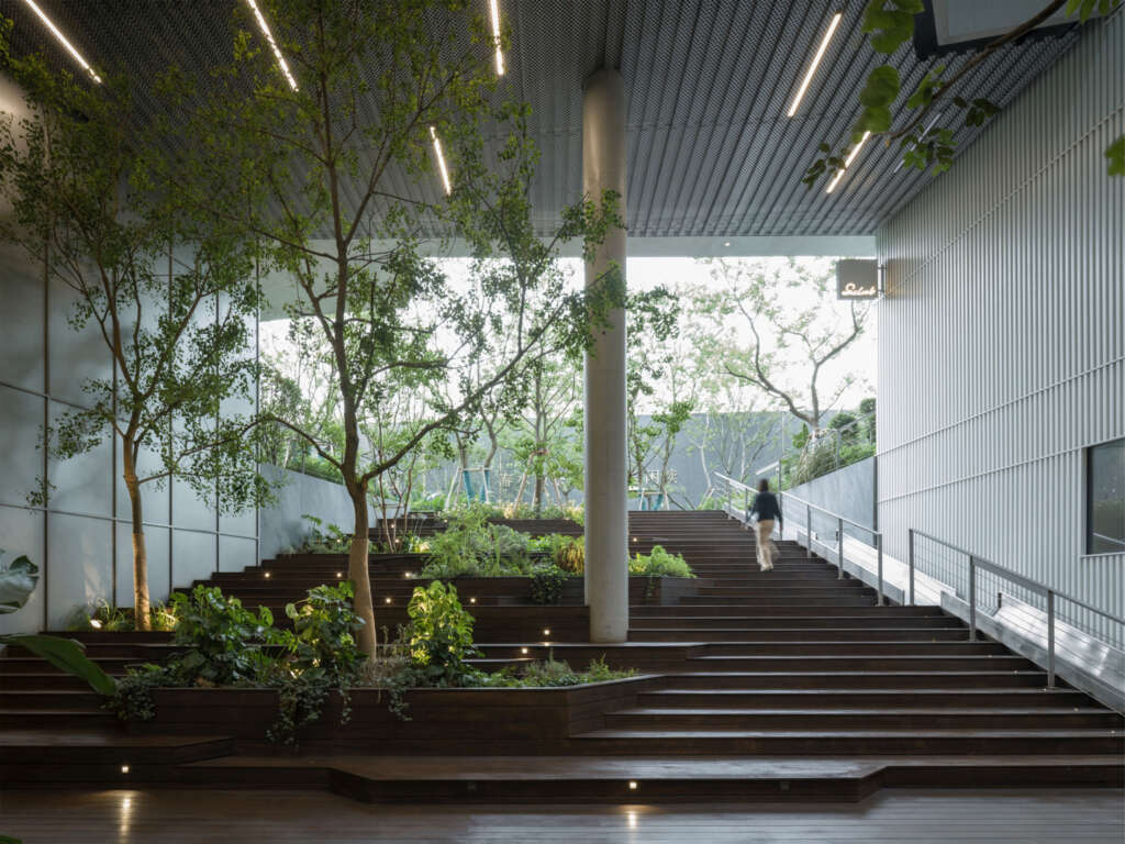
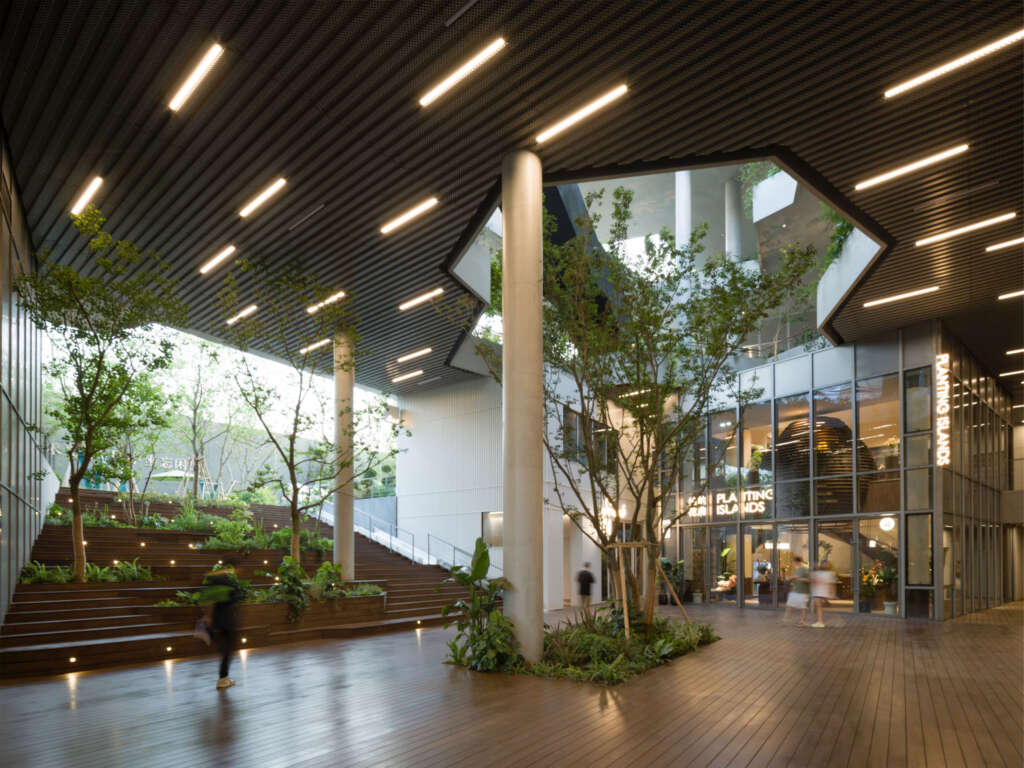
Under the site conditions where the urban environment and natural ecology are intertwined, we hope to introduce a regulator that helps people leave the city and enter nature, and creates as much comfortable and rich outdoor activity spaces as possible in the plaza. The inclusion of up to 3500㎡ of outdoor space within the 7000㎡ of architectural space is a key element of the project. In conventional real estate projects, the design methods involving huge amounts of non-indoor spaces contradict the logic of the real estate revenue, leading to a considerable contradiction. However, in this project, the client strongly agrees with the concept of integrating nature and architectural space, resulting in a completely open architectural form.
“Half city half nature”
As a public function of the community, the neighborhood center is an important hub for people to relate and communicate. We try to create a miniature three-dimensional neighborhood within an architecture and use the logic of “streets and alleys” to connect the spaces to bring interesting and diverse spatial experience.
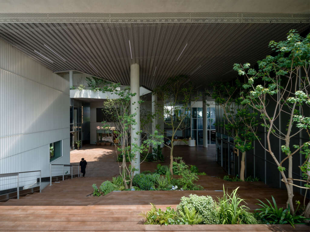
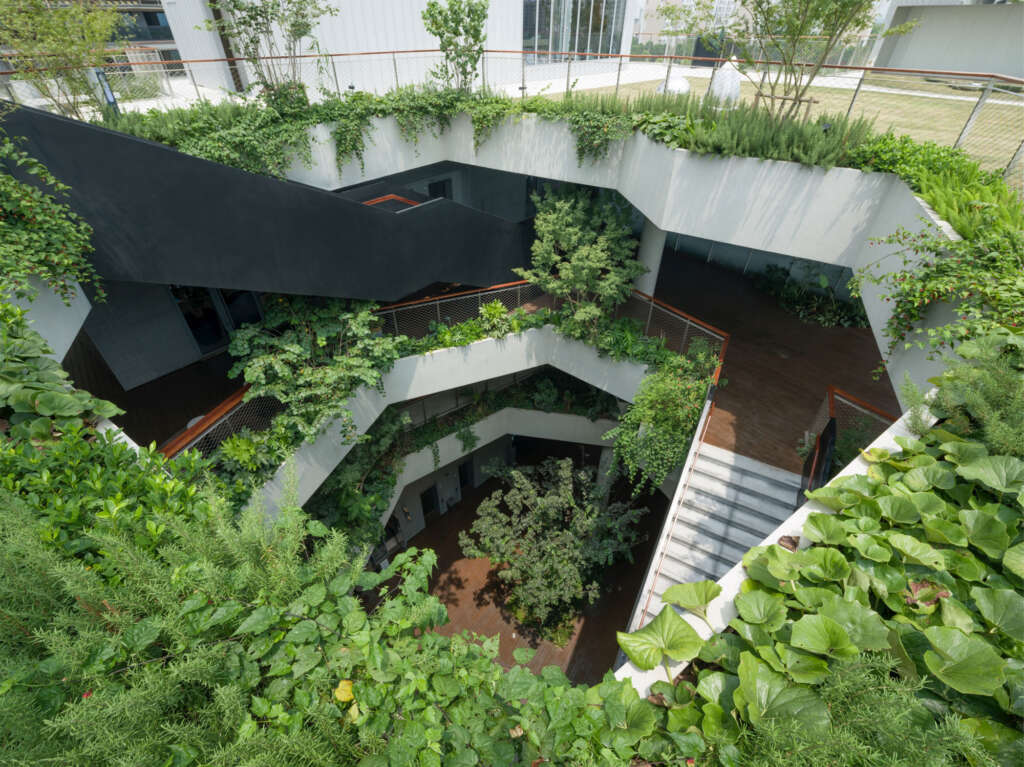
As a significant medium, plants are inadvertently interspersed in the architectural space that people walk through. The plants easily come into sights of the citizens and allow direct contact with the bodies. Through the design, greenery naturally flows into life.
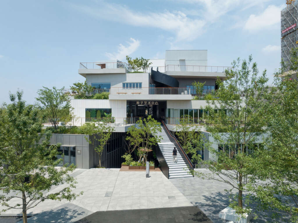
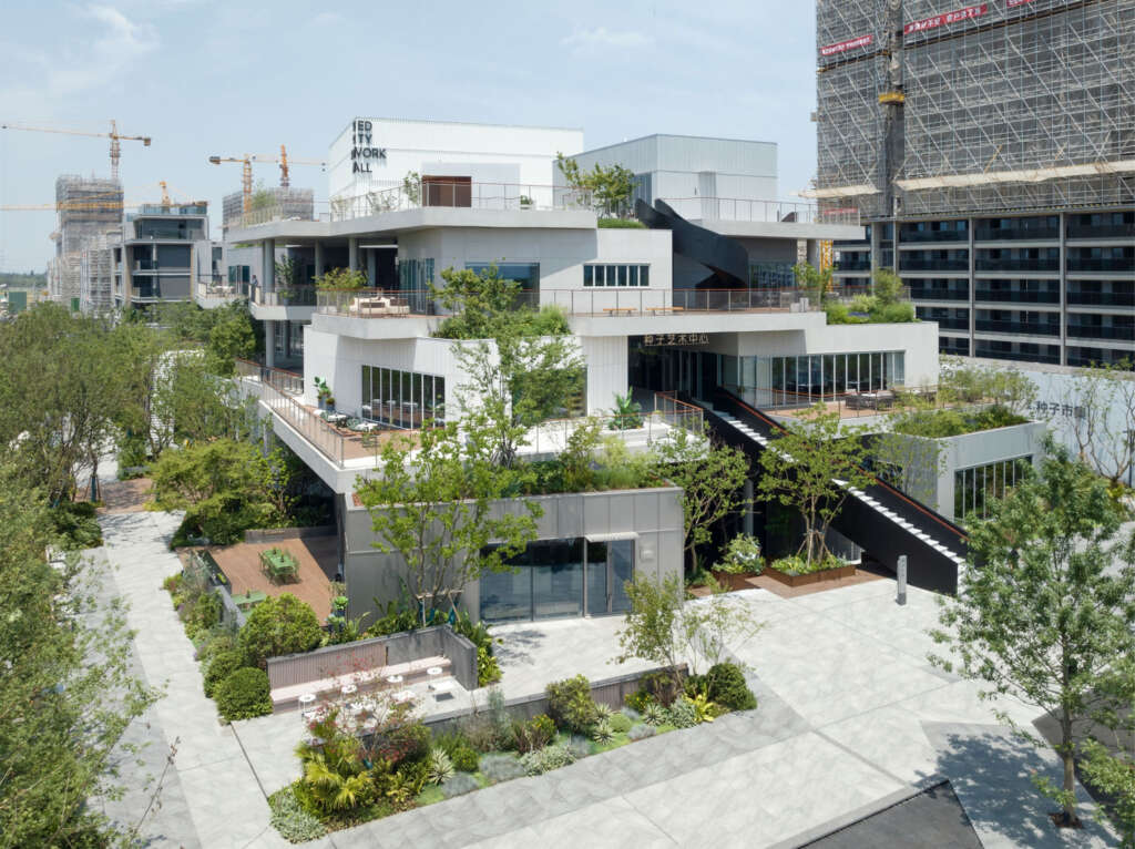
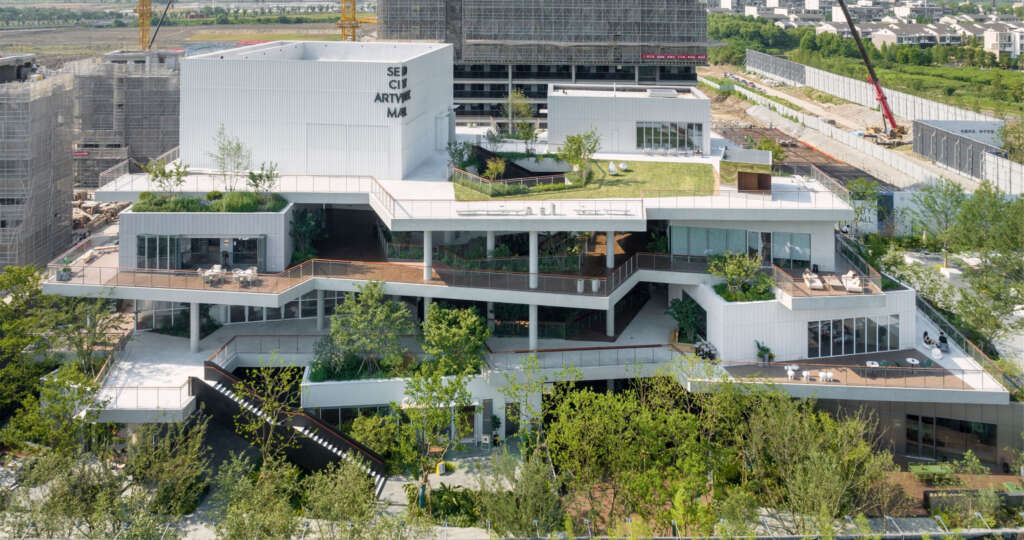
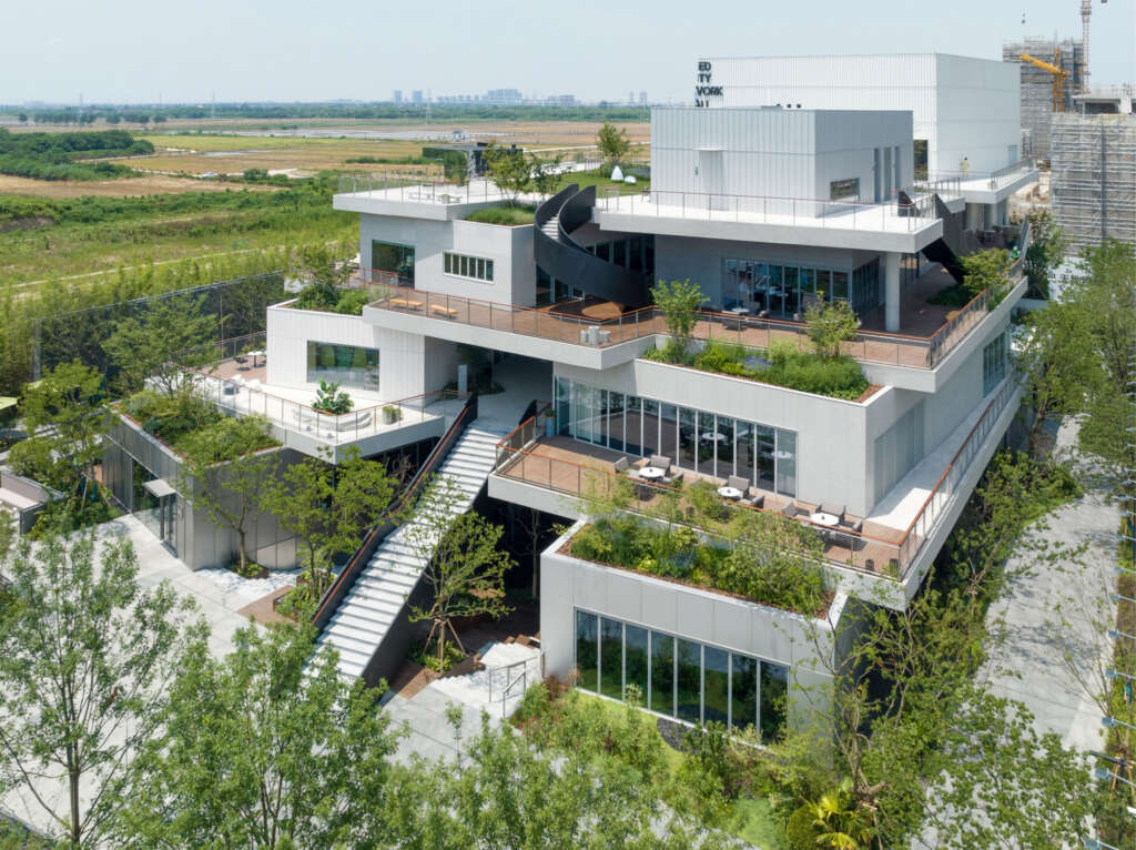
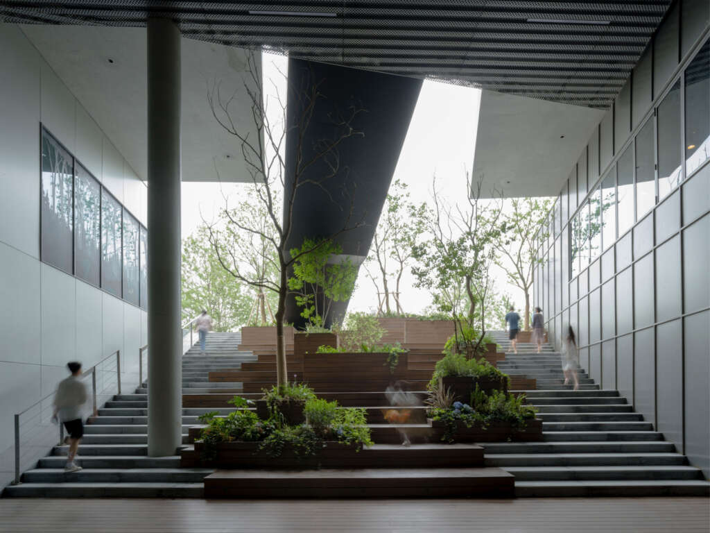
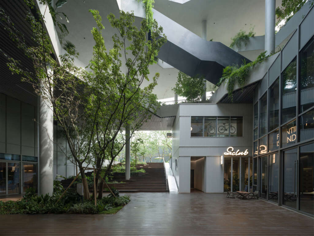
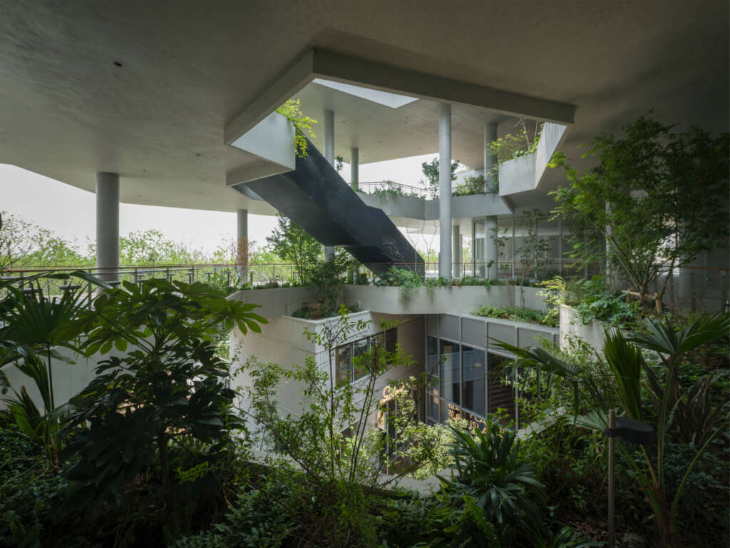
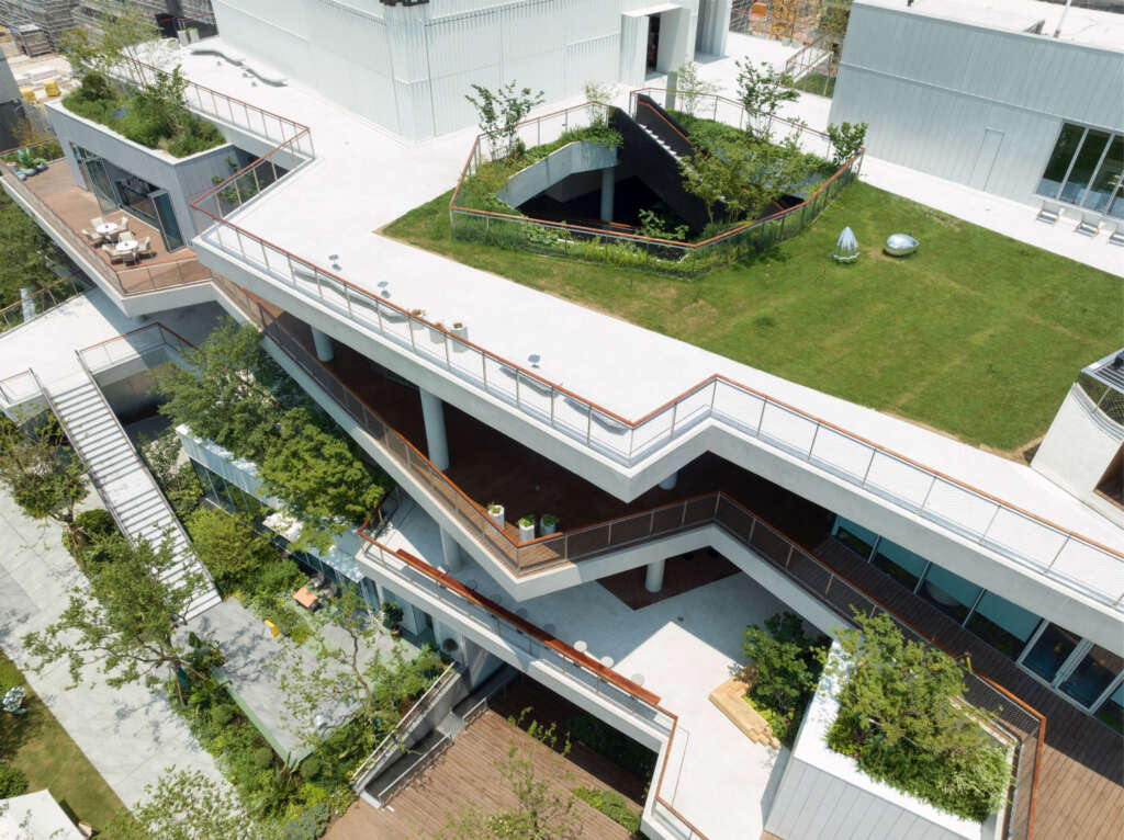
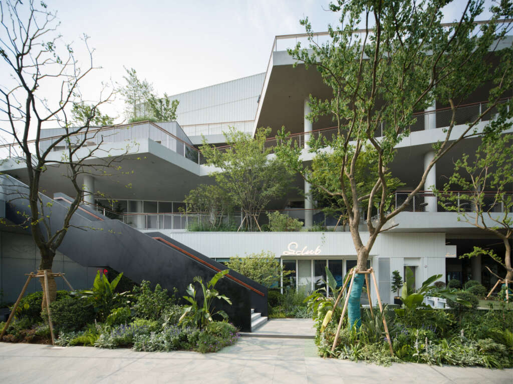
The entire building is composed of 20 stacked boxes of different shapes, representing a diverse and growing personality. Combined with the floor slabs, large amounts of grey spaces are created between boxes for people to walk and explore freely. Thirteen stairs that go up and down break the concept of normal multi-storey architecture and are as endless as urban streets. The endless circulation make people to forget the existence of the elevators and immerse themselves in the building, roaming and walking aimlessly, looking for randomness and uniqueness in daily life.
The mutually independent architectural form of the boxes can flexibly responds to future functional changes in the building. As time goes by, the demand for real estate’s display function gradually transforms into the functional needs of a community center. During the process of partial adjustment of individual boxes, the normal use of other boxes will not be affected.
Nodes of Space
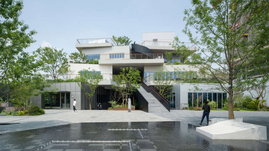
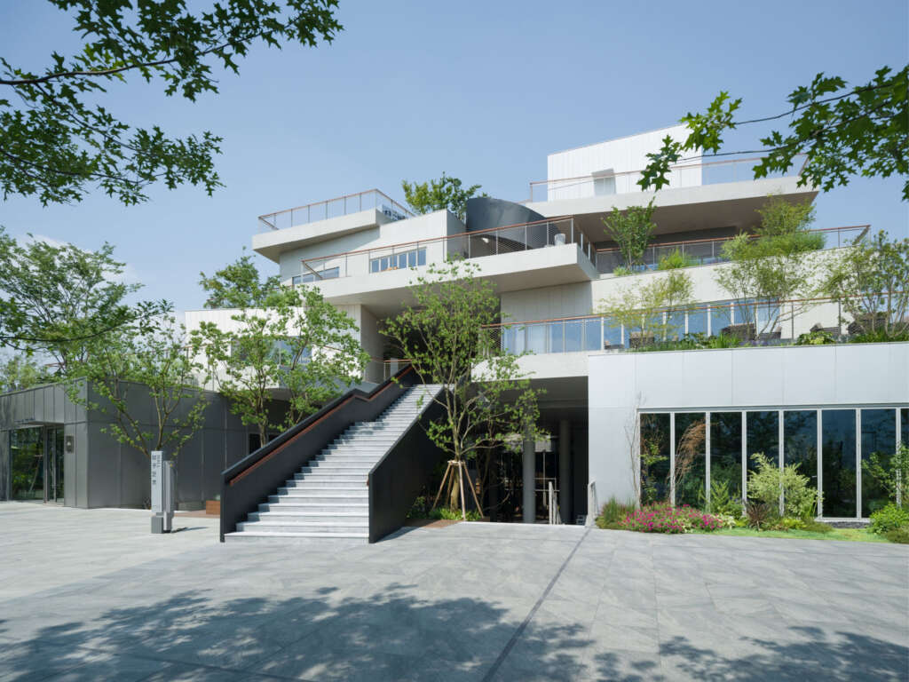
Based on the project’s site area and the functional requirements of the client we set up four floors as the platforms for spatial organization. The platform relationship moves back step by step, showing an intention of mountainous terrain on the facade. The floor slabs avoids the rigidity of straight lines and responds to spatial changes through spatial bending, reflecting a lively and dynamic visual effect.
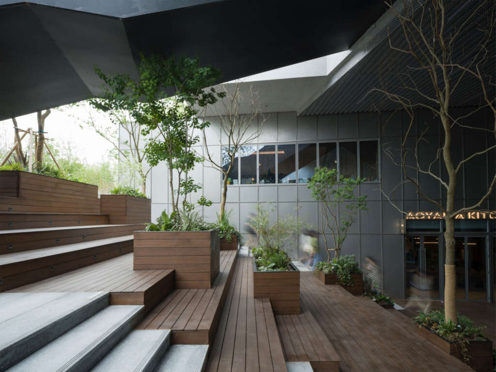
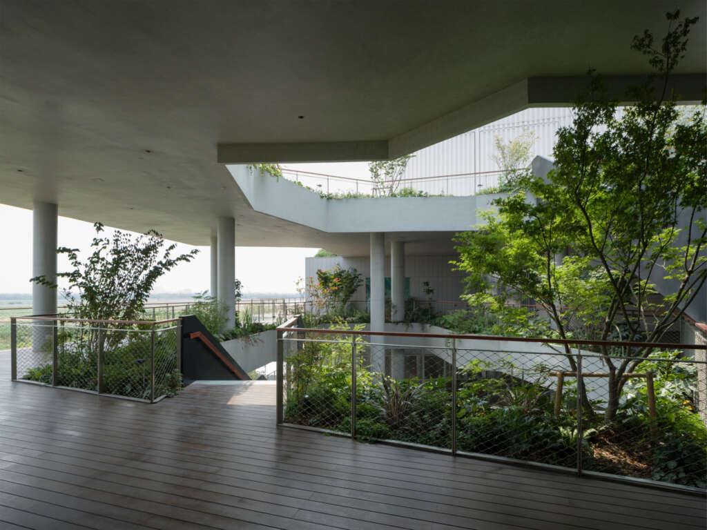
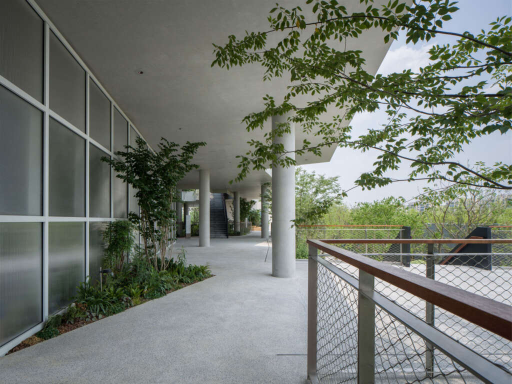
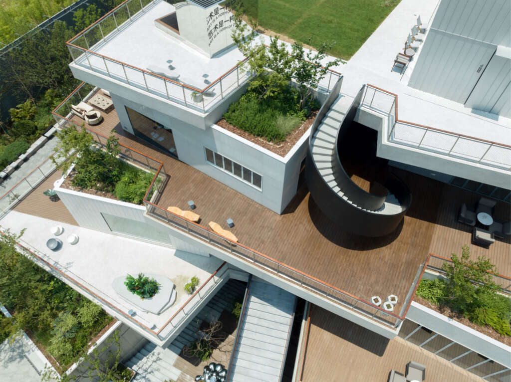
Each box moves with different angles to form semi-outdoor spaces with different scales and views. These spaces are connected to each other, connecting movement and stillness, thus creating a continuous and vibrant spatial state. The area which connects the boxes and the grey spaces is surrounded by local greenery. By placing furniture and seating, the area becomes a communal resting space as if in urban streets.
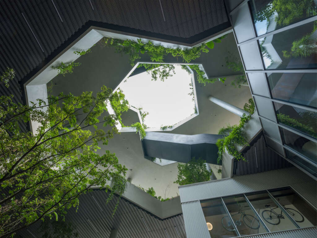
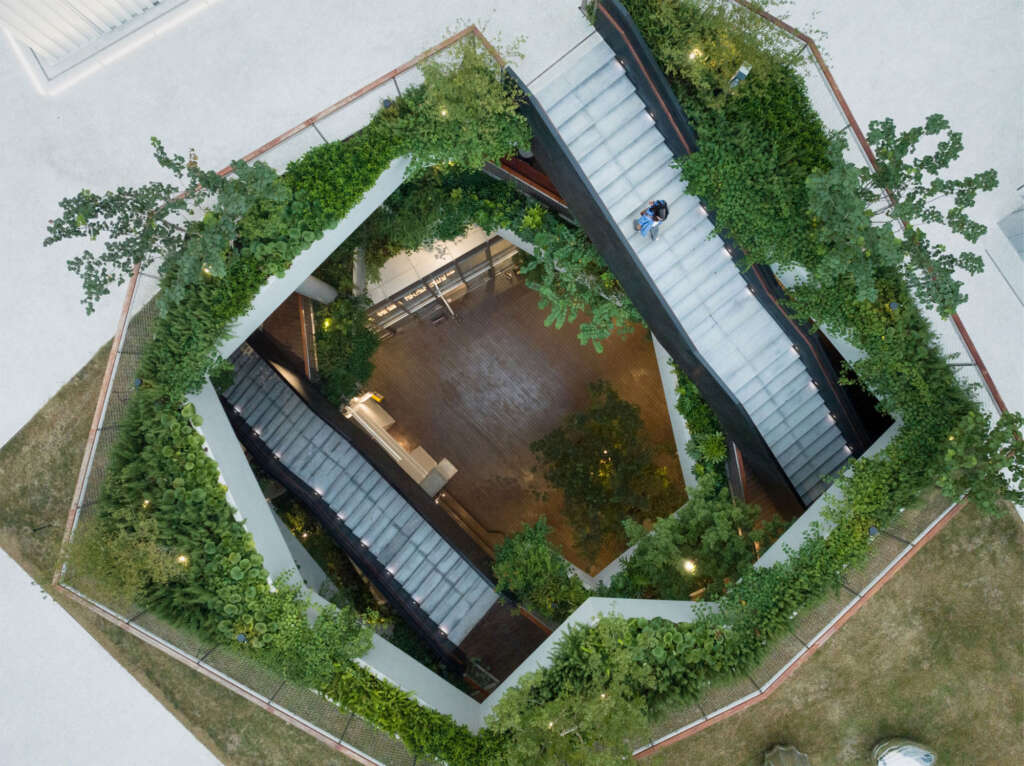
Trees are planted on the roof space which is created by stacked floor slabs and staggered boxes, forming a rooftop forest scattered on the building. Irregular-shaped holes are cut around the atrium, running from the ground floor to the roof, establishing intersecting lines of sight. We choose to leave some gaps around the atrium to grow bushes and ground cover plants. When standing in the semi-underground space and the grey spaces on each floor, people can see the layered greenery. When the breeze comes and sunlights pours in, the sense of nature flows in the space. Meanwhile, the tall and open holes become the major visual focus inside the architecture. The steps going down from the first floor connects the semi-underground space and the square, eliminating the height difference and transforming it into an area for seating, seeing and activity. In this way, the space has various possibilities for use. The top wall of the fourth-floor large box is designed to be high to lead people’s sight inward and upward. People can stay in a ceremonial theater feeling the sky and the earth. Facing the sky at the highest point of the architecture, people get to experience the end of the wandering.
Material Details
The colors of the building facade materials are designed as the tone of gray and white to ensure a sense of art and integrity. The pure and clean state helps reflect our design philosophy of architecture as the background and container of daily life.
In order to further achieve a rich, neighborhood-like status in the space, each of the 20 boxes adopts different facade effects. The boxes on the first and fourth floors use metal panels with different brightness and specifications according to their different commercial and artistic properties. Serving as the core area of the center, the second and third floors choose wood panels and stone as facade materials which are warmer and more friendly.
The materials of the ground is also vary based on the nature and characteristics of the space. The ground floor features stone flooring which connects the landscape of the square. The second and fourth floors employ exposed aggregate concrete, while the semi-underground square and the third floor are made of outdoor laminated bamboo flooring. In addition, the outdoor rest areas of each box are made of different materials and textures. This allows people to experience the rich appearance of the neighborhood center as they move between floors.
Summary
In the past era of rapid urban development, society pursued saturated interior usable areas. However, in the change from the incremental era to the stock era, outdoor spaces once considered extremely wasteful may gradually become more important. As an architecture with a 1:1 ratio of indoor and outdoor spaces, Seed Plaza provides people with a space that allows them to take a break and connects with nature. Through people’s walking and roaming, the plaza inspires their self exploration and establishes intimate neighborhood relationship, and expands the boundaries of life. We hope that this model may become a new choice for neighborhood center and commercial architecture in the new era.
Project Details
- Project Name: Seed Plaza in Jiaxing
- Project Location: Jiaxing, Zhejiang Province
- Project Type: Neighborhood Center
- Architectural Design: B.L.U.E. Architecture Studio
- Project Team: Shuhei Aoyama, Yoko Fujii, Haoxiang Rong, Nailun Chen, Jingyuan Li, Yuting Wang, Xinyi Zhang, Yu Nagasaki
- Landscape Design: WTD Group
- Facade ( Curtain Wall) Design: Hangzhou Jiawei Curtain Wall Decoration Co., Ltd.
- Sign Design: Boxi Sign
- Lighting Design: ZOE Lighting Design
- Client:
- Jiaxing Shihe New Rural Development Co.,Ltd. & Jiaxing
- Vanke Real Estate Development Co., Ltd.
- Size: One Floor Underground/ Four Floors Above Ground
- Site Area: 2750㎡
- Gross Area: 7000㎡
- Design Period: 10. 2021 – 07. 2022
- Construction Period: 2022 – 05. 2023
- Photography Credit: Eiichi Kano


