Herzogenaurach, Germany
The following description is courtesy of Behnisch Architekten.
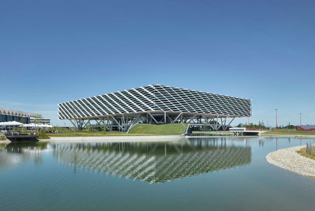
The adidas ARENA forms a distinctive landmark on the adidas World of Sports campus in Herzogenaurach. The new office and reception building marks the campus’s main entrance, welcoming visitors to the adidas group’s World of Sports headquarters and lending it a strong visual identity. The ARENA’s architecture is both functional and expressive, its sculptural shape emphasizing the passion for sports that adidas represents. A floor area of 52,000 square meters provides nearly 2,000 employees with modern and sustainable workspace organized on flexible, organic principles.
After 20 years of planning, the adidas World of Sports campus is now complete
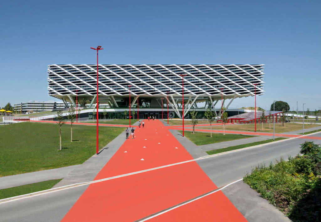
Development of the adidas World of Sports campus began in 1999, based on a master plan for an area of approximately 145 acres previously accommodating the Herzo Base used by the US army. The campus consists of a northern and a southern section. The first new building was the Stripes restaurant, followed by the Laces office building, a gym, and two multi-story car parks. With the addition of the new HALFTIME restaurant and conference center and the ARENA headquarters on the southern campus, the expansion of the World of Sports is now complete. The T-shaped green area between the freestanding buildings provides a recreational zone, while an extensive network of access and circulation routes links the northern and southern parts of the campus, helping employees and visitors alike to navigate the grounds. The artificial lake on the southern campus enriches the landscape and at the same time marks the boundary between the public areas and the private campus. It also catches rainwater runoff and serves as a reservoir for irrigating the ARENA ground floor’s green roof and the southern campus grounds as well as supplying energy for cooling and heating the HALFTIME building.
adidas World of Sports ARENA—impressive public face and gateway to the adidas Campus
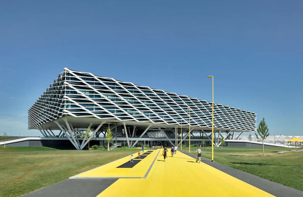
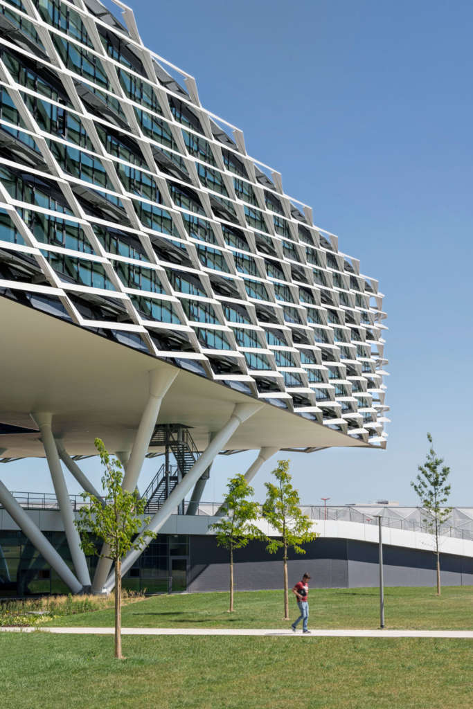
The architectural idea behind the ARENA building is predicated on a finely balanced interplay between transparency, landscape, and a modern concept of work based on communication and interaction across professional fields as well as responsiveness to future developments. The new office building is a highly flexible, organic structure that adapts readily to new processes and the employees’ needs. Rising above a sculpted hill that houses the building’s ground floor, the abstract volume accommodating three levels of workspace seems to hover above the modeled landscape. With none of the characteristics of a traditional building, this striking landmark offers no clues to its structure and organization as neither stories, nor windows, nor functional details are discernible from the outside.

David Matthiessen 
David Matthiessen
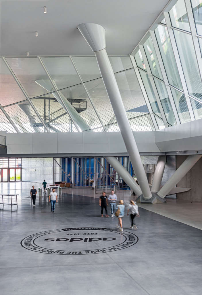
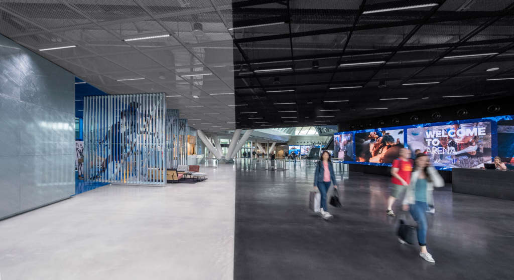
The building’s entrance is situated on the ground floor, which is integrated into a landscaped rise in the terrain and conveys a sense of familiar proportionality. The Welcome Area extends the public space in front of the building into its interior. Colors and materials lend structure to the continuous space and guide visitors into the central atrium, past the waiting lounge, conference area, and ancillary spaces. The Welcome Area’s muted design deliberately heightens the suspense of the visit, with varied animations flickering across a large screen intimating the adidas experience. The generous atrium is open towards the upper floors housing the workspace. Flooded with natural light, it is suitable for a variety of events. Towards the campus side of the building, a bistro with an outside terrace blurs the boundaries between interior and exterior. A light well provides access to the landscaped open-air level above, which offers a wide variety of lounge and recreation areas. Greenery and seating interact harmoniously in a pleasantly playful arrangement. A differentiated circulation system with paths and tracks links this area to the campus and the sports grounds emphasizing the passion for sports that adidas represents.
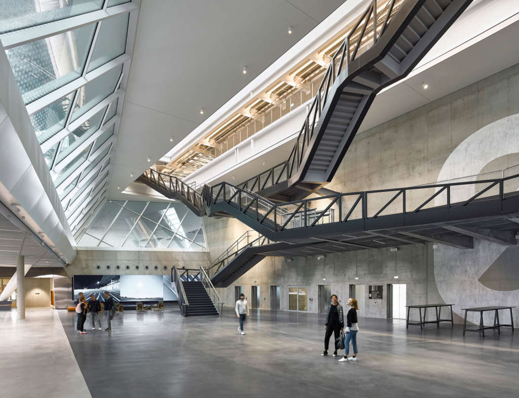
At the heart of the ARENA building is the dramatic floating staircase in the atrium. Rising through a wide opening in the ground floor ceiling—also a source of ample natural light—it takes employees up to the soaring workspace section arranged over three floors. The staircase offers exciting views into the atrium, across the open-air level onto the campus, and up to the office floors. It not only inspires employees in making an active start to their working day, but its twists and turns and the seating elements on its landings also make it a place for informal encounters and interactions.
The central destination on the office floors is the “main street” which links the three levels both vertically and horizontally to create a space akin to a lively marketplace suspended in mid-air. On each floor, the “main street” is adjoined by kitchen hubs and various social spaces for informal communication. Neighborhoods take shape and extend from the “main street” into the workspace, encouraging the development of differentiated local identities and multifaceted spatial relationships. Serendipity is deliberately tapped as a source of unplanned, surprising new encounters and experiences. The six portal areas of the office clusters each have a distinct spatial and architectural character defined by carefully selected materials and colors that lend them an unmistakable visual identity.
Flexible workspace inspires employees and encourages new ideas
Providing adidas employees with “the best workspace in the world” was the declared aim in building the new headquarters. The company’s ideas were clear: spacious, flexible work areas alternating with areas for formal and informal meetings and recreational zones. Based on the specially developed MyArena concept, the building provides the architectural framework for an open and creative professional atmosphere. Employees have a choice of workstations in open zones and in quiet retreats for focus sessions. On all three floors the work areas are organized as modules in a flexible, adaptable matrix, forming variegated clusters around light wells of different sizes optimized to supply ample natural light. Although arranged on a structured grid, the workspace permits a great deal of flexibility.
Interior design—orientation and identity, materials and colors
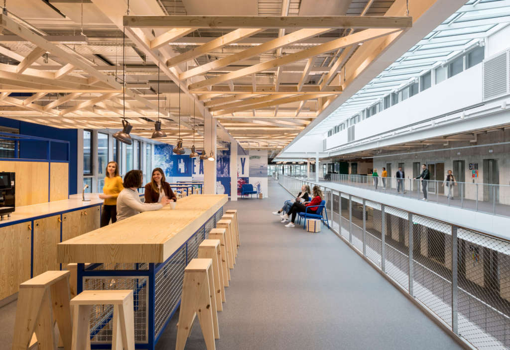
The materials used in the new building were chosen for legibility, clarity, and expressive straightforwardness. The workshop atmosphere engendered by simple and robust details such as exposed pipework reinforces the idea of an adaptable matrix.
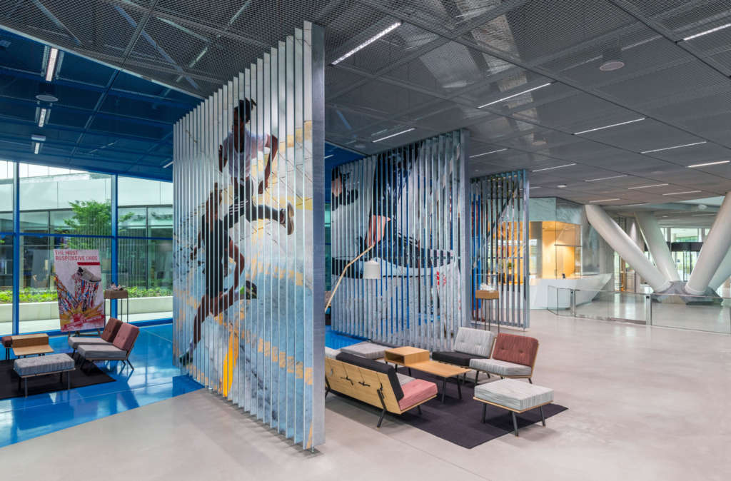
The entrance area emerges as an experiential space for dramatically staging the adidas brand. The route to the central atrium is characterized by a monochromatic palette, with dark and light polished concrete flooring subtly emphasizing the distinction between circulation systems for visitors (Slow Lane) and employees (Fast Lane). This contrast of dark and light recurs in the ceiling elements. The waiting lounge is the only part of the entrance area accentuated by a bolder hue. Its walls, floor, and ceiling are bathed in a homogenous blue to prevent insignificant details and accessories assuming the status of decorative elements. The waiting area is screened off by vertical reflective metal slats reminiscent of large open hangar doors.
The monochromatic approach to surfaces extends into the atrium, too. The sculptural form of the staircase picks up the darker tone of the Fast Lane as it takes employees up to the workspace, forming a three-dimensional contrast to the lighter shades of the interior facades and exposed concrete walls. The bistro with its outside terrace has sturdy furnishings made of solid wood to convey a pleasant, home-like, and familiar atmosphere. The conference area, too, is furnished with materials that are pleasing to the touch. Wooden fittings and handsome leather upholstery lend meetings an ambience of solid elegance.
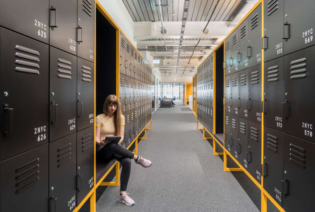
The workspace on the three upper floors is structured as a series of clusters. On each level there are six portal areas forming individual addresses within the building. Offset against the two-dimensional matrix, these create a more local sense of identification and identity. The first, fundamental step in developing the interior design was the selection of six “key cities” which would determine the basic range of materials, colors, and types of furnishing for each cluster. The selected metropolises are important locations for the adidas brand: Los Angeles, London, Tokyo, New York, Shanghai, and Paris. Next, a design manual was compiled to lay down differentiated guidelines for fittings such as counters and bars, wall elements, dropped ceilings, lockers, fitted and freestanding furniture, and lighting fixtures.
The defining color of “Los Angeles” is blue—as blue as California’s clear skies. Blue work booths, lockers, wall surfaces, and upholstery combined with ceiling elements and fittings made of pale maritime pine conjure up improvised beach architecture.
“London” is characterized by red color accents. Red upholstery and curtains are combined with darker background hues and an industrial look enhanced by materials like untreated carbon steel.
“Tokyo” was inspired by the delicate white of cherry blossoms and by traditional Japanese architecture, with black-and-white contrasts, dark purple color accents, and slender wooden elements providing distinctive features.
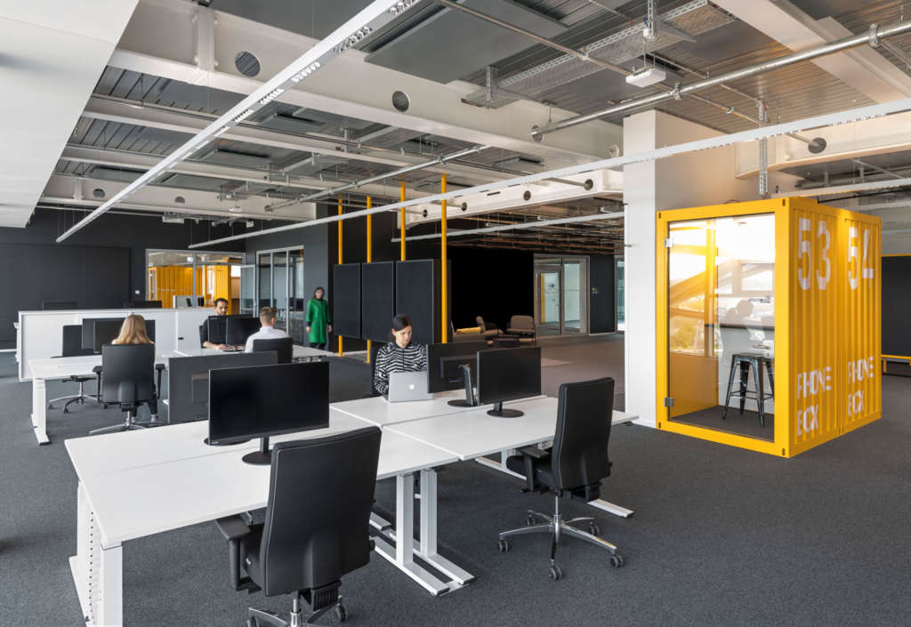
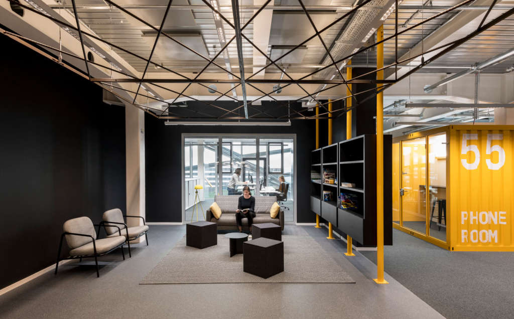
“New York” conveys an industrial, urban look based on metal and the signal color yellow, combined with darker shades and bold contrasts.
“Shanghai” is represented by the color orange conjuring up the “Glowing City” with its bright neon signs.
In “Paris,” green tiles inspired by the colors of the Métro stations combine with boldly articulated metal elements calling to mind the construction principles of the Eiffel Tower to create an elegant ambience.
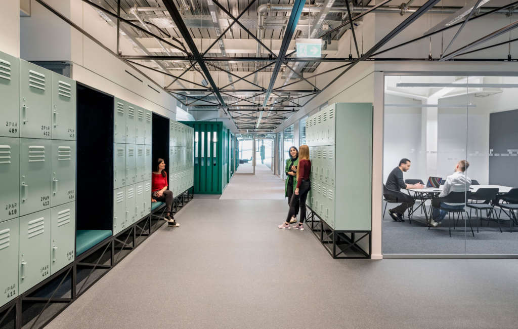
The portal areas provide ample space for interaction designed to bring people together and encourage spontaneous encounters. Open communication zones alternate with areas of quiet retreat for focus sessions or meetings. Dedicated rooms such as individualized game rooms or maker rooms enrich the array of spaces available along the main street and can be used for special projects. A modular system of customized work booths resembling shipping containers structures the workspace and provides a broad array of functions: larger booths are useful for team meetings or discussions; smaller ones provide privacy during telephone calls.
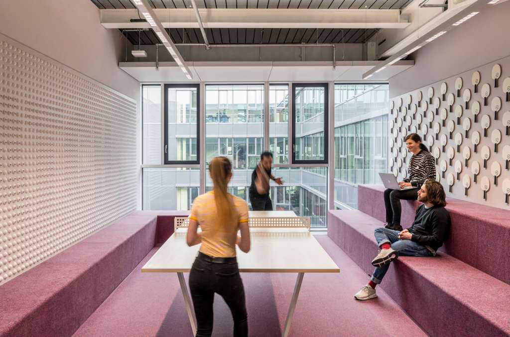
The “ID Portals” function as neighborhoods and seek to convey a homelike feeling within the larger context of the workspace. Cozy seating and bookshelves equally suitable for a residential living room provide ideal surroundings for meetings. To enhance the effect, employees are welcome to introduce personal objects. The palette of materials and colors is determined by the basic “key cities” concept that visually characterizes the “main street” and extends into the workspace, characterizing the design throughout each office cluster.
Signage and wayfinding
The signage system was developed by Behnisch Architekten in collaboration with the design studio OCKERTUNDPARTNER. Its fundamental idea was to guarantee easy navigation within the building and, at the same time, enhance the architectural themes of the interior design. The wayfinding system for the workspace is based on the organization of the building along its six identity-building “key cities” situated along the “main street,” on a structural grid defined by the supports on each floor, and on the office clusters. The color codes of the “key cities” provide a first level of orientation, as they articulate the space and help users identify their general position. The grid of supports provides coordinates for breaking down the space into quadrants, giving each workstation an unmistakable, exact address of its own.
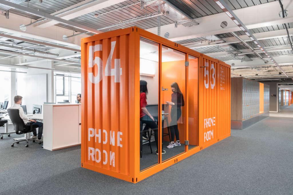
Signs modeled on analog score boards feature rectangular letters and numbers in monochromatic white against a dark background. More general signage information is painted directly onto the walls in large lettering and grainy transparent paint to enhance the interior’s rough workshop character. The “shipping container” work booths are clearly labeled with information about their equipment and function. Reflecting window safety films featuring stylized representations of the key cities’ sports stadiums are applied to the glass dividing walls.
Light-flooded workspace in an intelligent building envelope
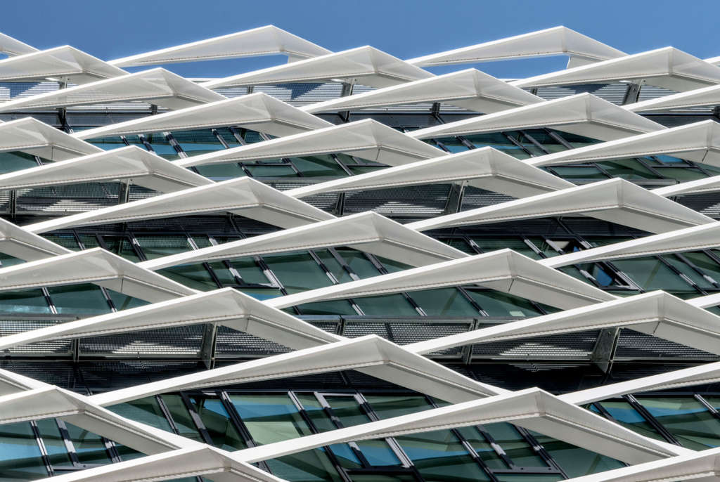
An environmentally sustainable approach to effective daylighting and shading was used to produce bright office spaces flooded with natural light and to enhance the sculptural appearance and abstract proportionality of the volume accommodating the building’s three office floors. In collaboration with Bartenbach Lighting Design, Behnisch Architekten developed a fixed external sun control and shading system adapted to the orientation of each facade and taking into account the different, changing, and complex parameters of the sun’s varying angles during the day and throughout the year. A simulation of the building’s thermodynamics made it possible to geometrically optimize the balance between daylighting and heat gain to guarantee ample daylight while simultaneously limiting heat gain. The building has been submitted for LEED Gold certification in recognition of its implementation of up-to-date energy-efficiency standards and extensive use of recyclable materials.
Detail information on sun control and shading
Models of the different facades’ exposure to the sun were analyzed and evaluated in a number of different simulations. As the building sits at a slight angle off the north-south axis, each of its facades sides casts a certain amount of shade. These factors were taken into account in all energy models used as a basis for calculation.
The reduction factor (fc-value) of fixed shading devices largely depends on the sun’s angle. In combination with the glazing, an optimal energy transmittance (g-value) is achieved for the ARENA building that minimizes overall heat gain. The fixed external shading system was also optimized to allow maximum light transmittance. Parts of the system are translucent to a degree of approximately 30 percent, increasing the amount of daylight entering the interior. Perforations with an 8 mm diameter in the 3 mm slanted panels of the shading system guarantee excellent through-vision.
The color and gloss level of the surfaces are finely coordinated with one another. It was decided to use a medium-light color that combines well with the dark glazing of the thermal envelope behind it and prevents glare or distraction at the workstations while ensuring unimpeded light transmittance. The gloss level of the surface coating enhances the shimmering effect without causing distracting reflections on the inside or in the surrounding area. For the surface coating we chose the shade Pearly Haze (IGP) with a pearl mica component of approximately 30 percent and a matte gloss level of 30 percent. The diffusely reflective color achieves a largely unaltered translation of the daylight color spectrum into a natural lighting atmosphere. To optimize conditions at the workstations, the option of installing antiglare devices was included.
The fixed external shading system mainly consists of opaque and perforated sheets mounted on an aluminum frame reinforced by a steel substructure and its support brackets. The substructure reaches from one story to the next, spanning 8.1 meters, and generally bears four shading devices attached to it by means of floating bearings. Open wings spaced at 2.7 meters guarantee excellent views from within the building.
Exceptional architecture meets innovative engineering
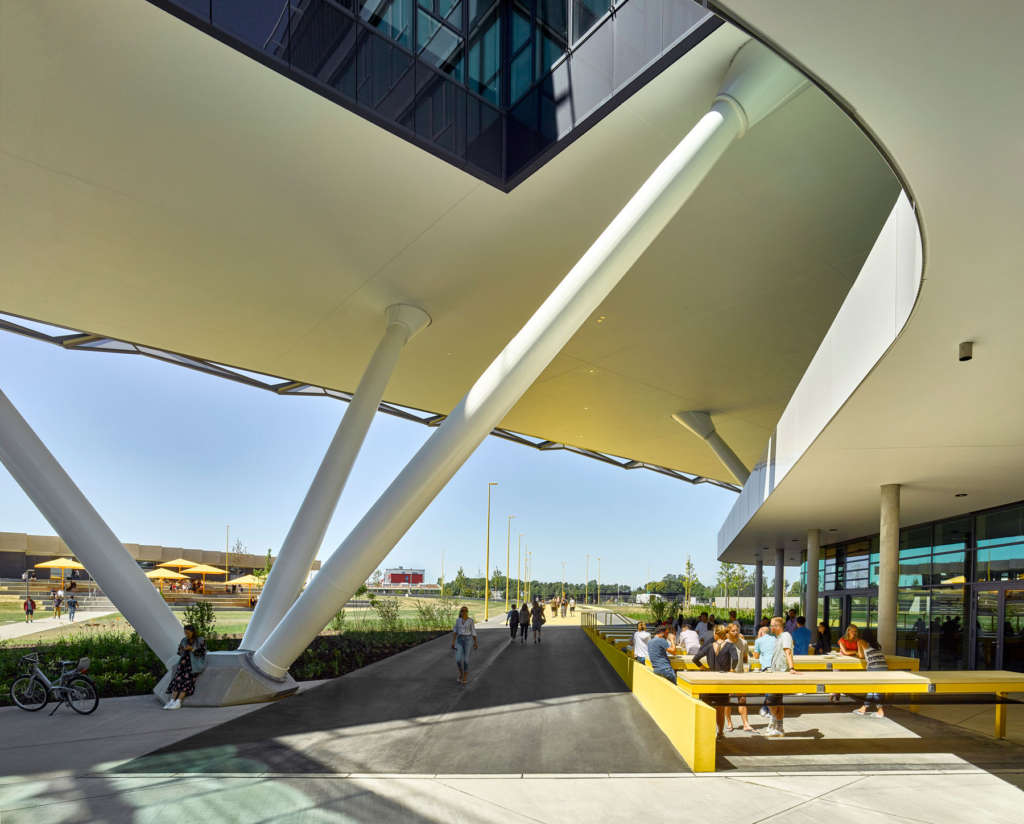
The architectural design represented a significant challenge in terms of structural engineering. It required an innovative load-bearing structure and engineering solutions that enhance the floating lightness of the raised volume housing the office floors and, at the same time, make it possible to realize the open-plan office space without dividing walls. The steel load-bearing structure measures 143 × 118 meters. It is a three-level Vierendeel truss which, by obviating the need for diagonal bracing or bracing walls, permits maximum flexibility in designing the workspace. It is supported by a system of 67 slanted steel and concrete supports arranged in v-shapes in groups of three or four on a primary grid of 8.1 meters.
Together with the central reinforced-concrete core it forms a three-dimensional structural system pierced by six light wells of varying size supplying the workspace in the center of the building with daylight.
Two levels of the steel-and-concrete construction, which weighs 12,500 tonnes, were preassembled on the ground, raised by approximately 10.5 meters by means of a special lifting technique, and then settled on the supports. Close coordination between planners and subcontractors and a tight dovetailing of all project stages from planning to realization made it possible to meet the abovementioned challenges and technically implement numerous new developments and innovations in steel and composite construction in a compelling manner. For this achievement, the ARENA building was honored with the Engineering Award of the German steel construction industry association bauforumstahl e. V. early in 2019.
Project Details
Client: adidas AG
Architect: Behnisch Architekten, Stuttgart
Competition: 2014, 1st Prize
Planning and completion: 2014–19
Gross: 52,000 m² / 560,000 sq.ft.
Volume: 259,000 m³ / 9,146,500 cu.ft.
Address: Adi-Dassler-Straße 1, 91074 Herzogenaurach, Germany

