Azabudai Hills
Architect: Heatherwick Studio
Location: Tokyo, Japan
Type: Retail, Office, Cultural, Community Center
Year: 2023
Photographs: Raquel Diniz, Kenji Masunaga
Making a human district in a global city
The following description is courtesy of the architects. There’s a snapshot of an alley in Tokyo, taken two decades ago. It’s unremarkable. It could be a scene from any number of residential neighbourhoods, with its familiar tangle of cables, autumn branches, telephone poles and washing strung across first-floor balconies. On the ground, a vending machine and pot plants on a flight of stairs. Looking up, a distant skyscraper and handful of taller buildings against blue sky. What you can see needs some care. You notice the wall is overtaken by weeds, there are barriers around a garage and a rusting fence. What you can’t see is the meaning this place holds for the people that lived there, the invisible threads that drew its community together. The story of Azabudai Hills begins with a neighbourhood in similar need of renewal, but one that is being stitched together from these threads of memory. It is a new kind of district in the city, made for people and filled with greenery – “a place,” says Thomas Heatherwick “to be cherished.”
Two generations in the making
The completion of Azabudai Hills doesn’t just mark the culmination of a decade of work by Heatherwick Studio, who designed the landscape and many of its buildings. In 1989, the developer, Mori Building Company, began a remarkable process of pregeneration that has been underway for more than thirty years. To transform more than eight hectares of land in the heart of Tokyo, Mori Building negotiated and cooperated with the owners of each business, house and plot on the site, one by one.
As a result of this gradual, community-focused approach to development, Heatherwick Studio’s client is a consortium of Mori Building and local residents and businesses. “This is a very different model to similarly-scaled regeneration projects in the UK, which often become unaffordable for the existing residents,” explains Neil Hubbard, Group Leader at Heatherwick Studio. “In this project, the ambition has been to engage with and retain the communities that call the area home. It’s a development that has spanned generations. In many cases, parents or even grandparents signed up to the move to give their families a better place to live.”
“There were more than two hundred structures on the site, among them many post-war buildings that had seen better days. But they had all the everyday spaces that, together, make up city life. There was a temple, for example, a dry cleaner, florist, print shop, memorials, a post office and park – all of which needed to be relocated in the new district, in buildings designed to last.”
Azabudai Hills straddles the neighbourhoods of Azabudai and Toranomon in Minato ward. This is an international part of Tokyo, home to a number of embassies, and sits in a natural valley between the
hills of Roppongi, a cultural area to the west, and the business centre of Toranomon to the north. The site
is Y-shaped, split into three irregular sections and just 30 metres wide at its narrowest point. When
Heatherwick Studio was commissioned to design the landscape and the assortment of lower-level retail,
office, cultural and community buildings, the location of three towers was already envisaged within the
masterplan. Its three segments needed to be brought together, but also given their own character and
distinct gateways: a retail presence along the eastern edge of Sakurada-dori, a business district to the south
and a residential neighbourhood to the west. The client also wanted a completely umbrella-free route
for office workers, stretching 700 metres between the two metro stations at either end of the site.
Not another tower + podium
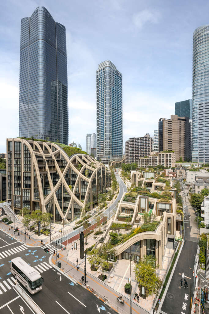
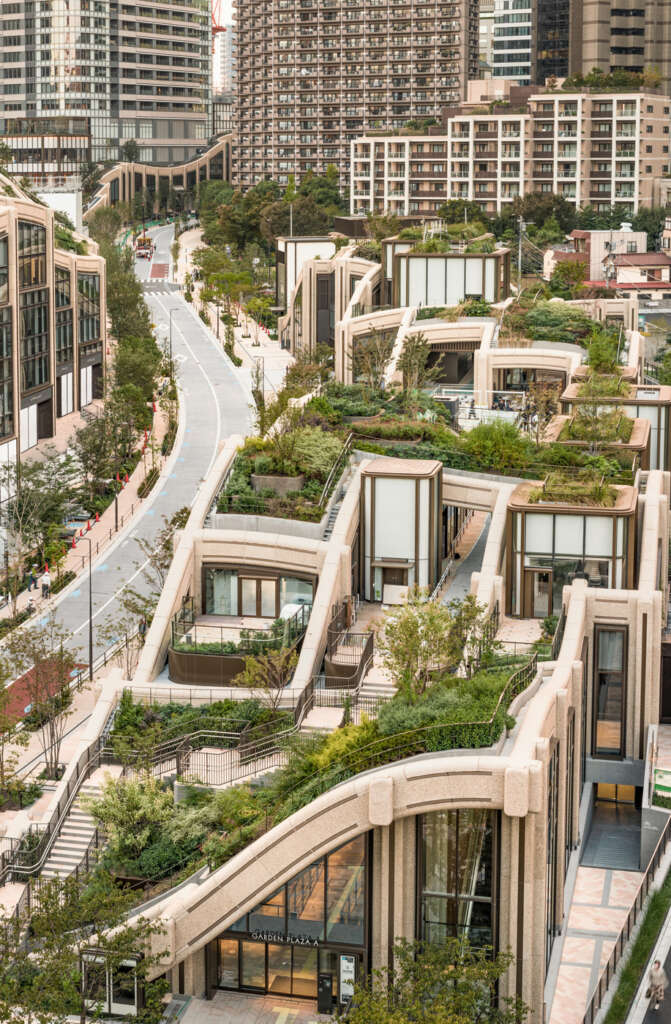
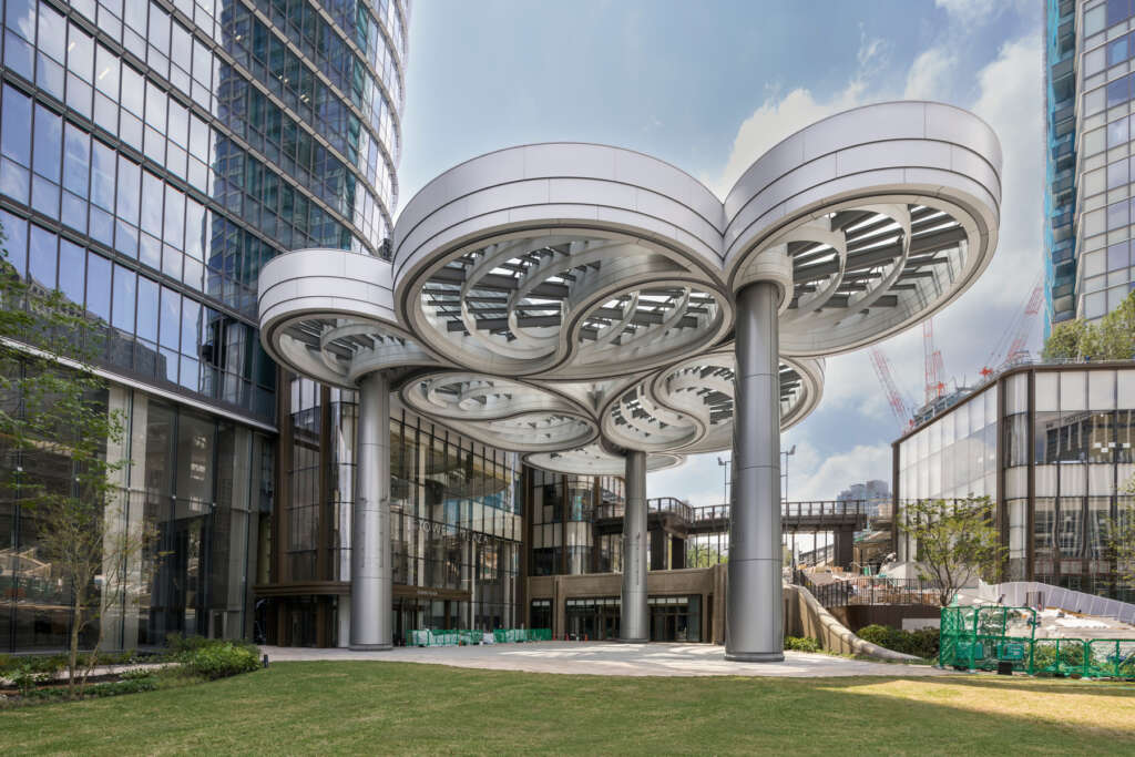
Rising to 330 metres, the office and residential Azabudai Hills Mori JP Tower, a glass skyscraper by Pelli Clarke & Partners, isn’t just the highest building in the development – when complete, it will be the tallest building in Japan. Typically, the formula for arranging different functions around a highrise building is to attach a medium-sized podium, like a bustle on a dress, which roughly aligns with the surrounding streets. But Heatherwick Studio questioned this mantra of form and function: does it have to be a podium? Is there a better, more human approach? Because while relating building to datum line might be accepted urban logic, it does nothing for the person standing in the street – to a pedestrian, a podium can seem like a shorter, but no less impenetrable, wall of glass and stone.
The landscape was also an important aspect of the brief, which emphasised the Corbusian ideal of increasing density by building tall, then sinking levels below ground to create more space for gardens. But
one of the less desirable outcomes of this is that it creates hard barriers; inevitably, those buildings
become a topography of jagged, manmade cliffs. A solution was needed that could create these gardens, but rather than lay them as a carpet, use their organic form to gently stitch the buildings into the surrounding city streets.
Architecture Guide to Tokyo
Buy now at avontuura.com/shop
‘Only in Tokyo’
In Tokyo, the design team could study Mori Building’s precise 1:1000 scale model of the city, accurate down to the facades of individual shopfronts. When we think of the city, we tend to imagine its towers sprouting from tightly packed urban blocks. The model illustrates how Tokyo is dense in plan, yet in elevation, is much more open and fragmented than New York or Shanghai; it is shaped by the contours of the bay, the sea and the rivers that flow through it, and by the mountain plain. Looking at this model, at its maze of intertwined neighbourhoods and pockets of greenery, the team saw the chance to create more green breathing space in the area.
During early research, the design team also studied Japan’s architectural history, exploring ways to reinterpret certain principles. This, it turned out, was not entirely useful. “That is Kyoto, this is Tokyo,”
explained the client.
It’s a popular misconception that Tokyo’s architecture has its roots in the same historic influences that shaped Kyoto. Edo, as Tokyo was originally called, was in some ways a retaliation against this style and naturally evolved in its own way – and so it wasn’t enough that the project resonated with a Japanese architectural sensibility. Instead, alongside the central themes of ‘green’ and ‘wellness’, Mori Building had two tenets for the project: ‘only in Tokyo’ and a ‘modern urban village’.
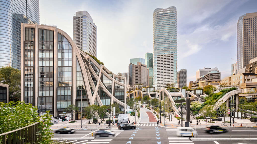
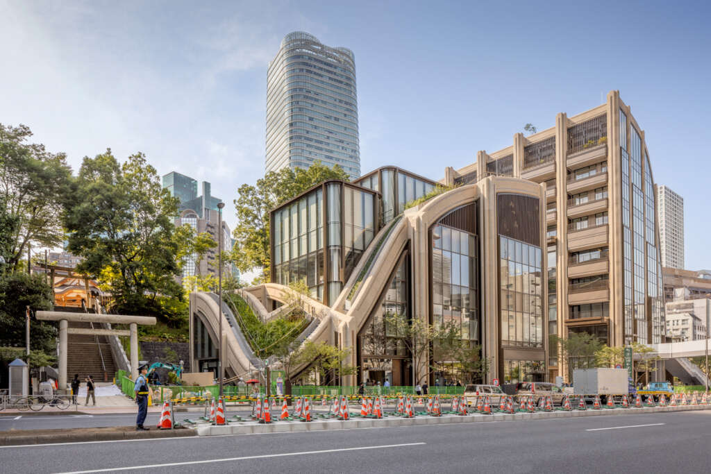
The answer to this challenge came through a close reading of the local area and analysis of the way buildings occupy Tokyo’s streets. The design team was drawn to the juxtaposition of old and new architecture, large and small – tiny houses next to huge towers – and the unexpected layering of activities. A cycle hire shop next to a shrine, a language school above a house, vending machines beside gardens and garages. The ambition was to retain this sense of contrast, of organic growth, and break the functional requirements of the podium down into a more human scale. The massing could then step up to the foothills of the tall buildings, layering the architectural scale to draw the eye upwards from a one-storey pavilion to the peak of the tallest tower.
A framework for life: people, trees and plants
However, it became clear that there was no single diagram that would achieve this topography. What was needed was a system. Exploring ideas through models, the team used card to fashion three dimensional
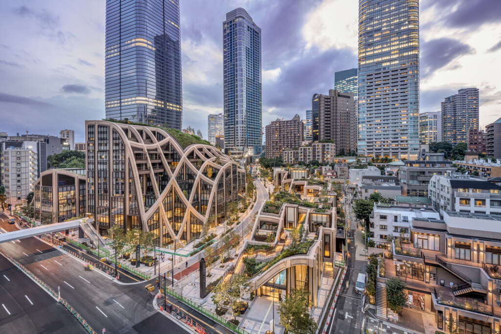
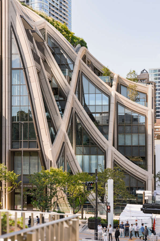
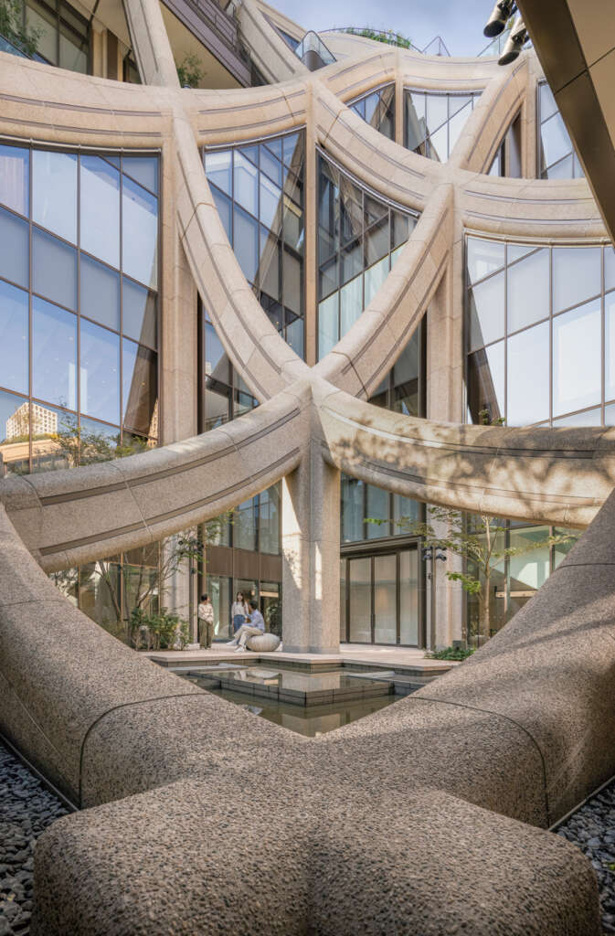
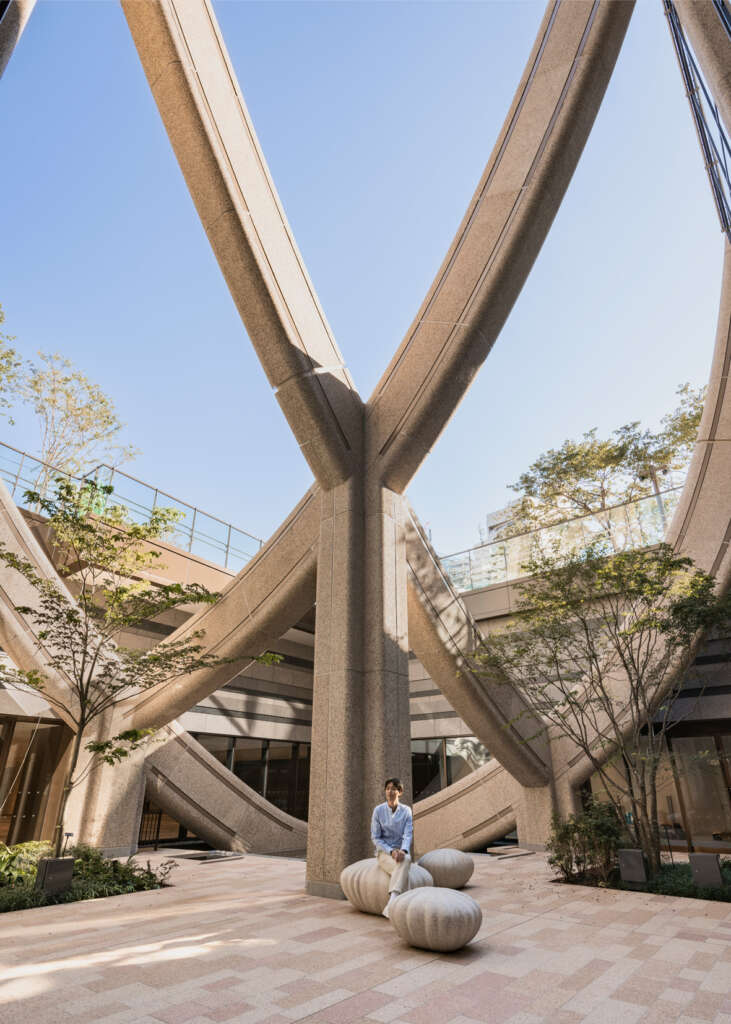
forms from a waffle lattice. This was based on a simple rectilinear structural grid, stable enough to meet Tokyo’s seismic requirements, but with the flexibility to shelter a variety of interesting spaces. Like a trellis, it could be planted, inhabited and flow through the city to reveal pockets of garden. The lattice of interconnected beams could be manipulated; pushed below ground, extruded and distorted – or even set aside, as Neil Hubbard explains: “After we had perfected the grid… we broke it. This is what allowed us to reflect that wonderful juxtaposition of scale and character, to create a contrast with retail pavilions and the more linear expression of a new school. Our system allowed many different spaces and forms to be jumbled together in a way that still makes sense – and is very Tokyo.”
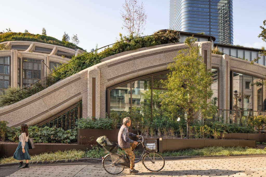
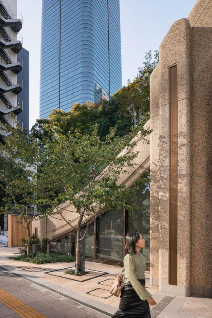
The framework itself is made of steel beams, approximately 1.5 metres deep and rendered in a tactile, pebble-like texture. The free-flowing structure belies the complexity of its fabrication; different spaces unroll from its modulations, from a top-lit sunken market hall to museums, galleries, apartment and office lobbies, a hotel, boutiques and restaurants. Where there are entrances, the landscape is pulled down to meet the ground. “Because the framework is so flexible, the scale can adapt to relate to the surrounding city”, Hubbard explains. “Facing the smaller streets to the north of the site, our buildings are two storeys and we have a network of little walkways with planters, courtyards, sunken gardens. These edges are designed to invite exploration; we created shortcuts, ways of weaving through.” At a finer grain, the grid provides an organising principle for balconies, the individual bays of retail along the main high streets and the terraces of the new school. And in practical terms, the systems approach also helped to unify the construction of the district’s three sections – from the start, each contractor and local architect team shared the same visual and conceptual language.
Shopping in floating glass lanterns
Over a number of recent projects, Heatherwick Studio has examined the way people spend time and money
in cities – and how that is changing. Places like Coal Drops Yard in London, with its curated selection of
shops; 1,000 Trees in Shanghai, where modular units extend into terraces under a canopy of trees; and the
Broadmarsh in Nottingham, which is a radical rethink of the social value of commercial development, all demonstrate that there can be no one-size-fits-all approach.
Attracting people to ‘buy stuff’ isn’t enough – the Covid-19 pandemic demonstrated how rapidly consumer behaviour can shift. There are also local nuances when it comes to shopping in Tokyo. It’s not unheard of to travel across the city to visit a particular shop for its highly specialised product line, whether that’s a white towel or the perfect iron skillet. From the start, the team understood that a podium containing a large, generic mall simply would not work. The aim, then, was to create a neighbourhood filled with interesting, unexpected spaces and experiences; a place that was about more than shopping.
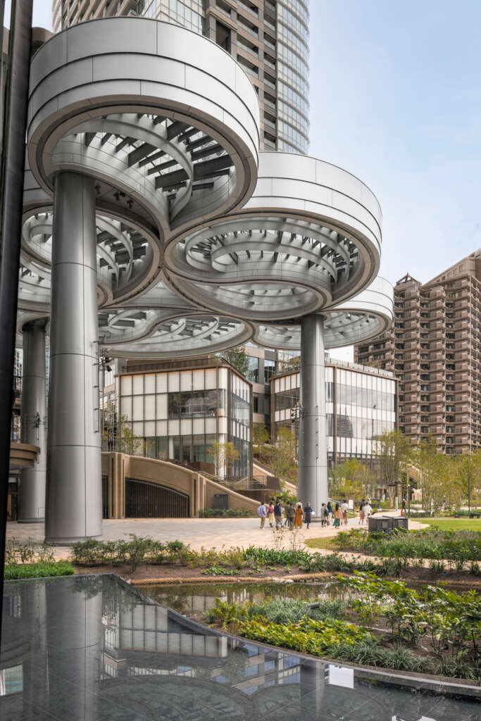
In practice, balancing the aims of a park, wellness spaces and shops isn’t straightforward: few retailers want a tree in front of their window display. In Azabudai Hills, the boutiques are cleverly contained within a series of pavilions, like delicate glass lanterns floating in the landscape. Heatherwick Studio defined guidelines for key elements, but the intention was never to be prescriptive; they are conceived as organic
clusters, rather than uniform boxes – as each pavilion is interpreted in new ways, they set the stage for more interesting, varied urban life. The units that line the main streets also share this high level of flexibility, framed by the trellis structure.
A seasonal Japanese landscape
Throughout the project, there is careful choreography between landscape and buildings: the garden pauses
for the sweep of an entrance, pavilions stand aside for a grassy clearing. Where one side of a building has views of a beautiful wooded shrine, the other is curved to create its own arc of terraced greenery, giving residents a sense of a continuous garden below and allowing daylight to reach the street. Like the assemblage of buildings, the landscape is of Tokyo, drawing on the Japanese principle of hidden and captured views. To heighten the site’s natural valley, the design creates a built valley at its centre, with paths winding up to more intimate terraces and vantage points. Water has been incorporated to create a sense of calm and playful, unexpected moments; in some places, it can only be heard underfoot, in others it emerges to form pools and streams. The gardens also feature works of art, from landmark sculptures to immersive installations, and ‘pebble’ benches, designed by the studio and sculpted in concrete.
In the tradition of Mori Building’s huge model of Tokyo, the studio created a three-metre-long model of Azabudai Hills, precise in every architectural detail. Equal care was given to the planting, as Heatherwick
Studio’s Project Leader, Michael Lewis explains: “When one of our client’s team visited London to see the model, she asked for tweezers to adjust a cherry tree to be just the right shape for that species. Because seasonality is so important, we incorporated several different types of cherry tree that blossom at different times of the year. The model also shows the exact position of fruit trees, even the detail of the smallest vegetable patch.”
The landscape contributes to the development’s holistic environmental approach, and Heatherwick Studio worked closely with local horticulture specialists to use climate-resilient species that need little irrigation. Mori Building’s ‘green’ and ‘wellness’ vision for Azabudai Hills is manifest in a zero-carbon, LEED Platinum strategy, achieved by a number of resource-saving measures, from stormwater management to sewage heating and waste recycling. It is a model for the future neighbourhood – a treelined, walkable town, with buildings powered entirely by renewable energy.
A school imagined as a treehouse
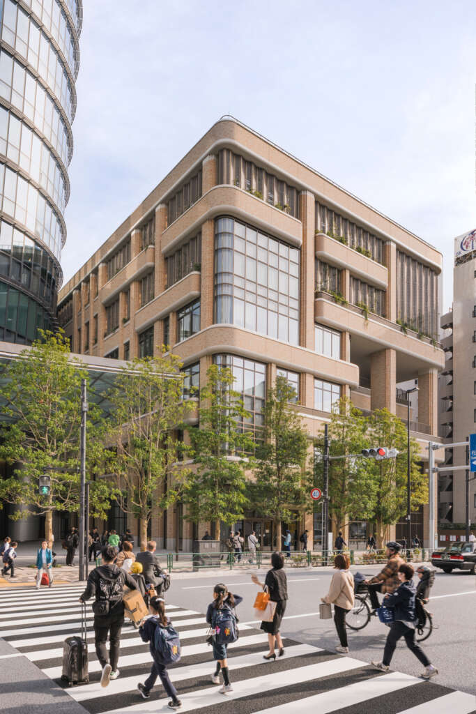
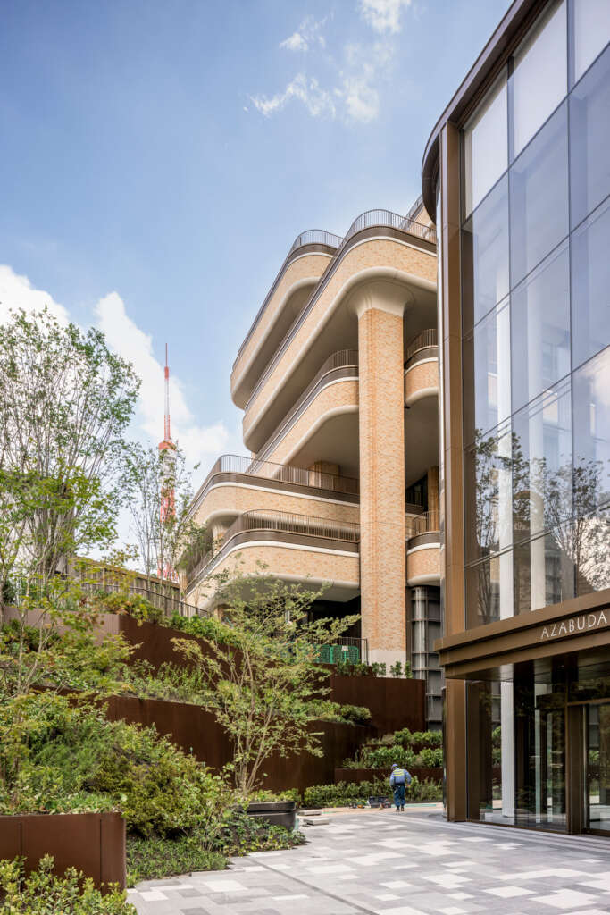
One of the most striking projects in Heatherwick Studio’s scheme is a new school for the British School in Tokyo, a campus for 700 students on the site of Azabudai’s former post office building. The architecture resonates with the local landmark it replaces, picking up its Modern proportions in the windows and incorporating similar yellow and orange brick tiles. Neil Hubbard explains how the design team worked with the original manufacturer: “As you can imagine, they had spent years perfecting the most precise shade of tile, only for us to come along and say, “could you mess it up a little?” When we found out that 15 per cent of tiles were being discarded because of imperfections, we said, “wait… can we try them?” For the design team, these imperfections gave the façade texture and warmth.
The next challenge was spatial – how to create more outside space for the children. First, one of the playing fields was lifted on to the roof. Next, instead of rows of classrooms, vertically stacked, outdoor classrooms were introduced to punctuate the 100-metre eastern façade with life and movement. Planted balconies were created to be tended by the students, helping to give the impression of the school as a great treehouse, held aloft by trunk-like pillars. Where the building meets the new landscape, its overlapping terraces provide a natural green link. The school also helps to introduce another kind of social life to Azabudai Hills, with parents dropping off their children, perhaps visiting the health club, families meeting in the new playground and school trips filing through the gardens.
Stitched together from local memories
In many ways, Azabudai Hills is an expression of the new: in its deconstruction of the podium archetype, its environmental mission, flowing forms and abundance of new plants. But what is there of old Azabudai? An important aspect of the project has been finding ways to resonate with memories of the place, to evoke the space it occupies in people’s imagination. There are subtle references in the school’s tiles, in the reinstatement of memorials and the new public playground.
When Heatherwick Studio redesigned the much loved London bus, they didn’t replicate the surfaces or details of the Routemaster but referenced its rounded corners. In a similar way, the project echoes the physical memory of the site’s roughly eighteen metre level change. “There was once a geological cliff, which, over time, became a retaining wall,” says Michael Lewis. “We referenced it on the site’s northern edge with a stone wall, which isn’t designed to look natural, but in its form conjures the sense of a rock face.” And, of course, the most significant connection with the past comes from the people, many of whom will move back in, joined by new neighbours and businesses.
The 1,000-year building
Heatherwick Studio believes in the 1,000-year building. Rather than piecemeal, temporary repair, Azabudai Hills represents a bold approach to urban renewal. The whole district is a flexible framework, designed for longevity and environmental resilience. It combines innovation with the timeless principles of greenery, variety and joy.
“We were inspired by the opportunity to create a piece of city that feels more human-centric than most new, modern district. A place people want to come back to for many decades,” explains Thomas Heatherwick. “If we create places with care, with an understanding of the human experience – places that people love, that grow, that they can adapt and make their own – then they are more likely to stand the test of time.”
Azabudai Hills is the flowering of a long-term vision, from a seed planted thirty years ago. While its scale and creativity are impressive, the project’s true value lies in its loyalty to Tokyo, and to what has gone before: it has evolved from an existing neighbourhood and is designed to nurture that same sense of community. “As the project now welcomes its first residents, businesses, schoolchildren and visitors”
says Hubbard, “it offers something special yet familiar – a piece of Tokyo that can be cherished for generations to come.”
Project Details
- Project Name: Azabudai Hills
- Location: Tokyo, Japan
- Client: Mori Building Company
- Completion Date: November 2023
- Size: 8.1ha
- Architect: Heatherwick Studio
- Design Director: Thomas Heatherwick
- Group Leader: Neil Hubbard
- Project Leader: Michael Lewis
- Project Manager: Elisa Simonetti
- Technical Design Lead: Andy McConachie
- Project Team: Adam Peacock, Adriana Cabello, Ana Diez Lopez, Alberto Dominguez, Andy McConachie, Artur Zakrzewski, Aurelie de Boissieu, Ayumi Konishi, Charlotte McCarthy, Chi Chung, Dimitrije Miletić, Elli Liverakou, Etain Ho, Etienne de Vadder, Gabriel Belli Butler, Ho-ping Hsia, Ian Atkins, Iván Linares Quero, Jacob Neal, Jorge Xavier Mendez-Caceres, Jose Marquez, Kacper Chmielewski, Kanru Liu, Kao Onishi, Katerina Joannides, Ken Sheppard, Laura Barr, Lorenzo Pellegrini, Luis Sacristan, Luke Snow, Mat Cash, Megan Burke, Michael Cheung, Nic Bornman, Nicolas Leguina, Nicolas Ombres, Nilufer Kocabas, Ondrej Tichy, Paalan Lakhani, Paul Brooke, Philipp Nedomlel, Ruby Law, Sayaka Namba, Silena Patsalidou, Silvia Rueda, Steven Ascensao, Takashi Tsurumaki, Ville Saarikoski, Wang Fung Chan, Yanny Ren
Collaborators
- Executive Architect (Plots A/B2): Nihon Sekkei
- Executive Architect (Plot B1): Nikken Sekkei
- Executive Architect (Plot C): Yamashita Sekkei
- Tower Designer: Pelli Clarke & Partners
- Interior Designer (Plot A – Retail): A.N.D Nomura Co., Ltd
- Interior Designer (Plot A – Residence): Yabu Pushelberg
- Interior Designer (Plot B1 – Residence): Marco Costanzi Architects
- Interior Designer (Plot B2 – Residence): SCDA (Soo Chan Architects)
- Brief: Winkreative
- Lighting Design (Retail Interiors): Light Design Inc.
- Lighting Design (Event Space Canopy): L’Observatoire International
- Lighting Design (Landscape): Sirius Lighting Office
- Retail Entrance Design (Plot A): Sou Fujimoto Architects
- General Contractors: Obayashi Corporation (Plot C)
- Shimizu Corporation (Plots A and B2): Sumitomo Mitsui Construction (Plot B1)


