Exhibition Halls
Architects: Marte.Marte Architects
Location: Dornbirn, Austria
Type: Exhibition
Year: 2018
Photographs: Faruk Pinjo
The following description is courtesy of Marina Hämmerle. On the radical transformation of a dated building complex into a new, festive setting for the exchange of products, ideas, and art.
Due to a lack of space, the fairgrounds were moved to the outskirts of town in the mid-1970s, construction took place in several stages, and the resulting trade fair center has since been renovated step by step – with famous architecture firms responsible for certain elements of the 14 exhibition halls. The master plan created in 2012 outlines the upcoming renovation of the west axis – the agora, the central square, should play a bigger role; the orientation within the buildings and open spaces calls for improvement; and the sequence and function of the exhibition halls could be aligned better.
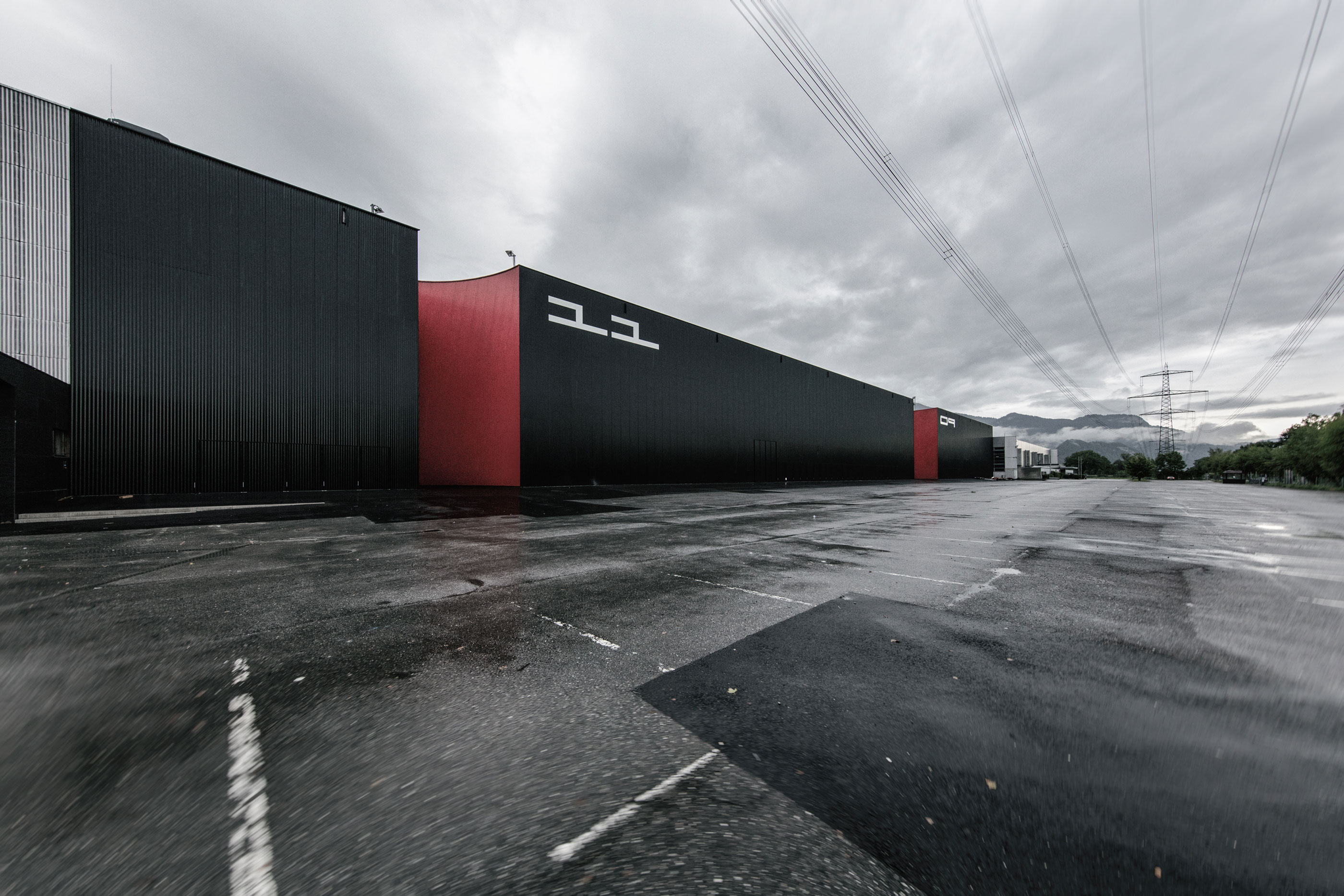
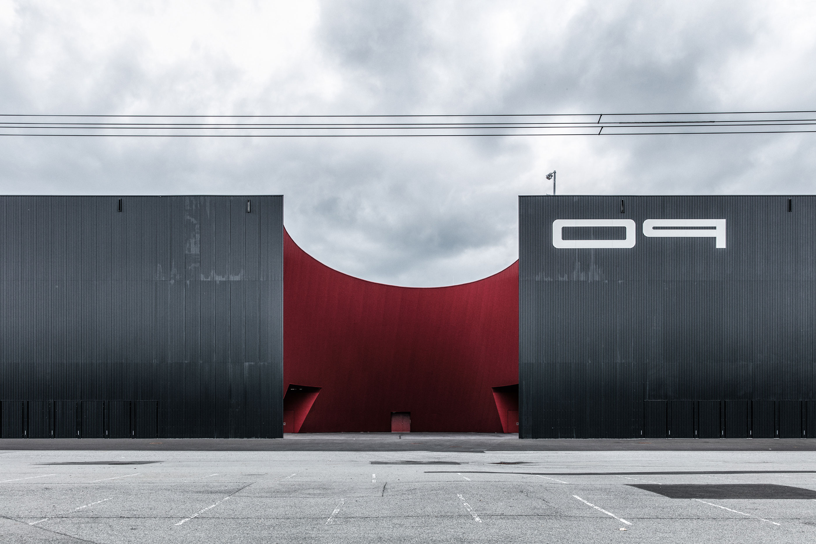
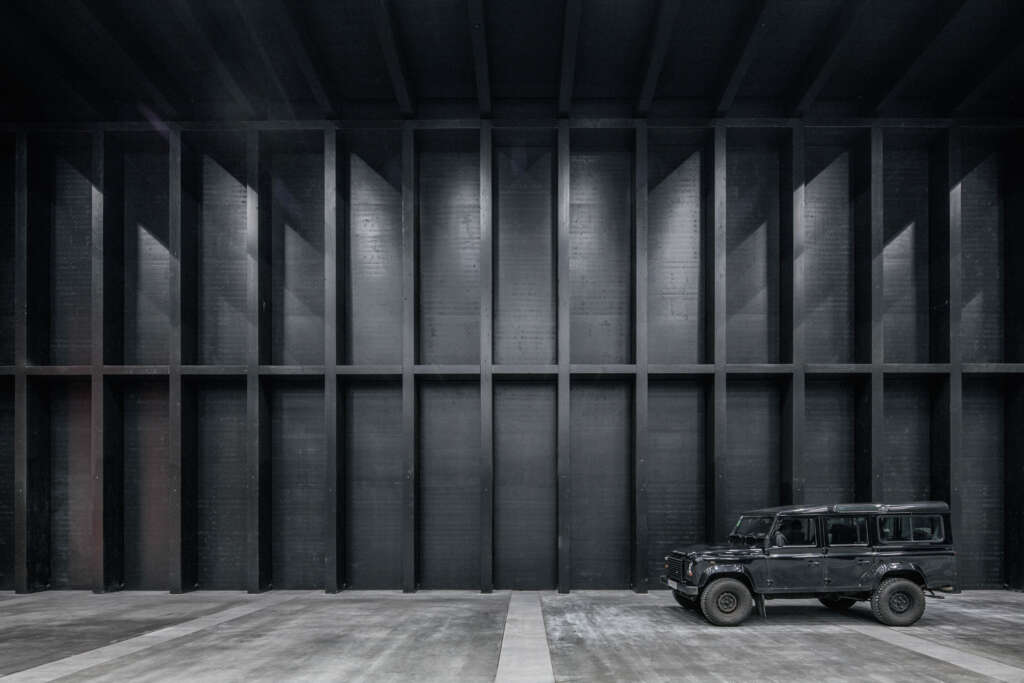
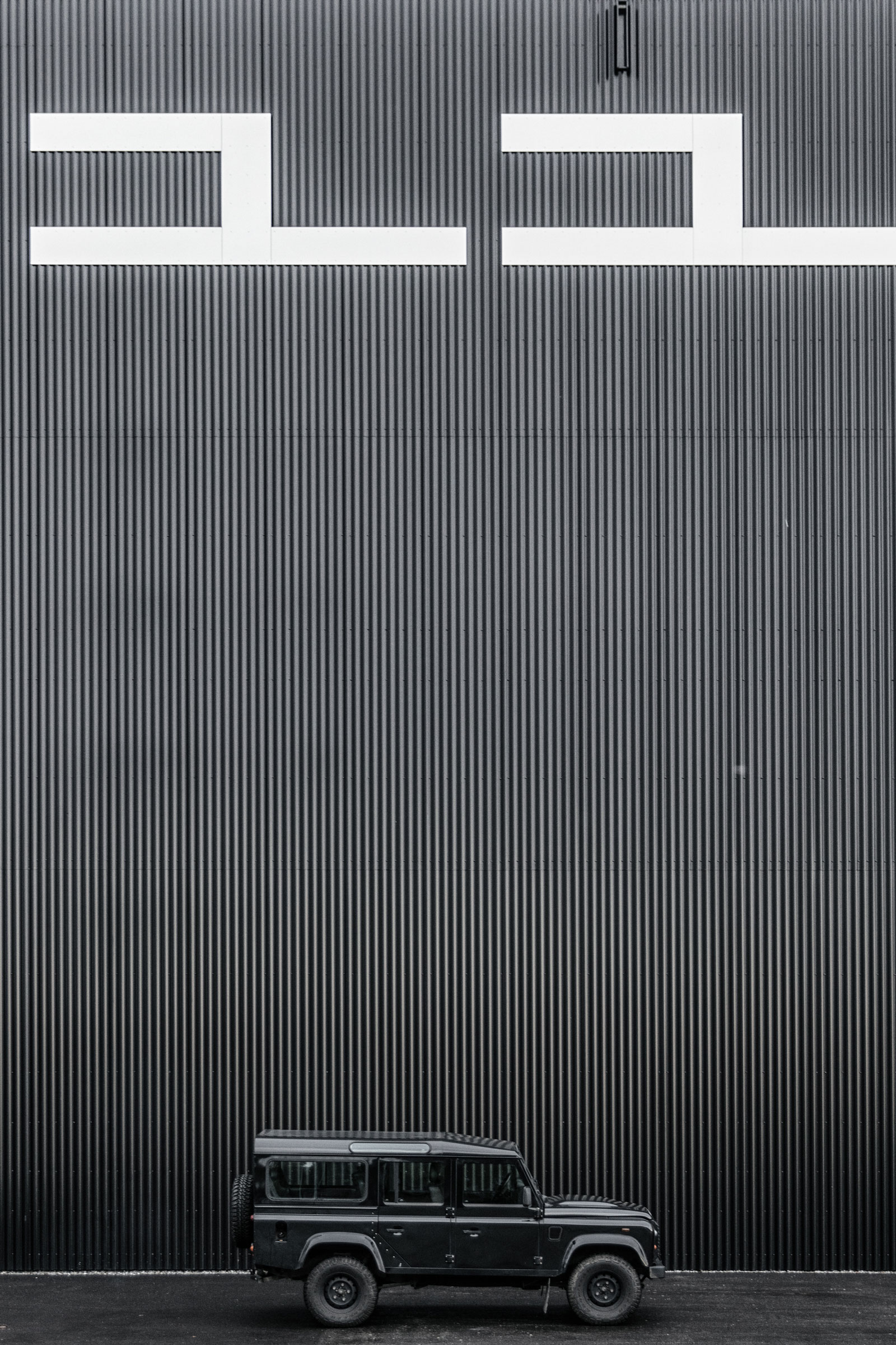
In 2014, Marte.Marte Architects convinced the competition jury with its outstanding design, which is characterized by power and restraint. The mighty gesture of the enormous emblematic structure – four exhibition halls are combined into one gigantic, monolithic building measuring 170 m long, nearly 70 m wide, and 16.5 m high – provides the existing conglomerate with an organizing principle and injects it with new energy.
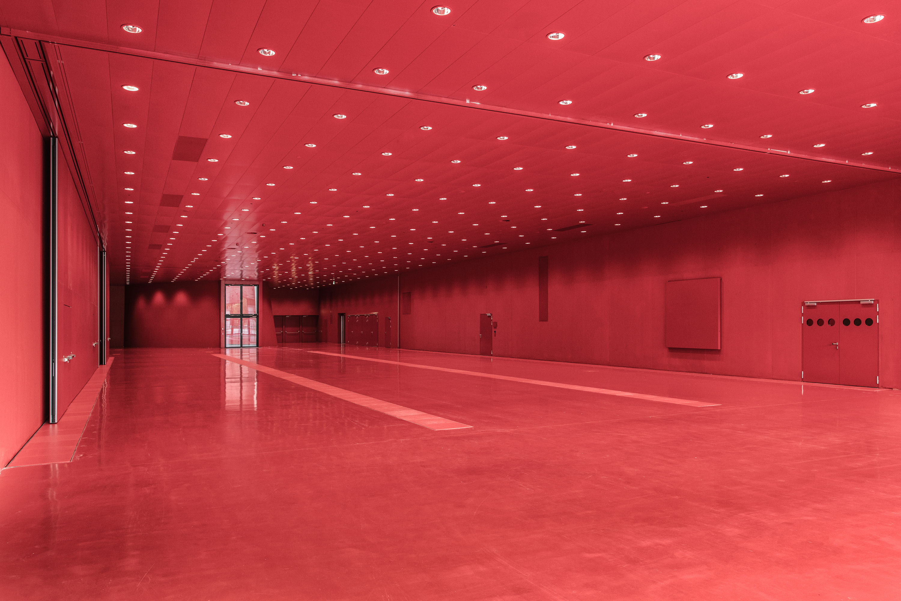
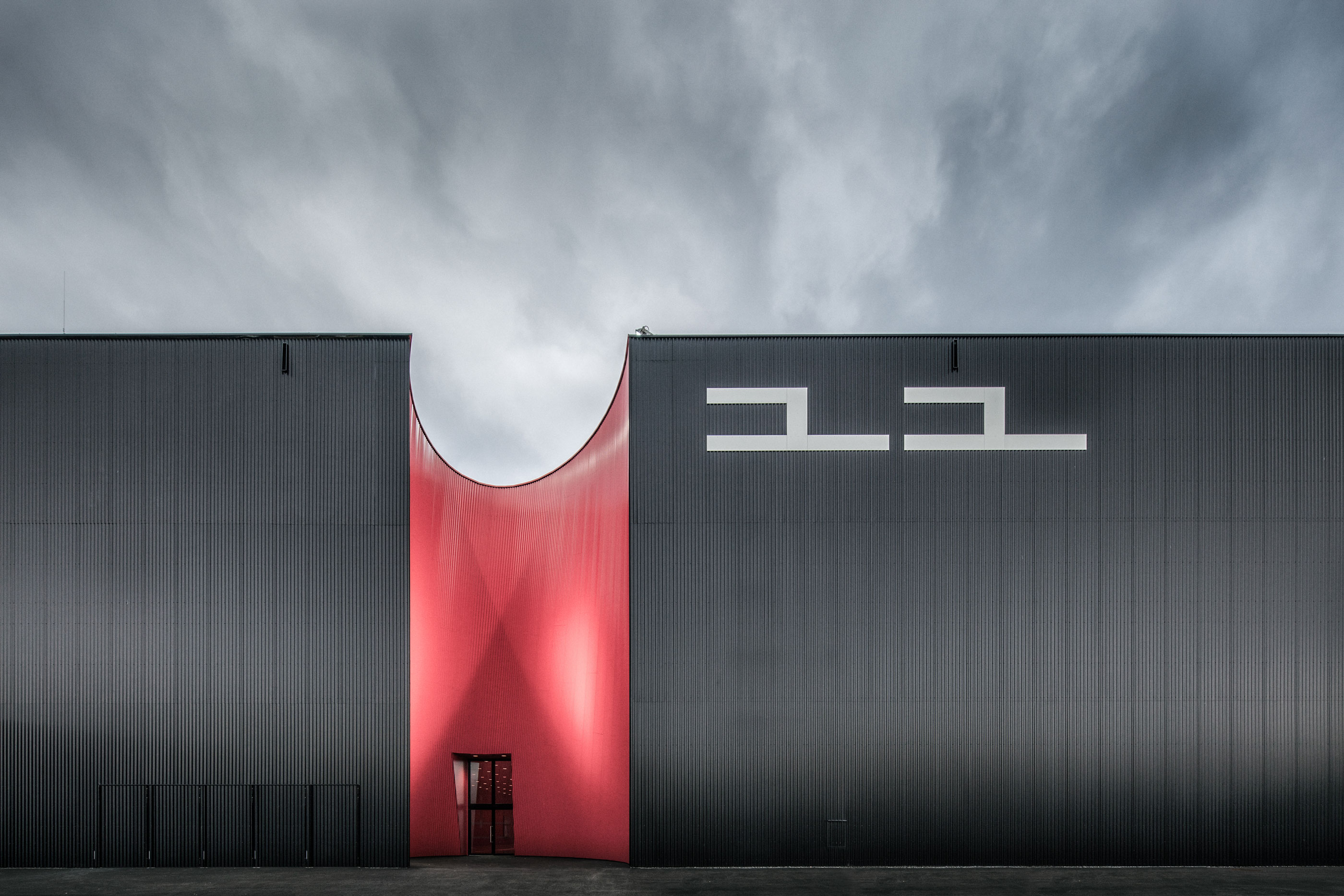
The backbone of the building is the interior circulation axis – room-high glazed openings guide visitors through the series of exhibition halls – red, black, red, black. As eye-catching as the elliptical, hyperbolic incisions in the two longitudinal sides of the buildings are, the color scheme of the giant is just as powerful and vivid – pure, rich colors without shading like those used in coats of arms.
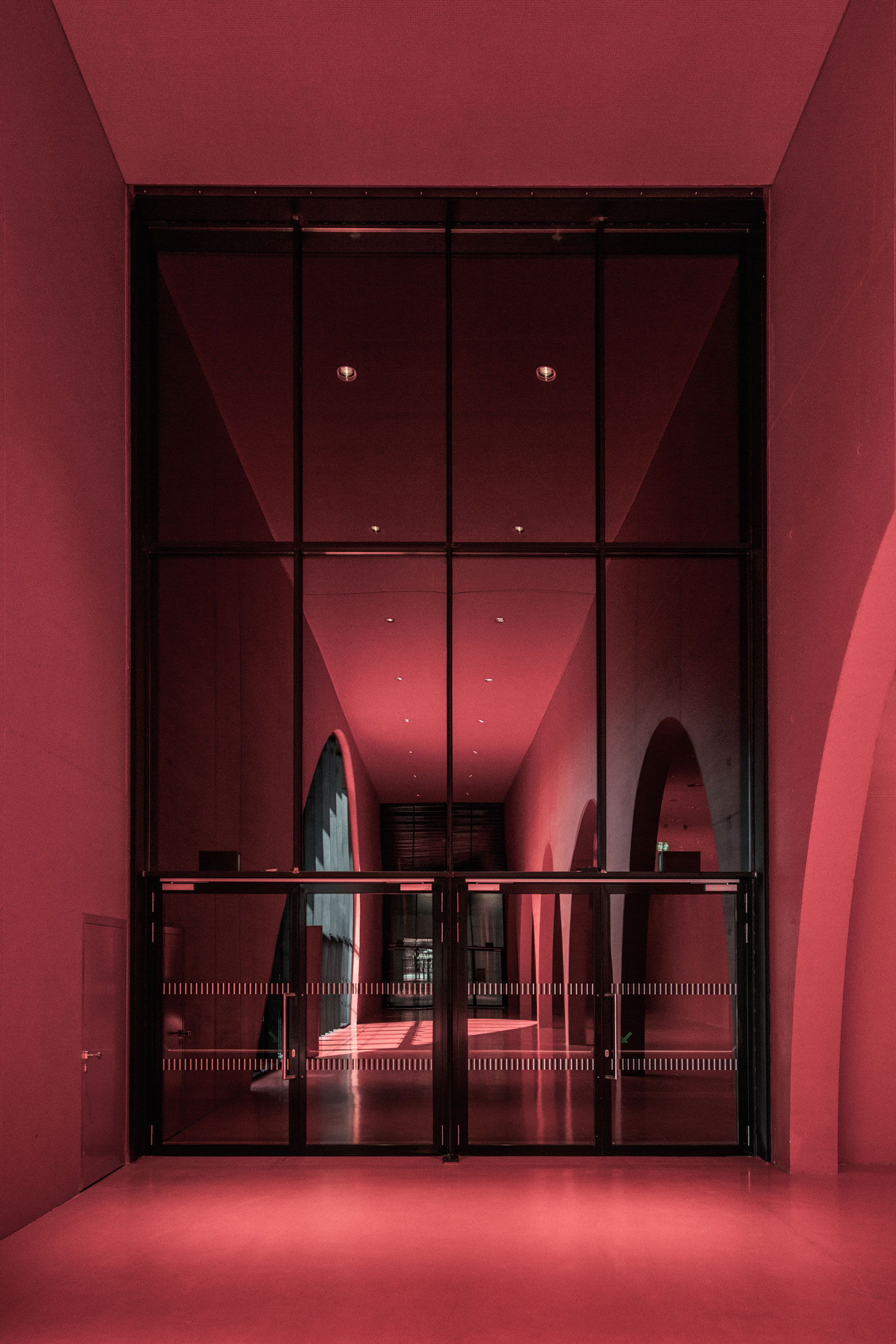
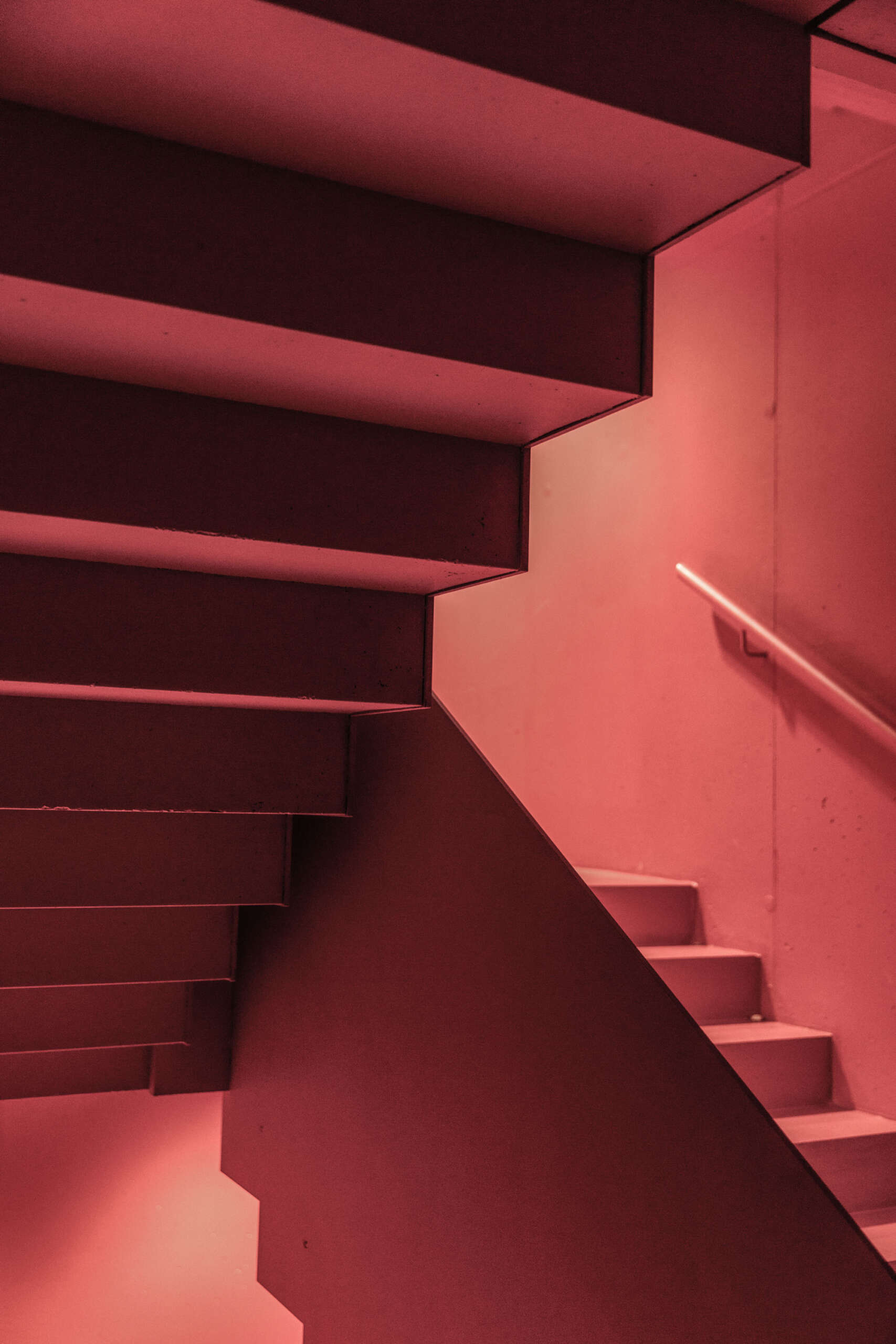
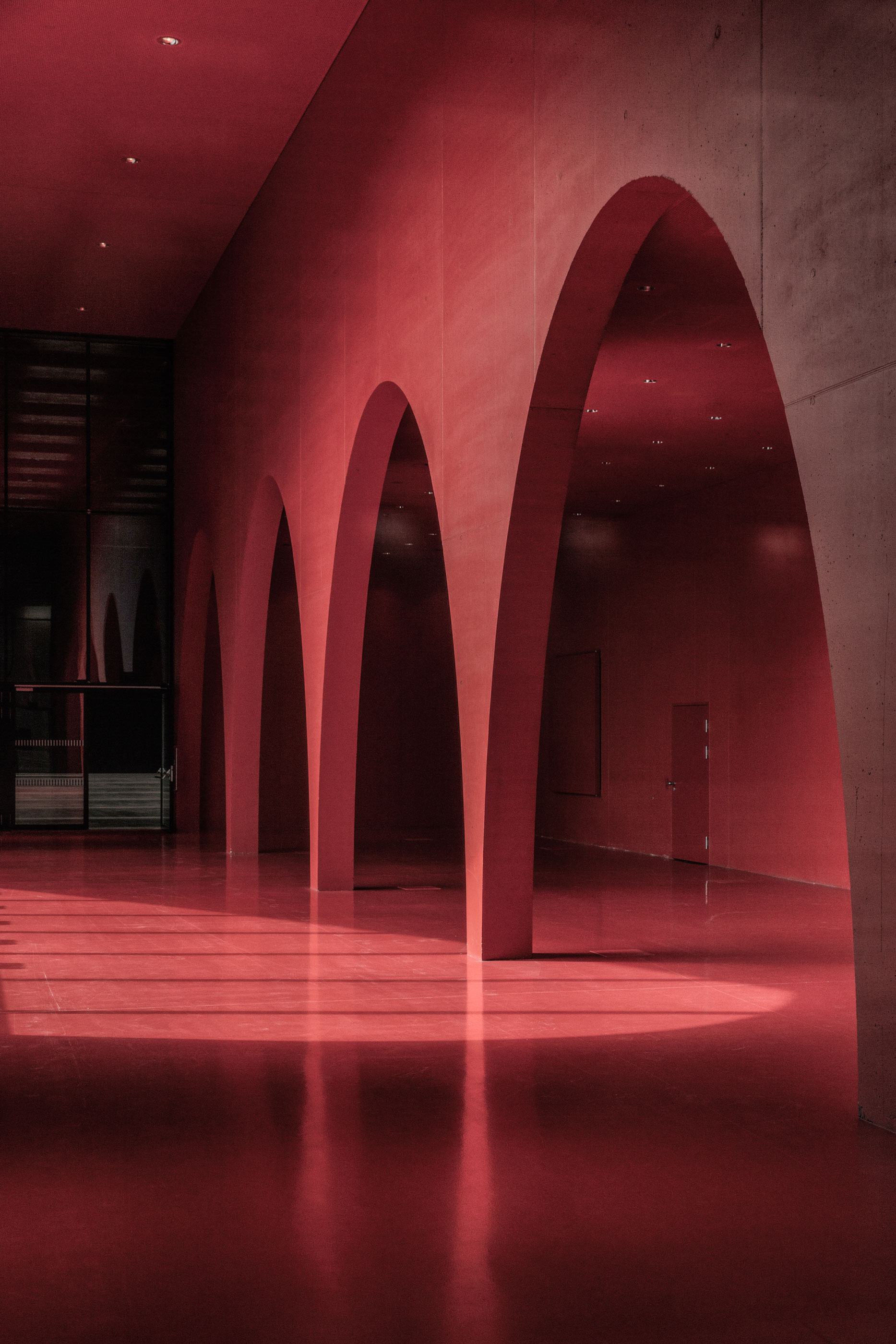
The dimensions and the power of the rooms are impressive. The entire building complex is crisscrossed with a lattice of 4.5-meter-high trusses made of laminated beams, giving one the impression of being placed side by side. A dropped ceiling covers the installation level and only the bottom flanges are visible. Between the facade supports with crossbeams, 70 doors permit exit in the case of fire, and a grid of acoustic panels prevents the dreaded flutter echo and ensures high-quality sound. Black in black. Function in construction. The spectacular foyer between the two exhibition halls is painted entirely in red, and the five elliptical arches of the load-bearing concrete slab form arcades and separate the stream of visitors from those relaxing in the bistro. In terms of lighting, the different sequences of the building cover the entire spectrum: Tunable White bathes the exhibition and event spaces in the appropriate ambiance.
What also distinguishes Marte Marte’s approach from the other competitors’ designs was the equal treatment of visitors, exhibitors, and vendors. Of the two carmine courtyards cut into the west facade of the building, one serves as the entrance for visitors and the other for the delivery of goods. Thus, the building doesn’t differentiate between front and back but is presentable and functional on all sides.


