Whitchurch, Cardiff
The following description is courtesy of Dow Jones Architects.
Maggie’s brief
For a client that has commissioned over twenty buildings for the same purpose, the approach of Maggie’s board is wonderfully entrusting of their architects. Character and exuberance are encouraged. There is no briefing document or performance schedule, rather a list of rooms and a beautiful essay written by Maggie Keswick Jenks, ‘A View from the Front Line’, about her experience of cancer and her ideas for a new type of place to help people suffering from the disease.
A Maggie’s centre is designed to be the antithesis of a hospital. The buildings are designed to be both familiar and inspiring, like a beautiful and surprising house, and are underpinned by an idea about how helping people to feel comfortable and uplifted will help them approach the challenges of their prognosis and treatment with greater ease.
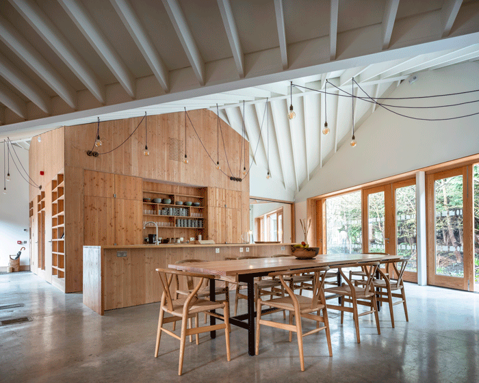
Like most houses, the centre of activities is the kitchen table, and the simple act of making a cup of tea is used as an ice-breaker, and the first step in standing on your own and regaining your sense of self.
The buildings are meant to be legible to whoever comes in to them, with no sense of being institutional. There is no reception desk, but rather an office where staff can unobtrusively keep an eye on whoever comes and goes. There is no signage; spaces open up one from another, so that you can find your way around. Doors can be shut for private consultations but there is generally a sense of openness and interconnection.
There are also rooms – big, medium, small – for classes and consultations, computers for access to information, a library of leaflets and books, a staff office from which staff can keep an eye on comings and goings without the formality of a reception desk. And while most of the building is focused on reaching out to other people, there is also a small space way you can tuck yourself away.
Location
Our centre is at Velindre Cancer Care Centre, a specialist cancer hospital in Whitchurch, North West Cardiff. Velindre serves Cardiff and all of south east wales, and so represents a large rural area as well as the city. Because of this, many patients and visitors drive to the hospital.
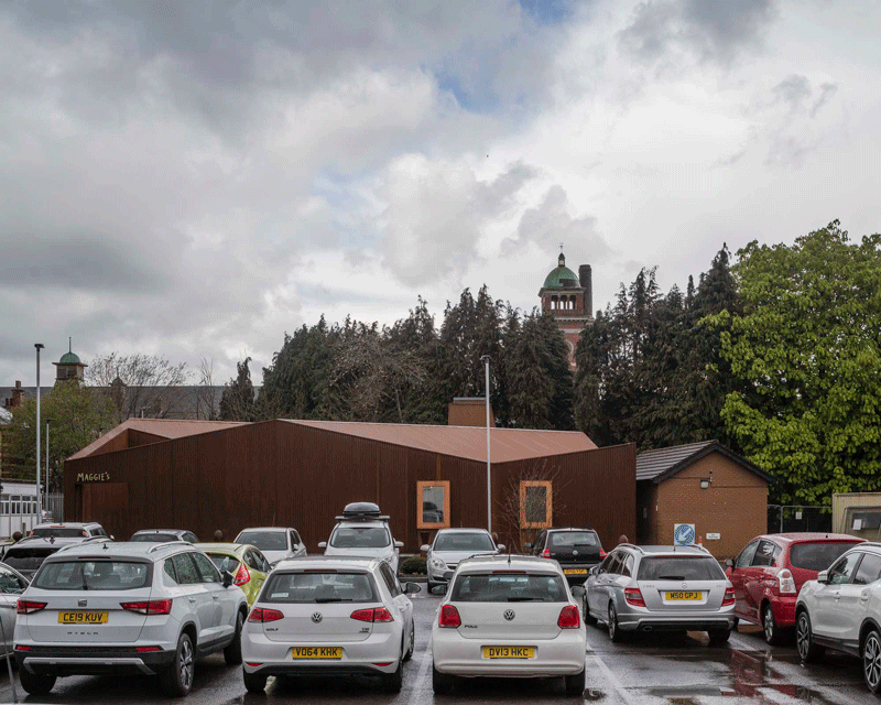
The hospital itself is a series of single and two-storey buildings that have been extended in an ad-hoc way over time. The car park fills any available space around it.
Its immediate surroundings are residential roads, with a small park and library to the east, and a large nineteenth-century Grade II listed former mental health hospital to the north, Whitchurch Hospital, designed as an ideal city with landscaping, a chapel, and radiating wings with their own garden and gazebos.
The building
Site and landscape
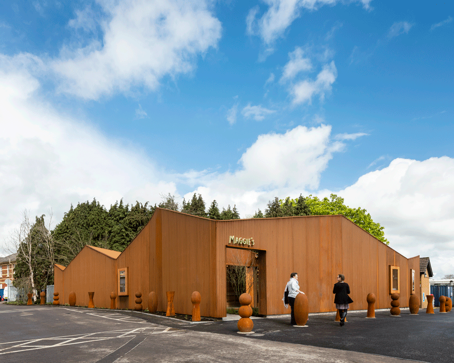
Our building is located on a triangular shaped site in the corner of the car park, visible from the road and easy to find.
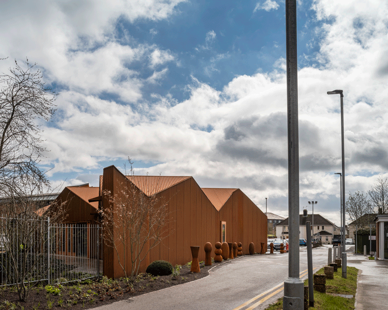
The site is generally quite harsh and unremarkable, surrounded by tarmac and cars, but it backs onto an existing stand of trees which are the only area of landscaping on the hospital site.
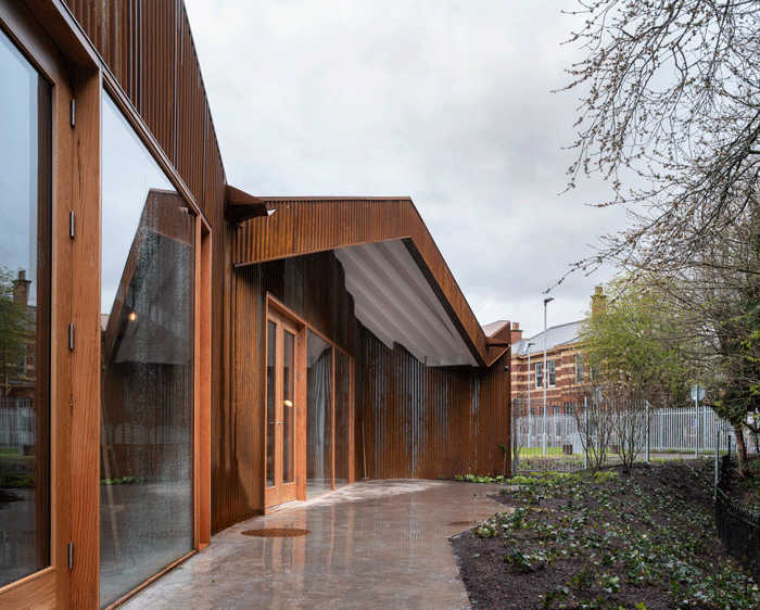
Our building takes you on a journey from the bleakness of the carpark, through an intimate courtyard garden, into a range of calm and contemplative spaces which focus on the stand of trees and a new landscape garden.
Form and material
We wanted to make a form that responded both to the domesticity of the neighbouring streets, and to the building’s broader context of the surrounding mountains.
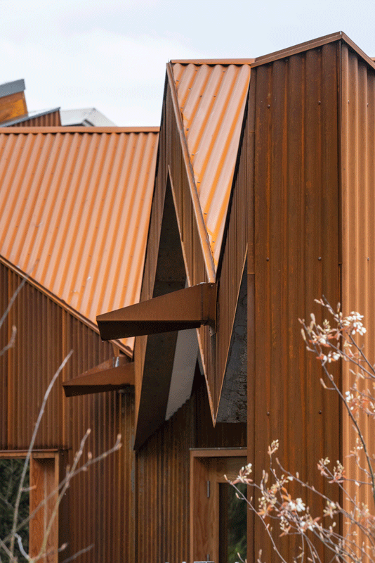
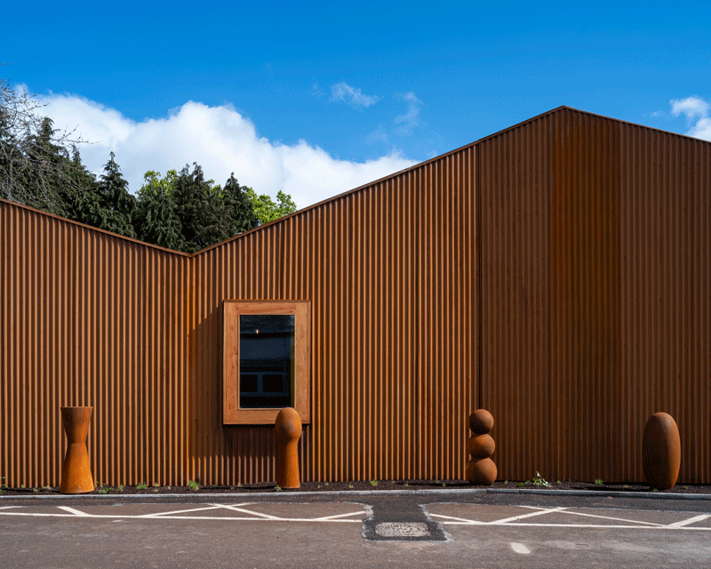
A series of pitched roofs at 45o to the triangular plan provide an uneven and undulating collection of pitches that look both like a bunching of houses and like the characteristic hunkering form of the local landscape.
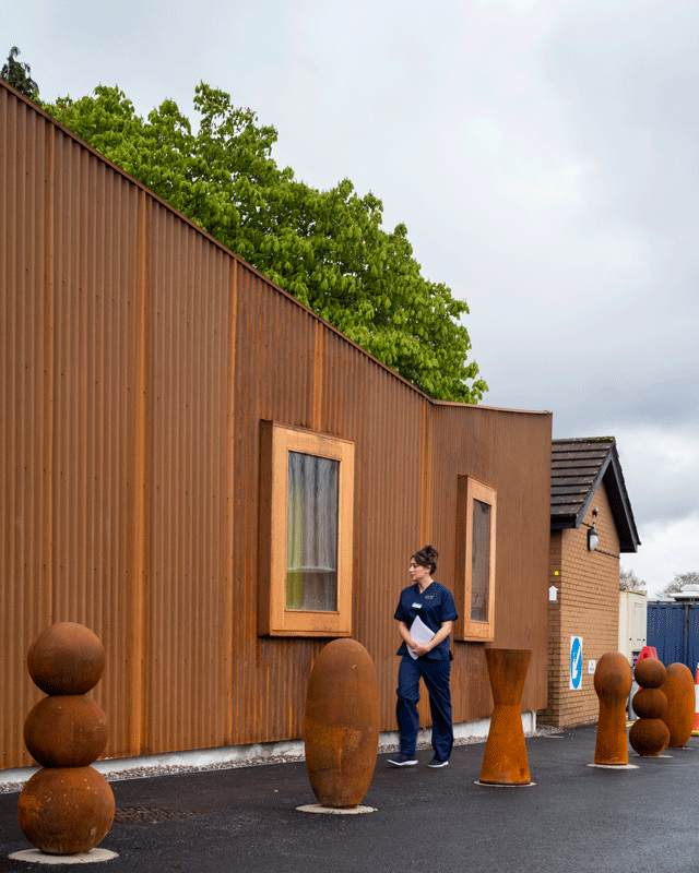
Both the roof and walls are clad in corrugated weathering steel so that the whole building is read as one abstracted form, and the vibrant orange rusting of the steel recalls the bracken which is a strong characteristic of the neighbouring hills in the Autumn.
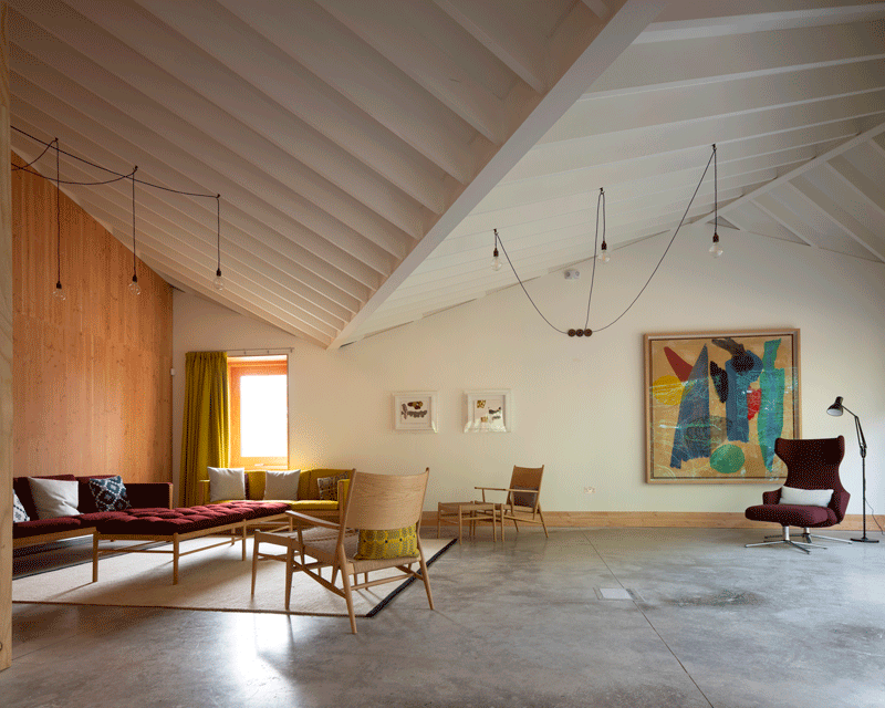
The undulating pitches of the roof are exposed internally and give character to the different spaces as they rise and fall across the plan.
The internal spaces are subdivided by Douglas fir elements which define the main spaces and are used like giant pieces of furniture within the landscape of the building. In between these pieces, the spaces open up and connect to each other. The timber brings a warmth and softness, and contrasts with the sleek polished concrete floor.
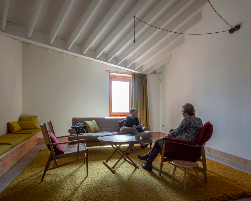
At the heart of the building is the cwtch, a tall and intimate roof-lit space, inspired by the simnau fawr (big chimneys) of vernacular welsh architecture. The Welsh word cwtch has two meanings; it means both a small, comforting space and also a cuddle. In Welsh homes, the cwtch might be the cupboard under the stairs which every house has and where every child will have hidden. Like a Maggie’s centre, it describes a feeling of safety. We thought immediately of this word when we started designing our centre, and so it became our name for the small hideaway room of the Maggie’s brief.
Collaborations with art and artists
From the outset, we have looked for opportunities to collaborate with and to integrate works by artists into the building, in order to make the building a rich and enlivening experience.
The earliest collaboration was with the prominent Welsh artist Osi Rhys Osmond. Osi’s painting Self Portrait was painted for Maggie’s when he was in the last weeks of his life and receiving treatment for cancer and using the Maggie’s centre in Swansea. It is a painting of the memories of the different places where he lived overlain over each other: a psycho-geography of his life.

The tiles for the fireplace have been designed by textile artist Linda Florence, and reflect the form of the building, the bollards and the welsh blankets used for curtains and cushions in the building.
The mugs for the centre were made as a handling collection by ceramicist Lisa Krigel, who works in Cardiff, and are from her collection Kitchen Storeys based on brutalist architecture.
The bollards that protect the building from passing cars are made of rusted cast iron by Anthony Gormley, originally designed for Bellenden Road in Peckham.
Pat O’Leery the ceramicist has made the ceramic sign above the entrance.
The curator Mike Tooby has worked closely with us to introduce art into the building, and has selected and hung a number of pieces generously lent by the National Museum of Wales in the installation. The intention is to rotate a collection of works not currently on display at the museum.
With Osi’s painting as the starting point, Mike has chosen works by artists who share an interest in landscape and who have some personal connection with Osi whether through their lives or their focus. The art on display can therefore be understood as an approach to life, memory and place.
Connection to landscape
From the outside in the car park, the building appears introverted and closed up, turning itself away from the bleakness of the car park towards an interior sense of calm and connection to the landscape which begins with the extended threshold of the entrance courtyard.

Internally, long views open up between the courtyard and the landscaping and garden to the rear, with a sense of openness and connection between them.
We worked with landscape designer Cleve West who under-planted the existing trees to bring a greater sense of depth to the garden. His courtyard at the front, in contrast, is a place of calmness and stillness.
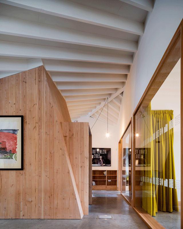
The diagonal journey through the building provides long views and layered spaces that give a much greater sense of space than the tight footprint would suggest.
The roof itself, with its series of pitches running diagonally to the plan, gives a sense of a broader landscape wrapping over the domesticity and immediacy of the rooms to the wider landscape beyond.
Project Details
Start on site: April 2018
Completion: March 2019
Gross internal floor area: 240 m2
Architect: Dow Jones Architects
Structural engineer: Momentum
M&E consultant: Mott Macdonald
Quantity surveyor: RPA Cardiff
Project manager: Chris Watson @ maggie’s
CDM coordinator: Cdm Scotland
Approved building inspector: Buttler and Young
Main contractor: Knox and Wells


