The following description is courtesy of Heatherwick Studio.
Maggie’s centres are places where people with cancer, and their friends and families, can go to find free practical and emotional support. They follow the approach to care set out by Maggie Keswick Jencks – a belief that people should not “lose the joy of living in the fear of dying”. Heatherwick Studio was commissioned to design a new centre at St James’s University Hospital in Leeds. Jimmy’s, as it is known locally, is Europe’s largest teaching hospital and home to the Leeds Cancer Centre, which serves a diverse community across Yorkshire. The hospital staff had been working to improve the experience for patients; bringing a piano into the Bexley Wing, for example, and hanging paintings from the city gallery. The studio wanted to support this by providing further respite from the clinical environment. The brief was to create “a home that people wouldn’t dare build for themselves” to welcome an expected 110 visitors each day.
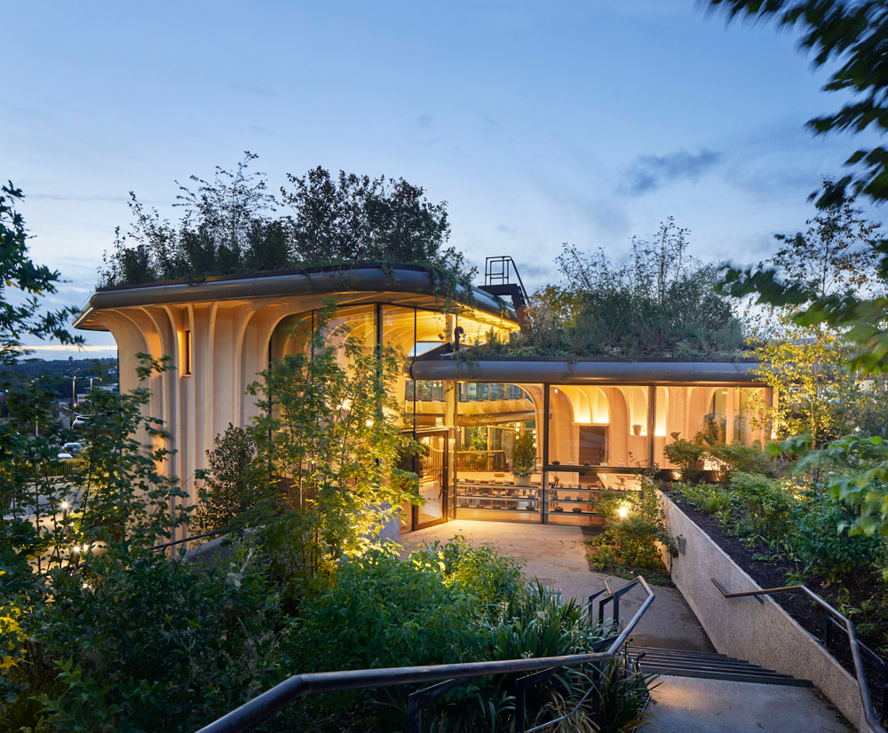
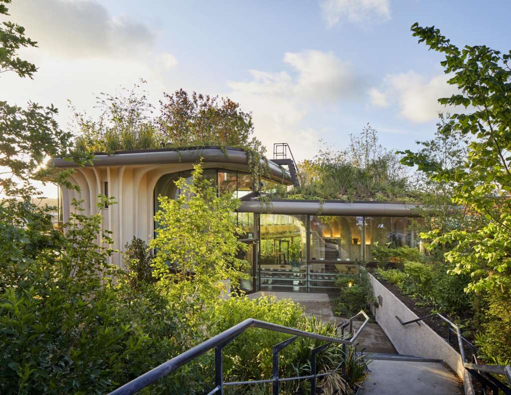
The site chosen for the new centre was the last patch of greenery at the hospital – a grassy hill next to the car park, bounded by roads on two sides and surrounded by large buildings. The six-metre difference in level across the site would typically dictate a building dug into the slope – instead, the studio chose to follow its natural contours, so that at the highest point, visitors would have views of the Yorkshire Dales, and a connection with the world beyond the hospital.
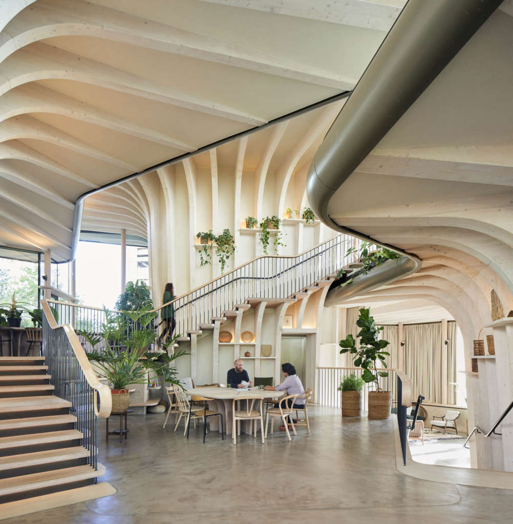
The pillars of support at Maggie’s are the counselling rooms, so these were placed, like three pavilions, organised around a heart and at changing levels of the slope. The space between them accommodates the common areas of the centre, resulting in an inviting open space, simple for visitors to navigate, connecting all the areas to the garden. Externally, this gives the building a different character from every angle. Two entrances were also created: a front door and a rear entrance for staff and regular visitors.
The challenge was to span and enclose the level changes and reinstate the greenery. Instead of a single monolithic canopy, the roof is composed of three overlapping gardens which step down and overhang to shelter communal areas. In this way, the hospital does not lose its last green space – it is lifted up, filled with woodland plants and made more accessible and inviting.
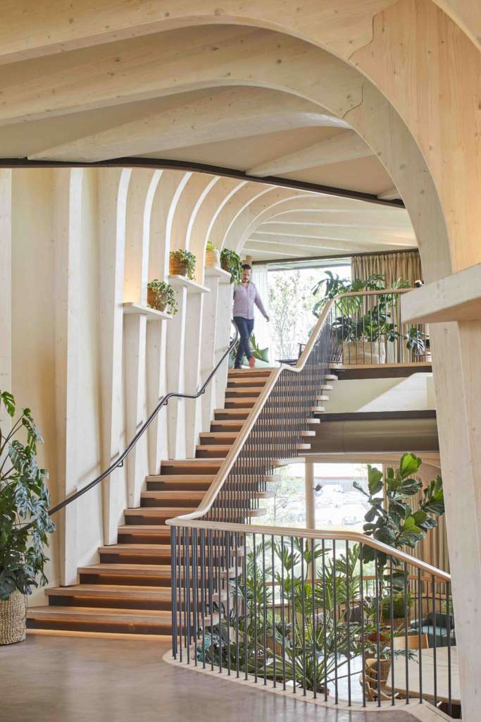
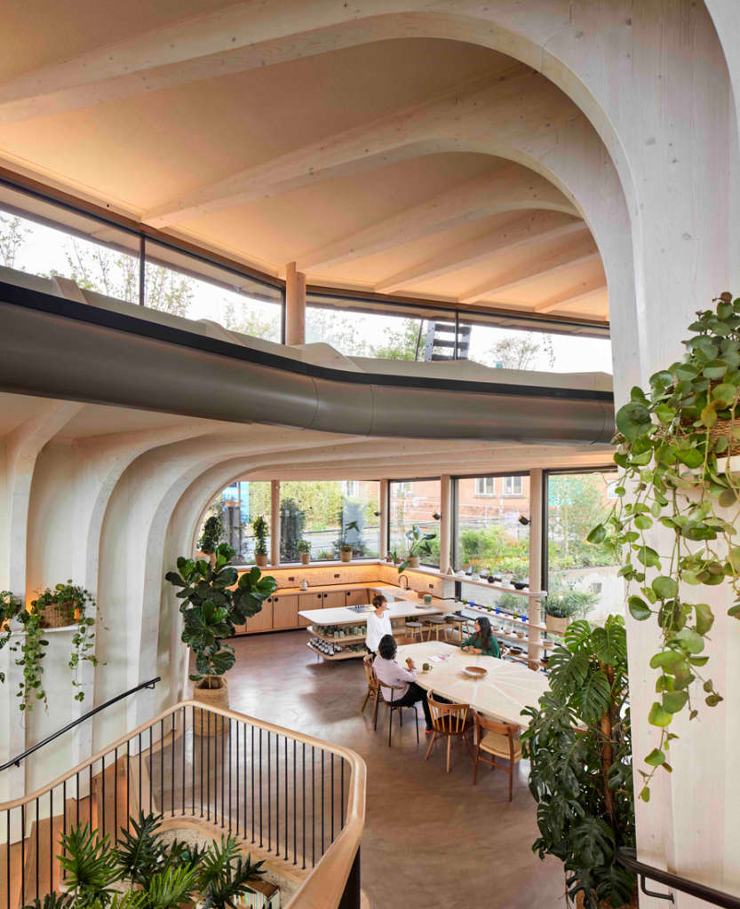
The relationship between the centre’s architecture and the experience for visitors extends beyond the uplifting effect of its garden. The front door, for example, is a psychological threshold – the point at which someone might start to accept a cancer diagnosis. Not everyone will be ready to open the door straight away, so there is a bench to sit outside, or a private path to wander quietly through the gardens. The entrance wall is transparent and the door is moved to the side under a lower roof, where it is less intimidating. Inside, visitors are not confronted by a conventional reception space; instead, they find a welcoming window seat, a noticeboard, and a view through to the heart of the centre, with its communal table in the arc of a staircase leading to the kitchen. The kitchen table, a feature of all Maggie’s centres, represents another threshold; the point where visitors feel ready to share their experiences. Everything is on display, so there is no awkward rummaging through cupboards to find a mug, and a clerestory fills the space with natural light. Above this, there is a private space for staff to rest and gather strength, and a sheltered roof garden accessible to all.
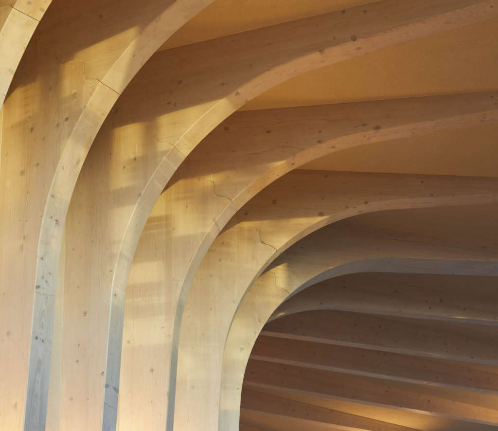
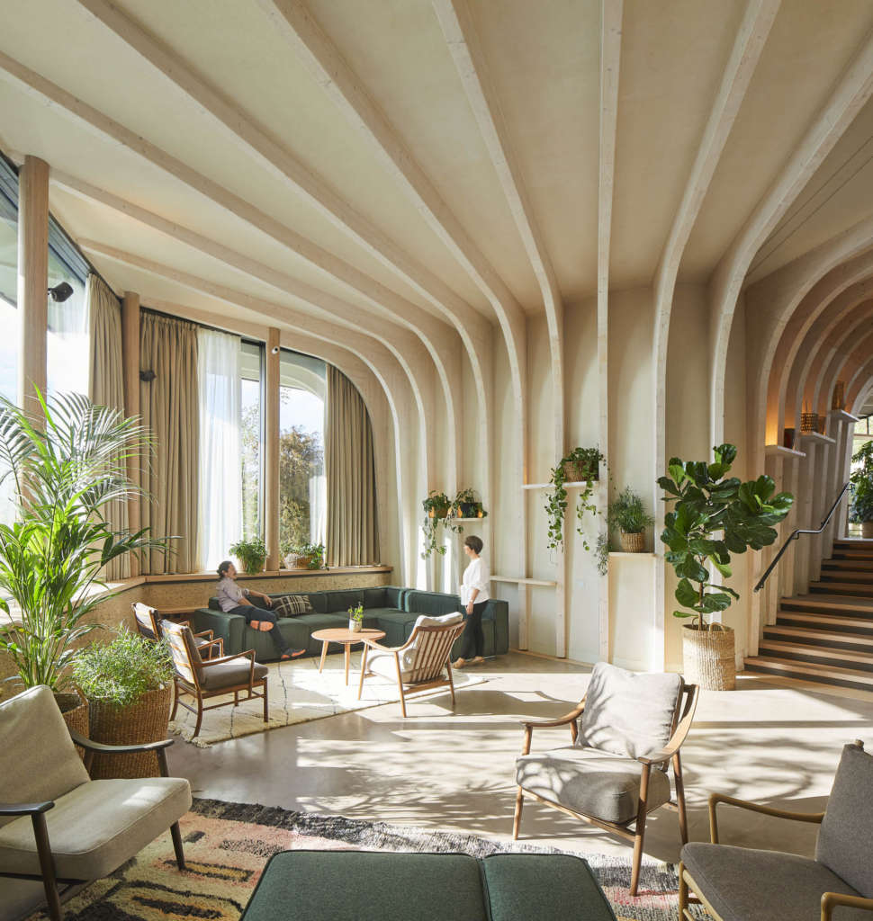
The road running along the site presented a challenge for the building’s construction – as the main ambulance route, it could not be disrupted by months of heavy vehicles. The team designed a structure that could be built off-site and assembled quickly on a concrete slab and retaining wall with minimal disruption. The entire building superstructure was manufactured in Switzerland and fixed together on site in just eight weeks. These are supported by glulam fins, whose modulations give the feeling of trunks rising up from the ground to support the gardens overhead. The structure is mostly made of sustainably forested spruce, a material that will expand and contract with the seasons, as if alive.
The studio looked at the qualities that make a building a home; the use of warm, natural materials, the way that objects are used to express individuality, the combination of private spaces and places where people can come together, and gentle lighting. Between the timber fins are shelves, lined, as you might at home, with nick-knacks, pot plants and the interesting things that people bring to the centre. When it came to lighting, the studio had the idea that the wooden cores could glow, as if they were emitting light. This is achieved by integrating the lighting with the shelves and interior edges of the roofs. The designers had to work backwards, specifying how the lights, and services would be integrated at an early stage in the process, as the building was still taking shape.
The studio worked with landscape designers, Balston Agius to develop the gardens. Given the shade cast on the site from adjacent buildings, the high winds and local weather, the planting is based on the British woodland, with hardy native species of plants that support the area’s existing biodiversity. The garden will be deliberately lush – Maggie herself was a gardener, and understood how calming and restorative it could be to pick up one of the tools left for visitors and get to work.
