Chengdu, China
The following description and images are courtesy of Kris Provoost.
Background
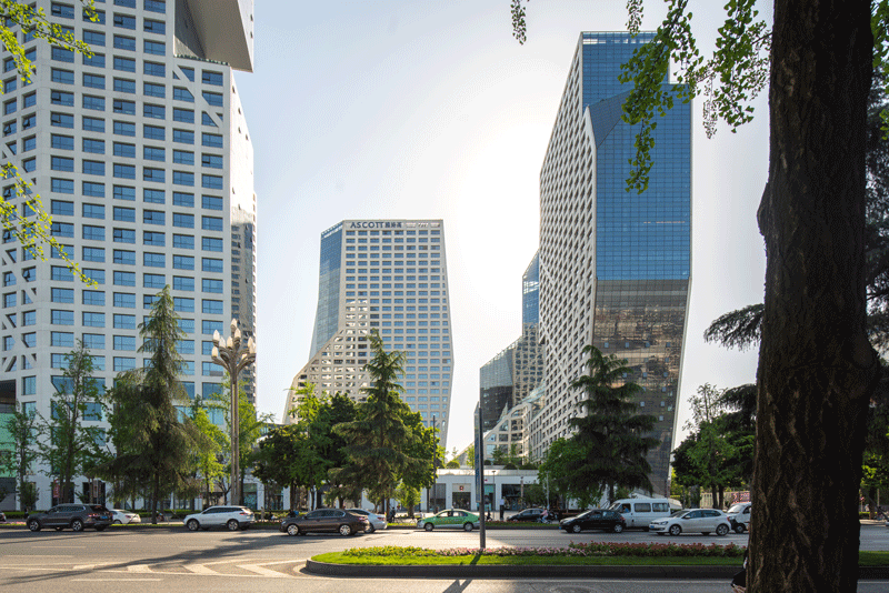
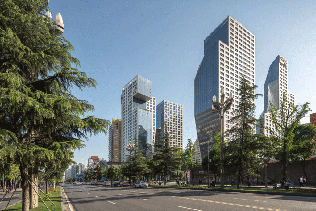
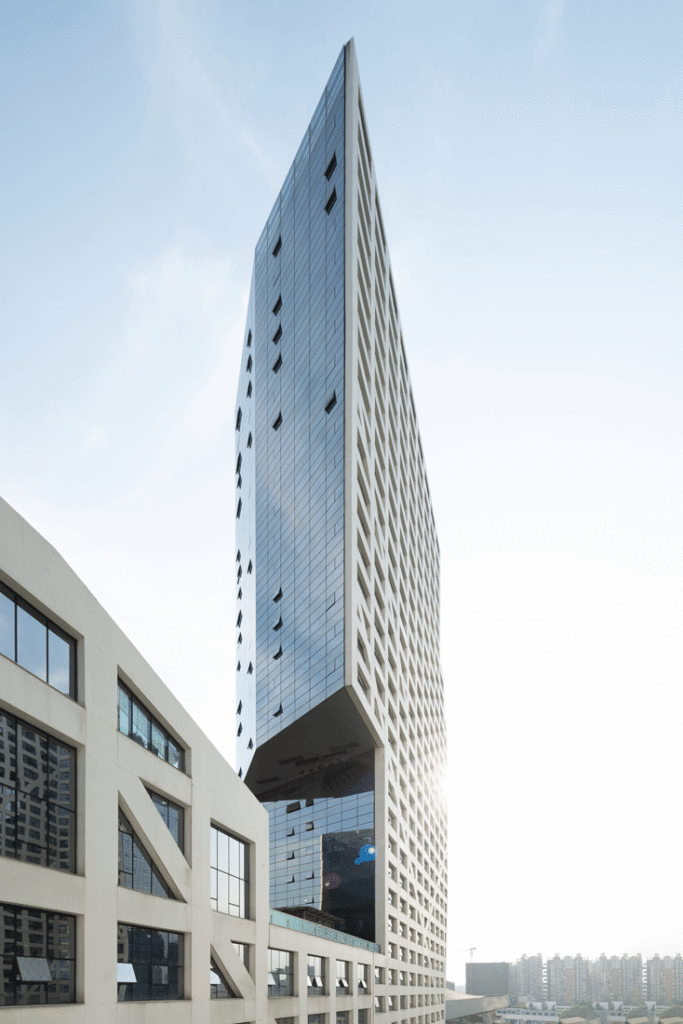
Designed by Steven Holl Architects in 2007, the Sliced Porosity Block completed construction 5 years later. Announced in the lead up towards the 2008 Beijing Olympics, a time when all architectural eyeballs were turned towards China. The sliced porosity block was part of a trio of mega developments conceived by Steven Holl Architects in 3 large Chinese cities: The Linked Hybrid in Beijing, The Horizontal Skyscraper in Shenzhen and this one, the Sliced Porosity Block in Chengdu. Each tries to break the standard typologies, each brings the public interaction to new heights. I visited the project in April 2019, 6 years after its completion to see and document how it has been used and if the public interacts with it.
Location
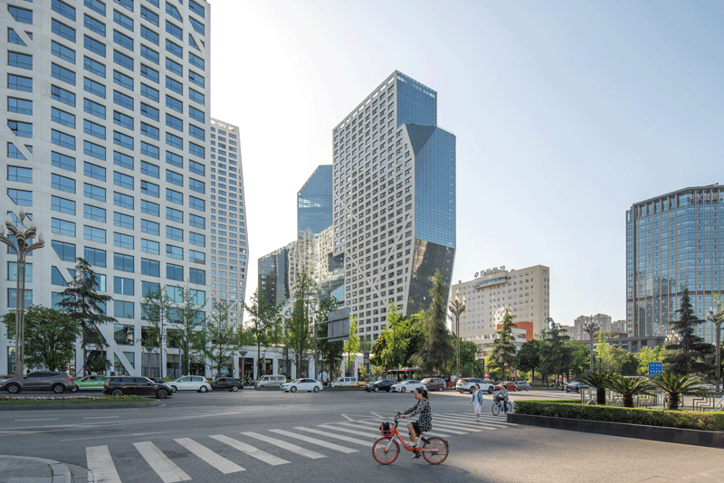
The project is located in the center of Chengdu, along Tianfu avenue (the large north-south axis that links the old center with a new area in the south). Chengdu’s city structure is quite comparable to Beijing’s. As in, the city is flat and has a few concentric ringways that structure the city. The sliced porosity block is at a node connecting both Tianfu avenue with a concentric ring. Additionally, it is well connected by subway. The project draws large crowds and is enjoyable busy during the daytime and at night.
City Fabric
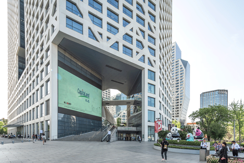
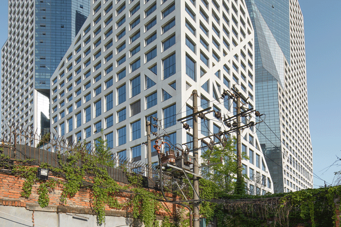
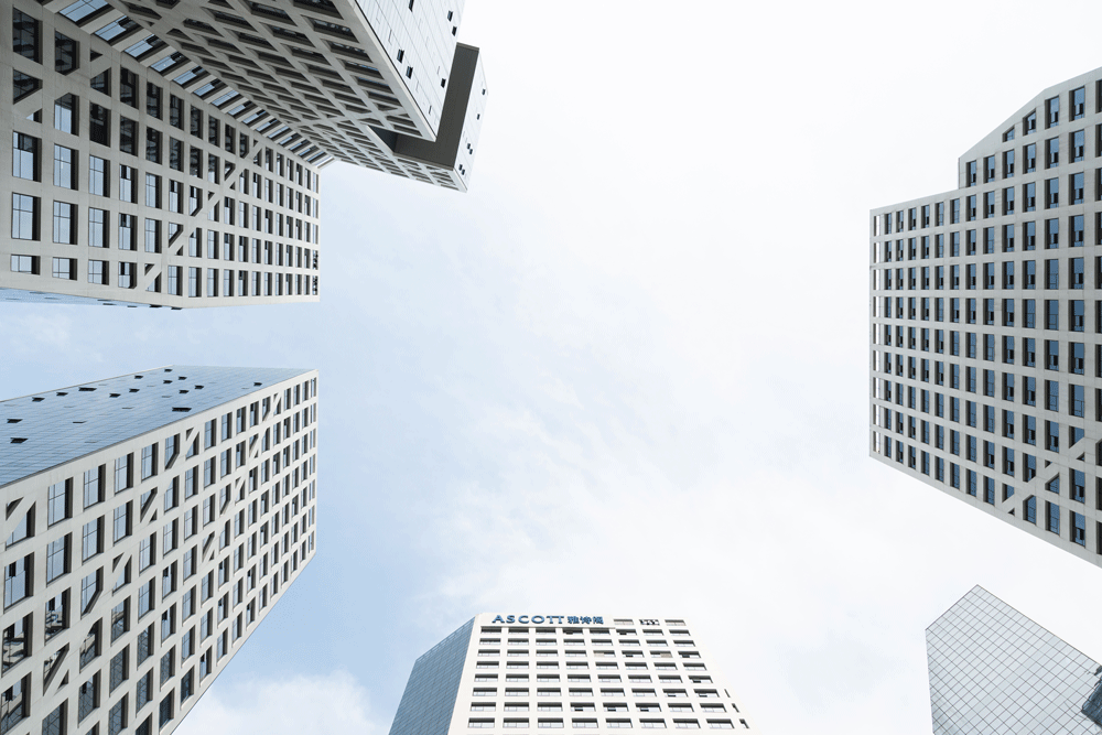
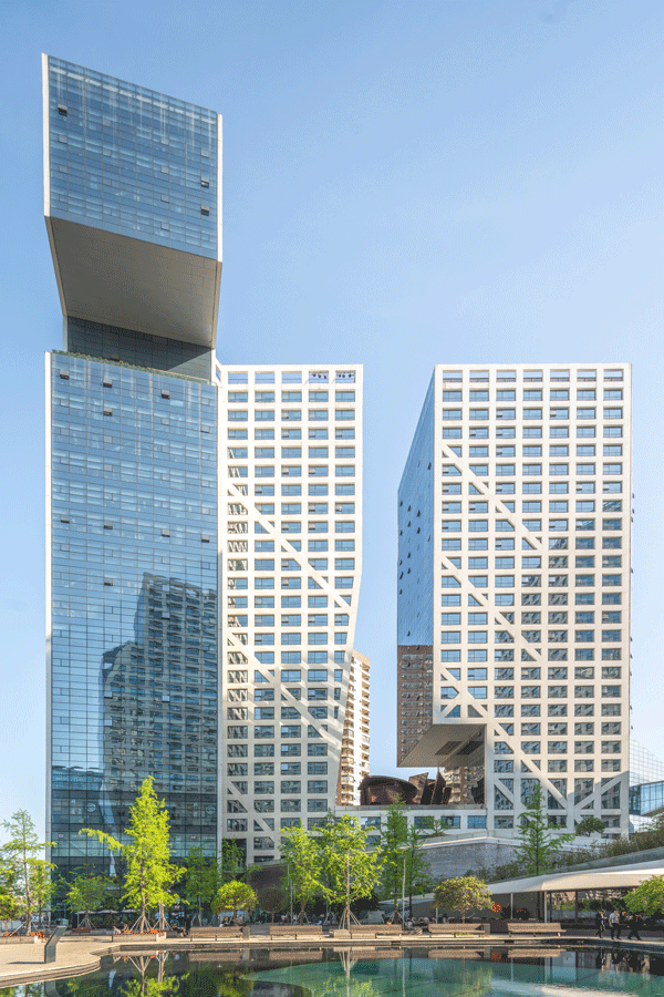
As with many Chinese developments, there is a large amount of area. In this particular case, 5 towers housing offices, hotel, housing, and a large retail mall were brought into a rather atypical composition.
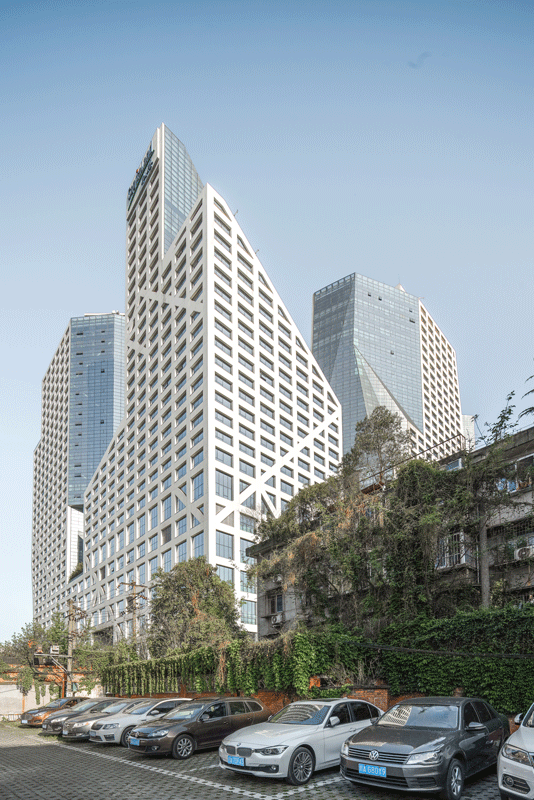
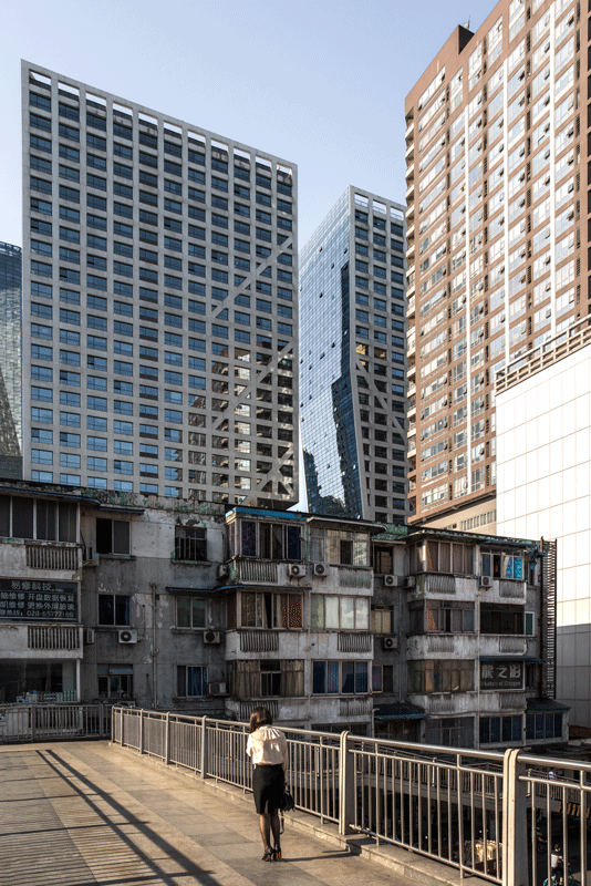
Instead of placing the towers in a regular grid adjacent to a gigantic mall, the towers were instead placed along the perimeter to keep open the center for public usage. The towers are sliced and cut to open to the surrounding. Instead of a rather enclosed inner space, the elevated platform acutally feels part of the city. That space feels open and bright, yet intimate and safe because it is lifted off the ground by housing and the mall underneath. It was very pleasant to spend an afternoon at this project and observe how people use it.
Elevated Public Space
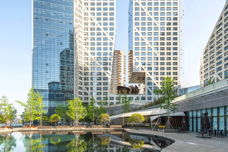
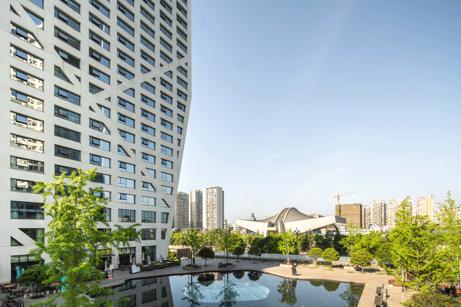
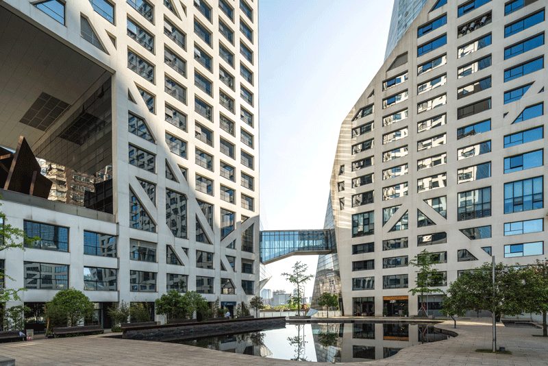
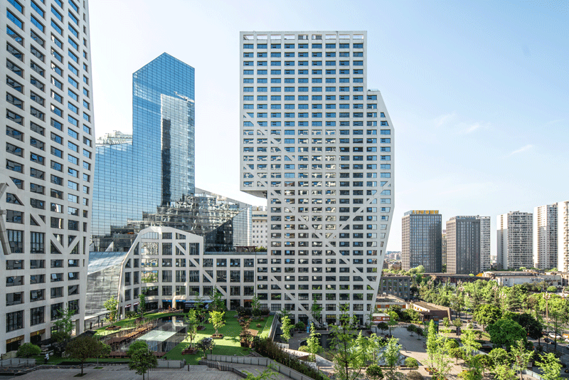
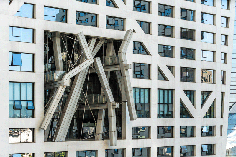
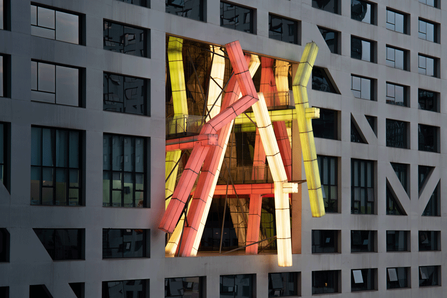
The public space is lifted off the ground because the mall is underneath. But the barrier of the ground floor and elevated public space is smoothly solved by a several large staircase and escalators. The journey is accompanied by a wide range of restaurants. The public space spans over different levels each seemingly with their own use. The higher you go, the more intimate it gets. With an interesting place between trees/plants, cascading water and integrated artwork (the light pavillion by Lebbeus Woods and Christoph Kampusch), the visitors smoothly move through the space.
Conclusion
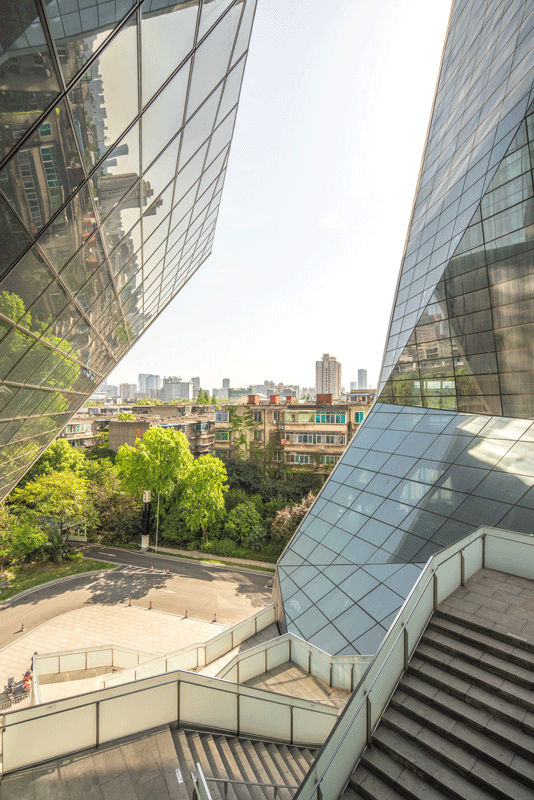
It was interesting to spend an afternoon at the project and observe the spaces and geometries. I was fortunate to have a bright blue sky, with this I could see how the public space opens up and uses light and shadow to define the space. It’s a standout project in the city (of course due to its geometry and shapes) but also because of its focus on the Chengdu citizens. It is a gathering point from morning to evening.
Photos Taken: April 8th, 2019
About the Photographer
Kris Provoost
www.krisprovoost.com
Kris Provoost is a Belgian born architect and photographer. He is active in Asia designing and capturing buildings and cities, to better understand the built environment. After graduating in 2010 with a Master in Architecture, he relocated to Beijing where he started his architecture career contributing to building spread around Asia. He worked for highly respected design firms including Zaha Hadid Architects and Buro Ole Scheeren. In 2013 he moved further south and set up base in Shanghai. Merging designer eye with photography blends well together, and influence each other complimentarily.
Kris created ‘Beautified China’ an architectural photography project highlighting the architectural boom of China during the last decade. The project has been widely published on CNN, ArchDaily, Fastcompany, amongst others.

