V&A EXHIBITION ROAD QUARTER | AL_A
AL_A was commissioned to design the Exhibition Road Quarter in 2011 following an international competition. The practice proposed a scheme that met the V&A’s brief for a new courtyard and gallery and, uniquely amongst the entries, placed the entrance and the stairs down to the gallery within the Museum’s existing Western Range building.
This approach inextricably links the new spaces to the historic V&A and maximizes the usable area of both the gallery and the courtyard, requiring excavation beneath and the underpinning of an entire wing of the V&A’s Grade I listed buildings.
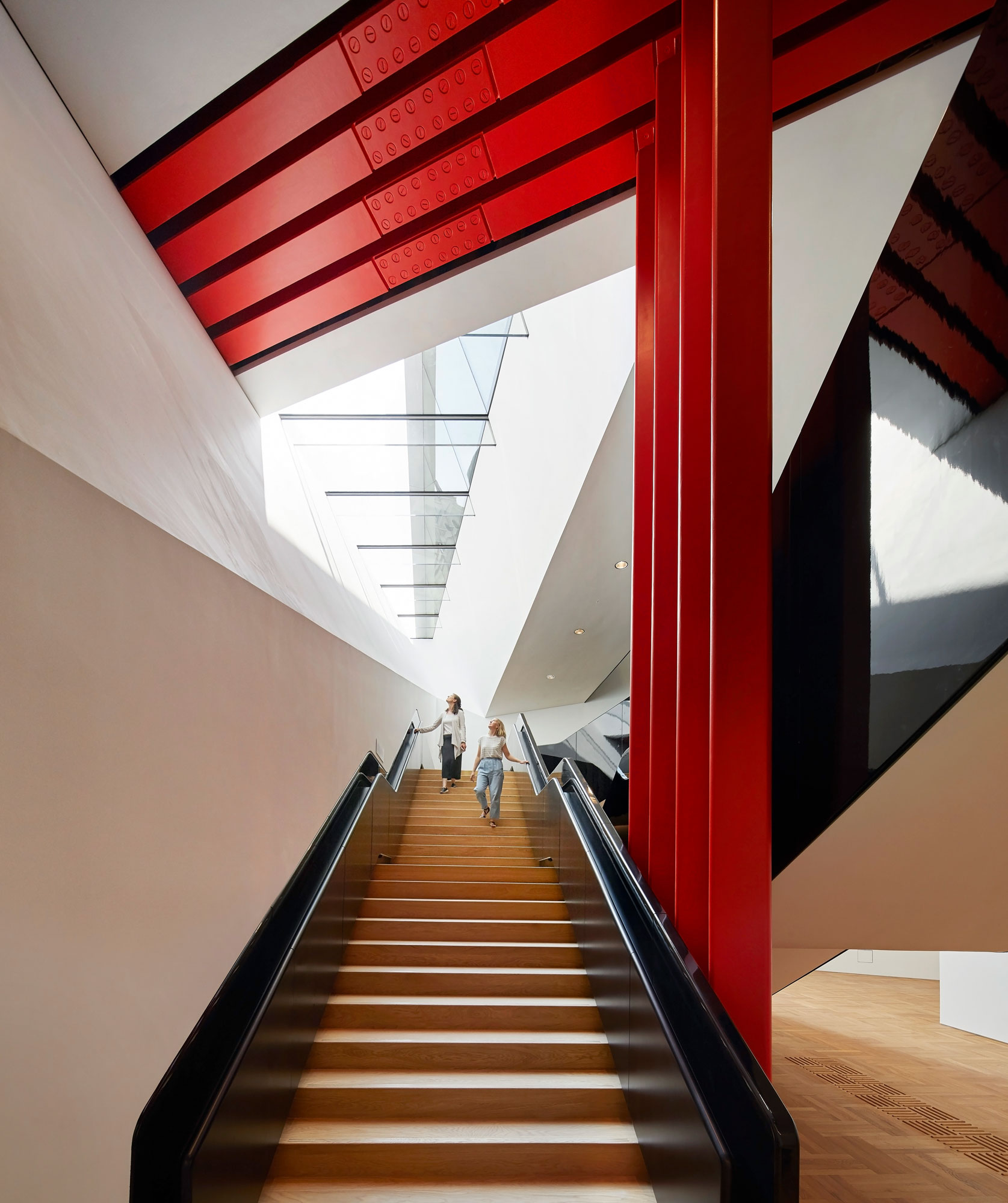
AL_A’s proposal won the judge’s approval and led to a daring engineering and construction challenge that is made visible to the public with the steel columns and beam painted in vivid international orange which are literally holding the weight of history and the Museum’s priceless collections above.
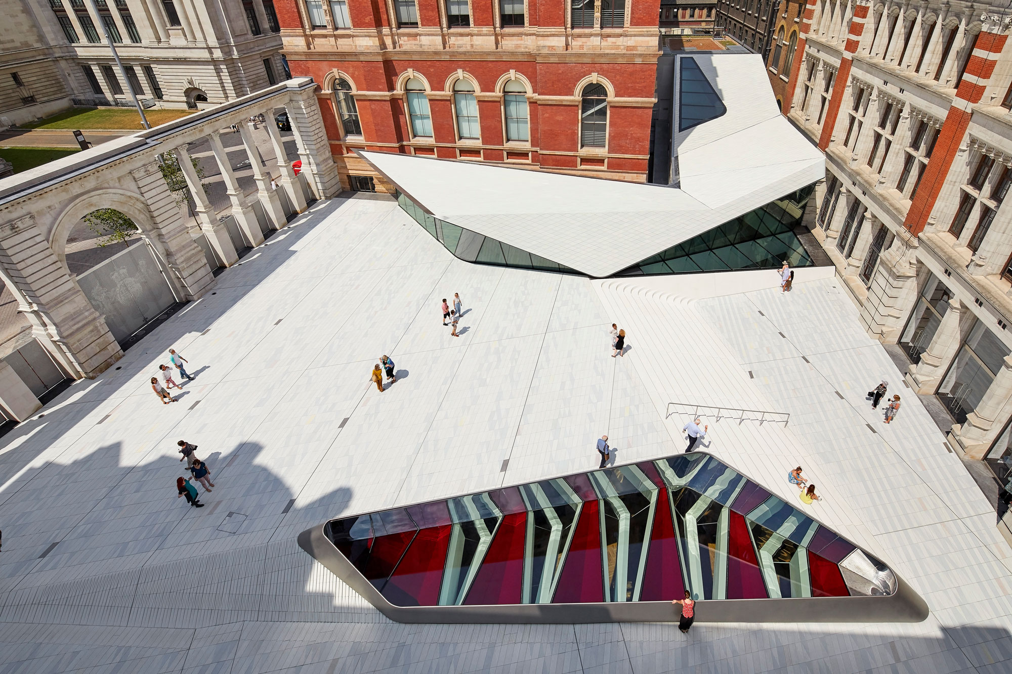
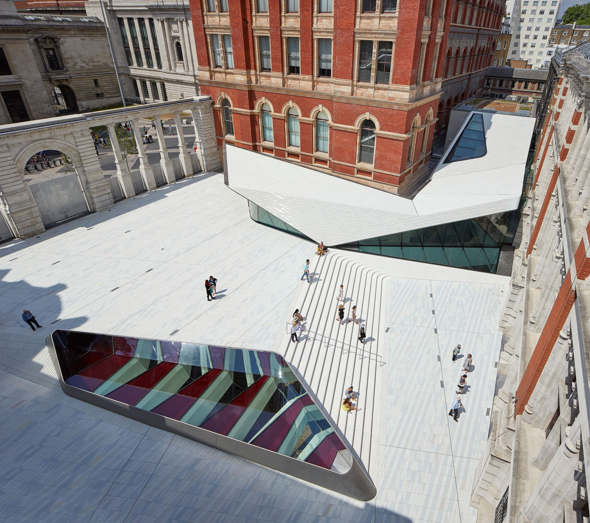
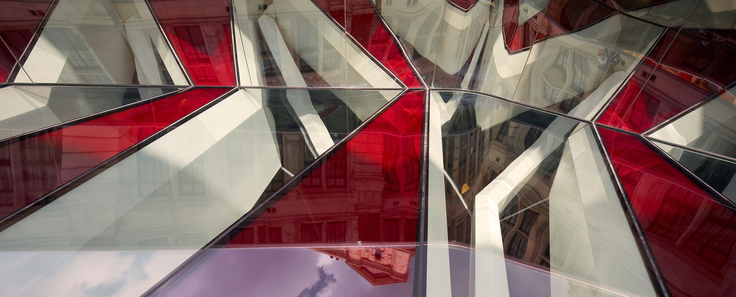
There is a paradox in-built to this project, that the big event, a vast new gallery space, is hidden below ground. So to resolve this paradox, AL_A came up with the concept of making visible the invisible. The pattern of the courtyard above the gallery is derived from the geometry of the gallery ceiling below, and the ceiling, in turn, is a response to the structural challenge of spanning 38m uninterrupted. An oculus brings moments of dramatic daylight into the gallery and, conceiving it as a museum vitrine, it allows views through the structure to the void below to reveal the gallery ceiling. The didactic mission of the V&A in its celebration of the marriage of arts and crafts with design and industry is made visible in the creation of the world’s first porcelain courtyard.
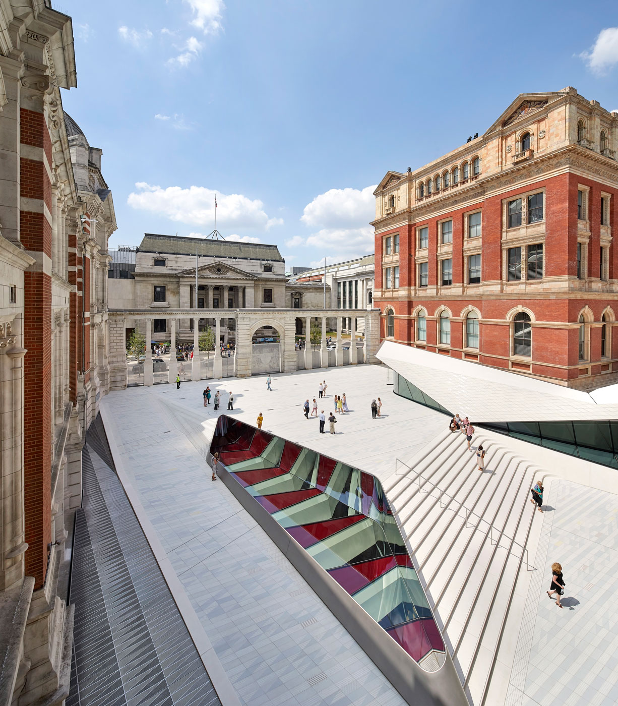
Each of the 11,000 porcelain tiles that make up the Sackler Courtyard was made by hand and bears the mark of the craftsman through subtle variations of shape that gives each its own unique character. There are 15 tile types which combine to produce a colour field to express a pattern that reveals the hidden 256-tonne structure of the fourteen steel trusses that form the gallery ceiling and support the courtyard. The glaze was inspired by the Qingbai ware ceramics held in the V&A collection, with grooves below the surface of the tile holding the translucent glaze.
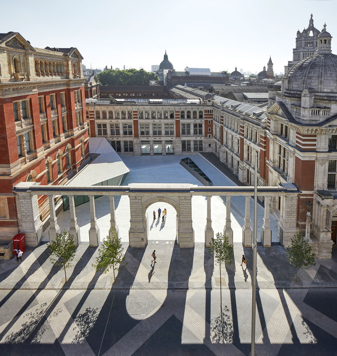
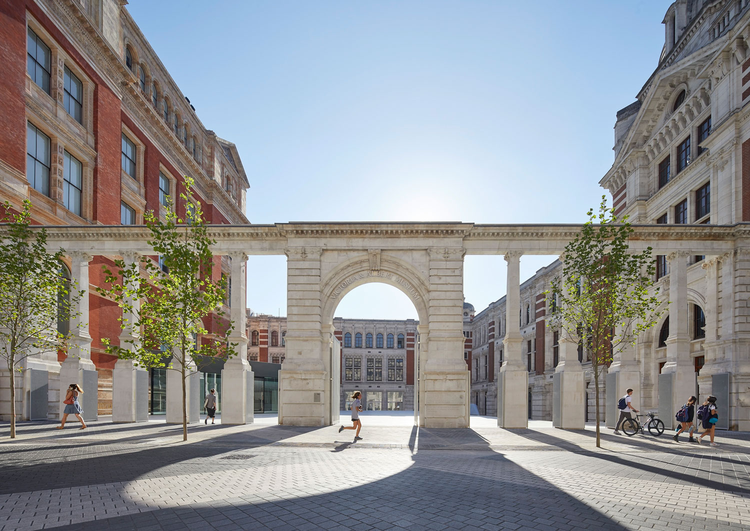
Resurrecting Aston Webb’s original intentions for a permeable colonnade, alterations were made to the Grade I listed Aston Webb Screen as it no longer serves to hide but to reveal, making it easy for people to drift in off Exhibition Road and into the Sackler Courtyard.
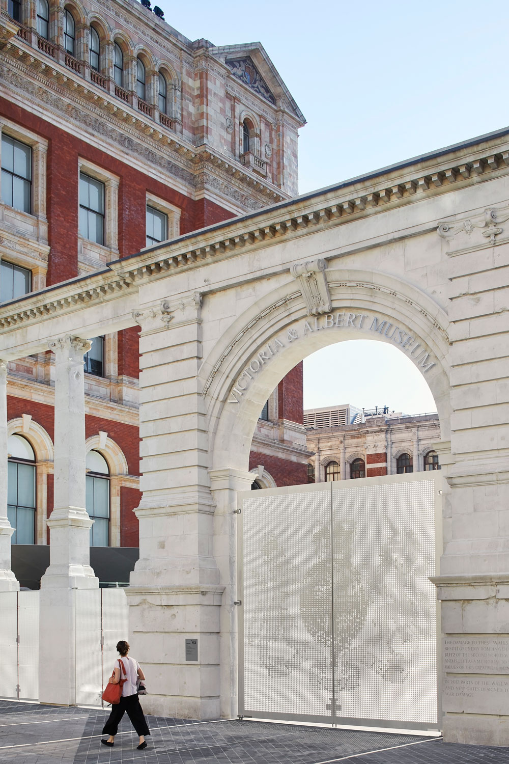
Despite opening up the Screen, the entrance to the Museum has to be closed at night. AL_A found significance in the living history of the Museum fabric and the Screen’s stonework that retains the physical scars that World War II inflicted on the Museum. New perforated gates have been manufactured that reference the absence of the stonework we have removed from the Screen, becoming a beautiful way of mapping the imprint of shrapnel damage. The gates resolve the paradox of resilience and permeability, memorializing the past as well as celebrating the future.
The Sackler Courtyard reveals, on all four sides, architecturally significant façades that had previously been hidden, including the sgraffito façade on the Henry Cole Wing, which has never been on public view. The café roof is covered in a further 4,300 handmade porcelain tiles and will be furnished with the 8mm Chair designed especially for the V&A by AL_A. The gates to the courtyard and the café will be open from 8.30am to encourage people to stop for coffee on their way to work or study or as they wait to enter the Museum.
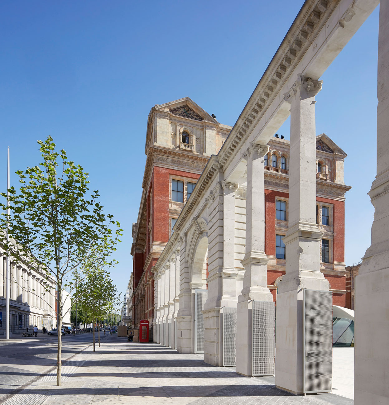
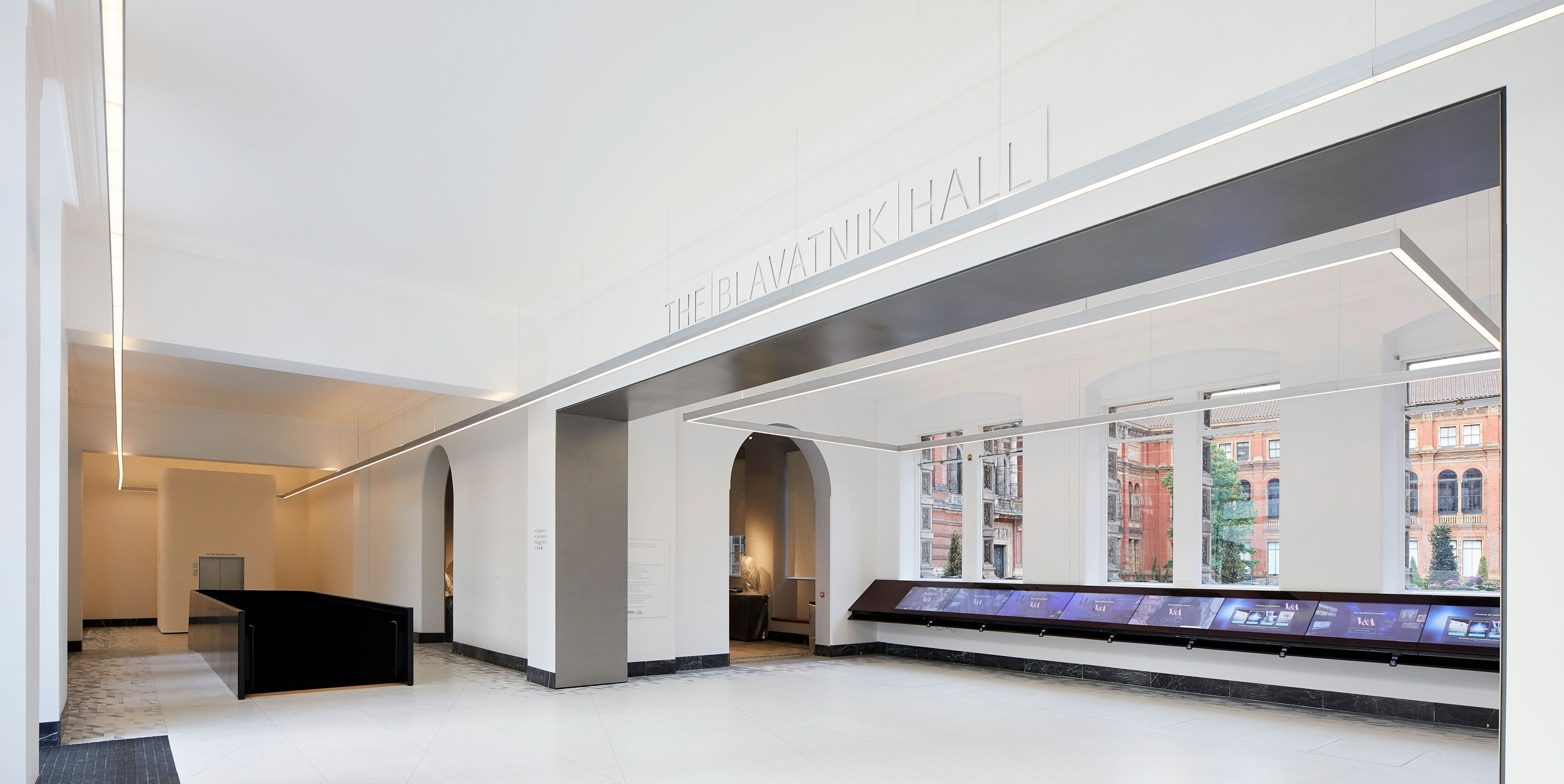
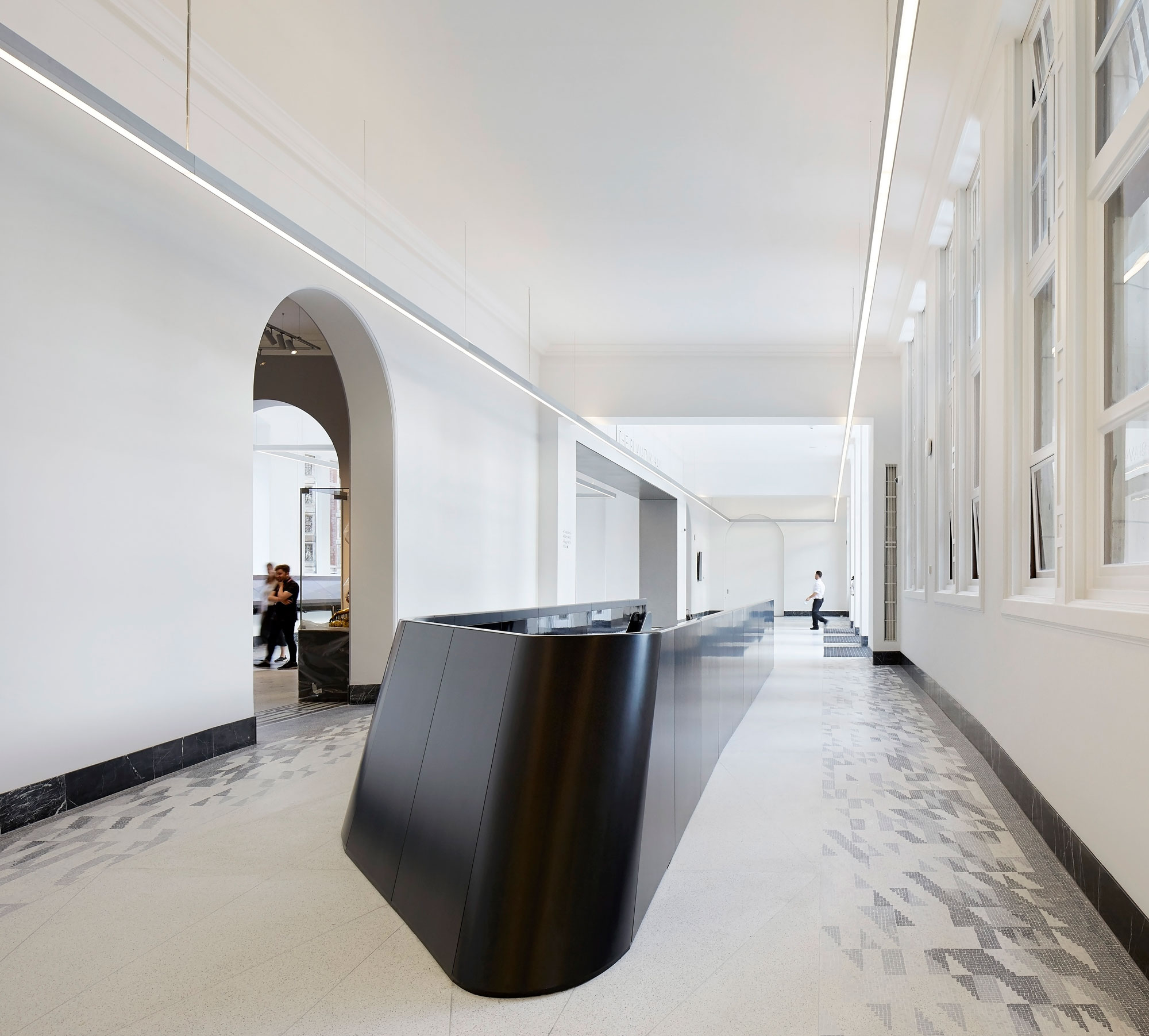
Three bays of the Western Range have been cut to create a new entrance to the Blavatnik Hall and the Museum, exposing the elegant profile of the stonework and becoming an eloquent example of the power of revealing more by subtraction than by addition. The Hall is new entrance space in the existing building and a seamless connection to the V&A, linking to the Ho and Hintze Galleries and with views through to the heart of the V&A, the Madejski Gardens. The new entrance sequence gives visitors an intuitive understanding of the Museum, bringing them to more places and to discover more of the collections.

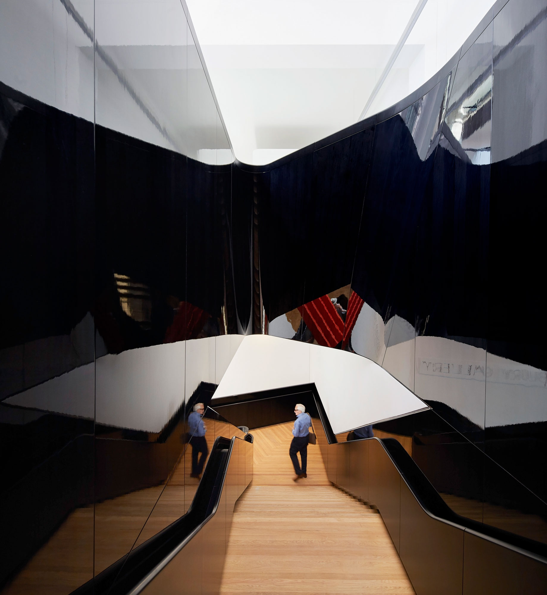
The descent to the gallery is celebrated as an important part of the visitor’s journey, woven into the historic fabric of the Museum. Visitors are drawn down by natural light, lessening until reaching the bottom where an uplifting pool of daylight appears, seemingly magically so far below ground. Descent and ascent have been kept separate, designed with a specific focus on the theatre of the journey and the interplay between new and old – and to ensure that visitors only exit, not enter, through the shop. Framed views of the Henry Cole Wing and the Aston Webb Building give visitors an understanding of where they have come from and where they are in relation to the rest of the Museum.
The Sainsbury Gallery is a 1,100m2 column-free, hyper-flexible exhibition space that sits above two further floors of dedicated art handling, conservation and preparation space. This will become the engine room of the V&A’s internationally-acclaimed programme of temporary exhibitions, allowing curators to realize their creative ambitions and giving the V&A unparalleled facilities to help it secure the loan of the most delicate and valuable artifacts.
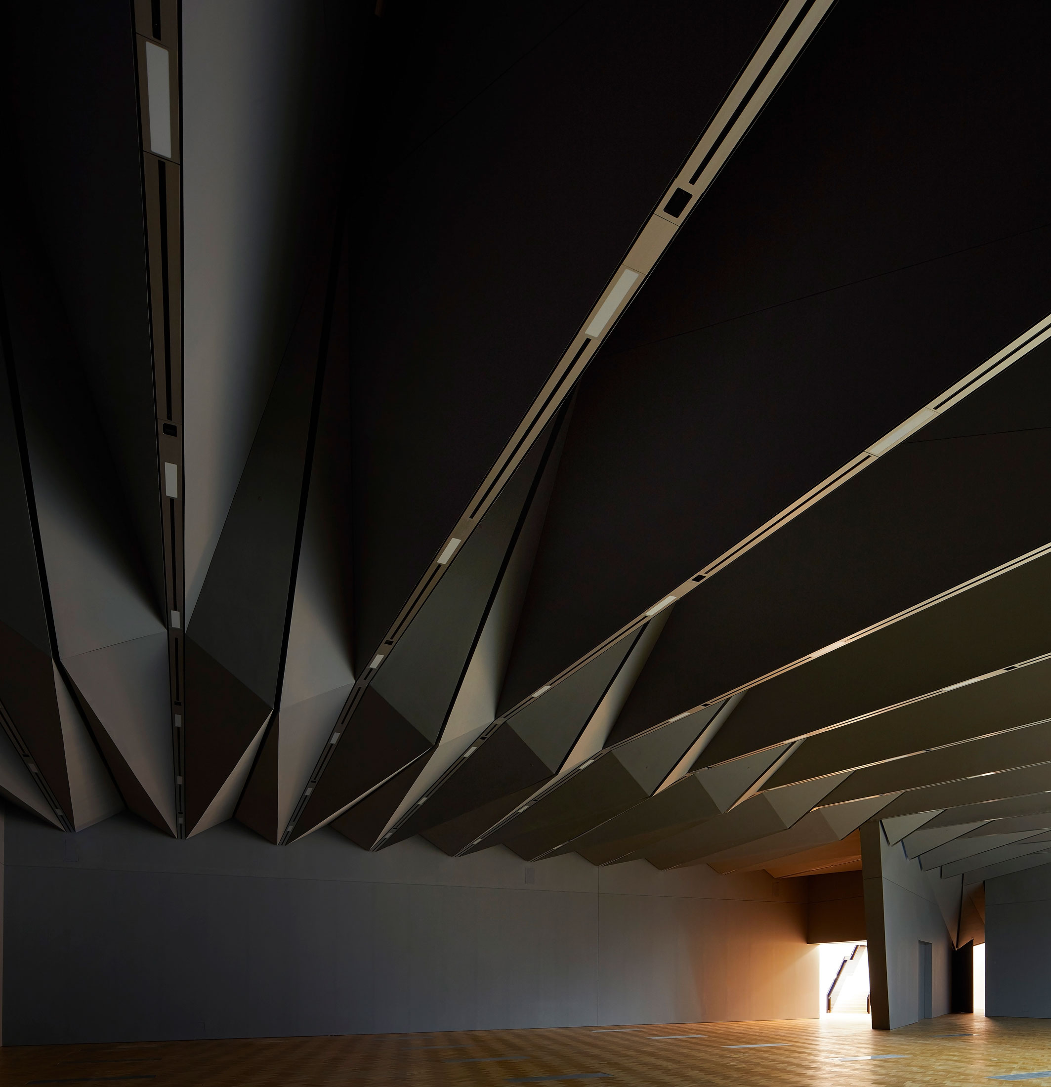
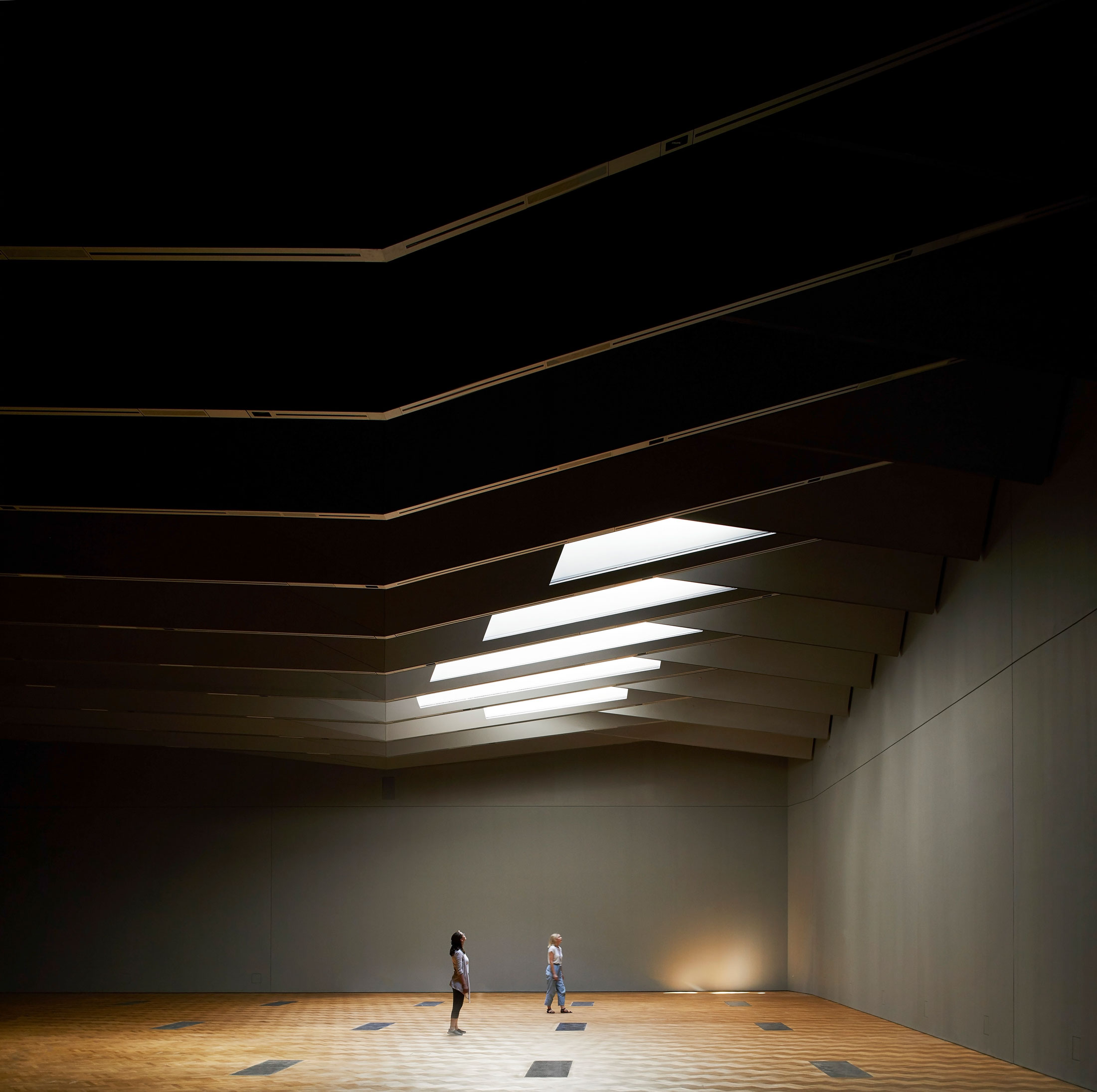
The character of the Sainsbury Gallery is born from the history and spirit of the Museum. The expression of the ceiling is derived entirely from is a structural function of spanning 38m uninterrupted and soars up to 10.5m over the visitor despite being beneath the courtyard. This expression follows in the neo-Gothic and neo-Classic museological tradition of ornate ceilings at the V&A.
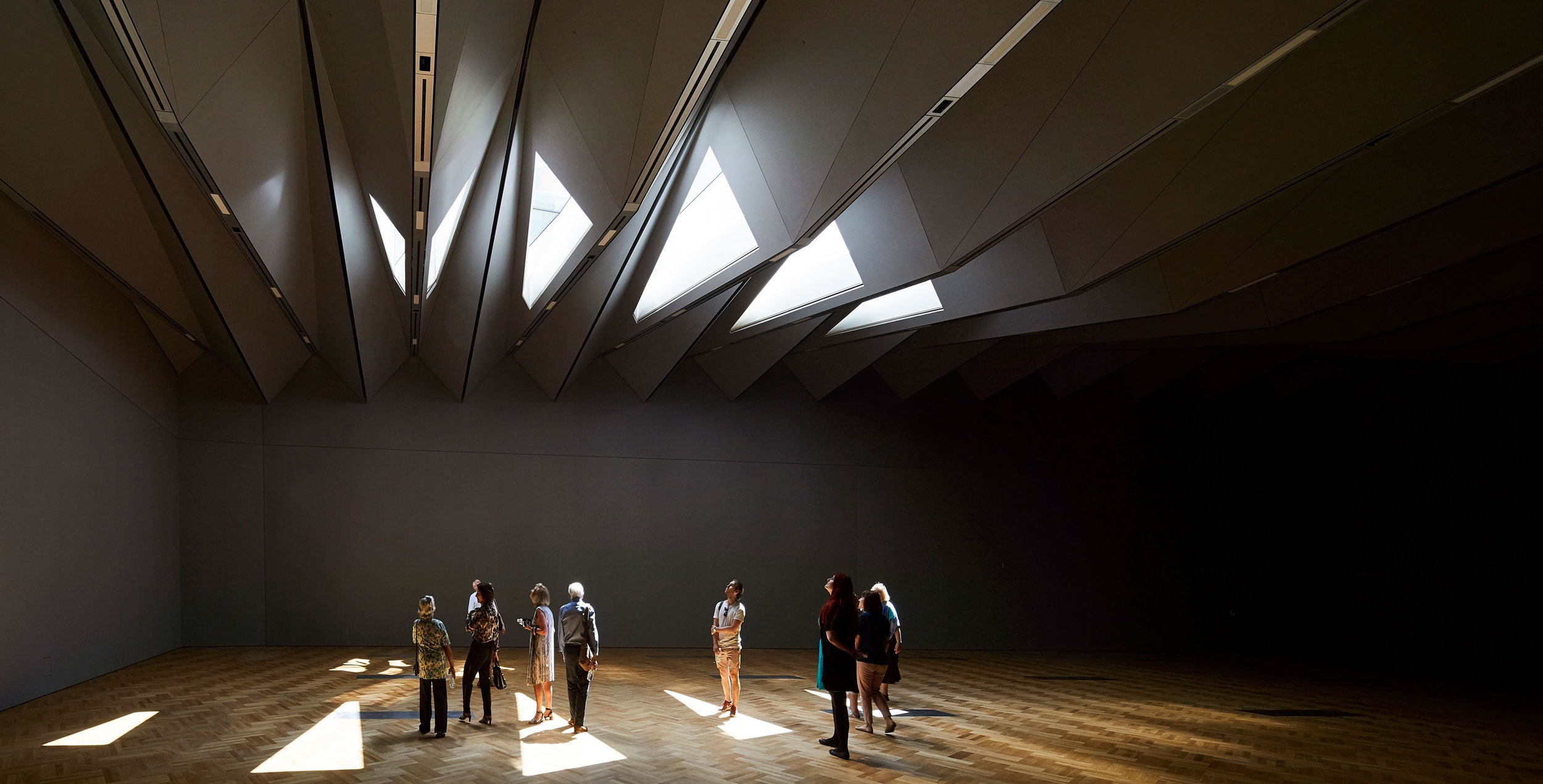
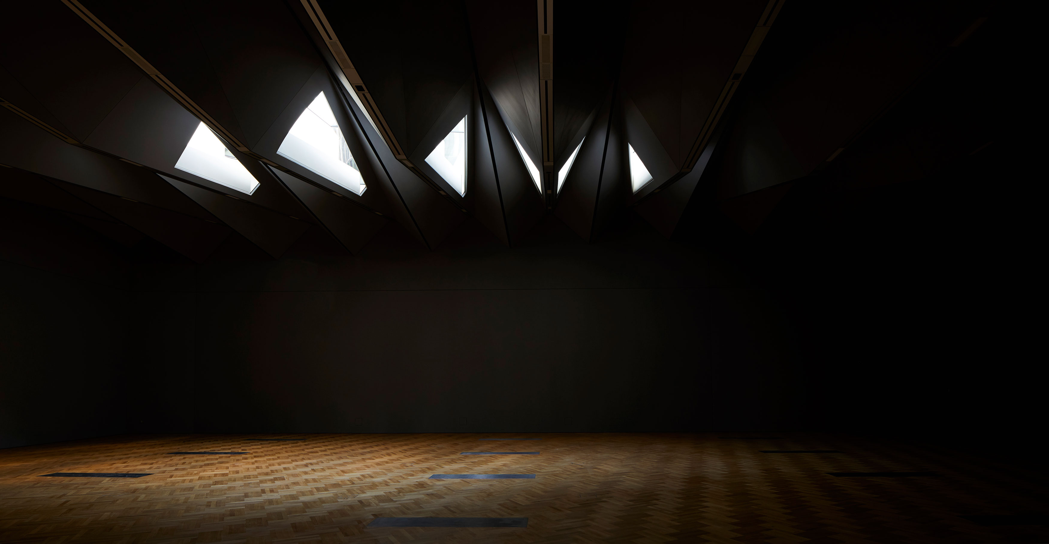
The Exhibition Road Quarter scheme is an engineering feat with extraordinarily challenging structural works, all carried out while the Museum remained fully accessible to the public. The project and its subterranean gallery 18m below the courtyard necessitated piling almost 50m down within 1m of a Grade I Listed building and underpinning a wing of the V&A and its collection while the Museum was fully operational.
Project Team
Client: Victoria & Albert Museum
Architect: AL_A
Engineers (SMEP): Arup
Quantity surveyor: Aecom
Lighting designer: DHA Designs
Historic building adviser: Giles Quarme & Associates
Planning consultant: DP9
Project manager: Lendlease
Main contractor: Wates
Specialist AWS contractor: PAYE
Specialist subcontractors:
Koninklijke Tichelaar Makkum – porcelain tiles
Octatube – oculus
Midland Alloy – Aston Webb Screen gates
Astins – gallery ceiling
EE Stairs – gallery staircase
Cornish Concrete – stepped terrace
Mazorati Ronchetti – café bar
AL_A team
Principal: Amanda Levete
Project Director: Alice Dietsch
Project Architect: Matt Wilkinson
Team: Ho-Yin Ng, Maximiliano Arrocet, Alex Bulygin, Blandine Plenard, Chiara Zaccagnini, Fernando Ruiz Barberan, Filippo Previtali, Giulio Pellizzon, Matthew Riley, Michael Levy, Michael Wetmore, Patrick Drewello, Peter Angrave, Peter King, Raffael Petrovic, Robert Rice, Rumen Stefanov, Song Jie Lim, Stefano Bertotti, Stephen Citrone, Win Assakul


