The following description is courtesy of MVRDV.
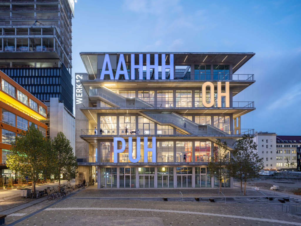
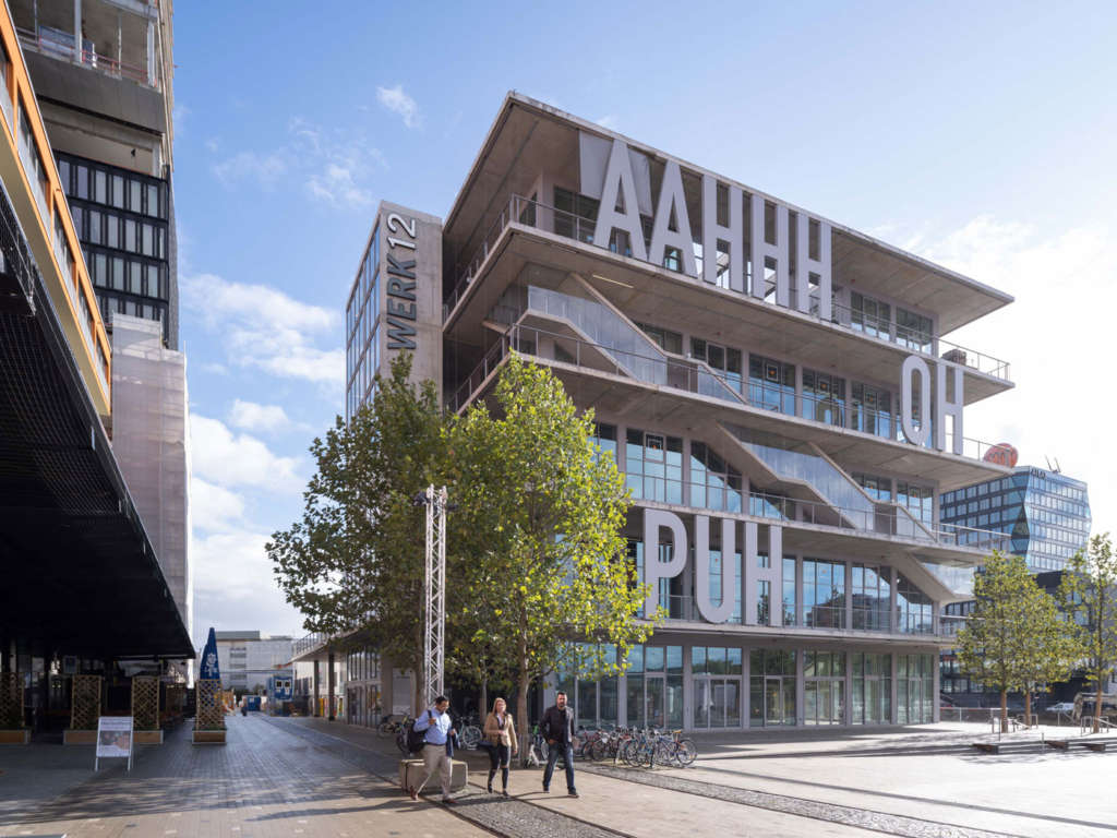
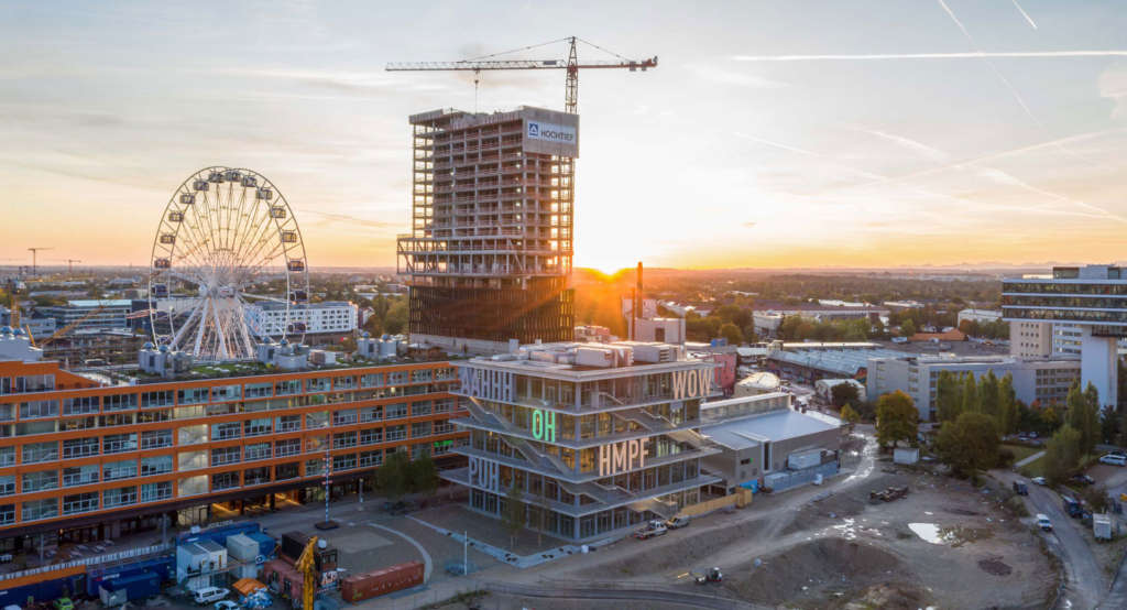
18 October 2019 – MVRDV celebrated the completion and opening of WERK12 in a ceremony held yesterday evening. Forming the nucleus of the Werksviertel-Mitte district, an urban regeneration plan on a former industrial site, the 7,700m2 mixed-used development located close to Munich’s East Station stands out with its bold and expressive art façade featuring five-metre-tall verbal expressions found in German comics.
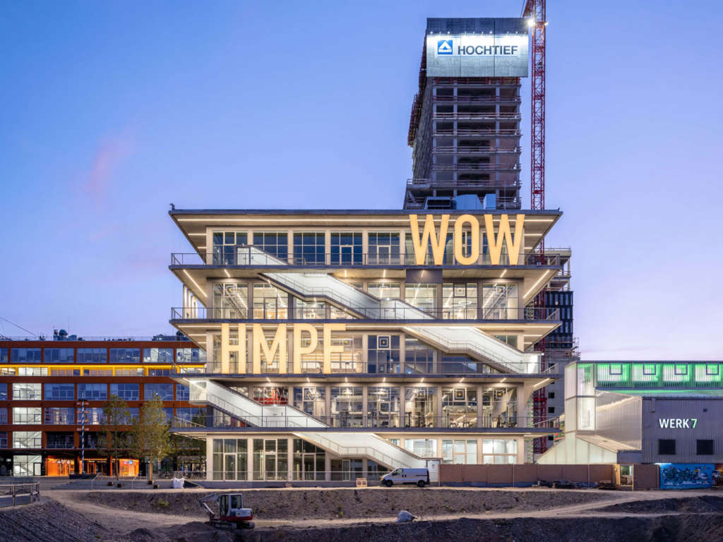
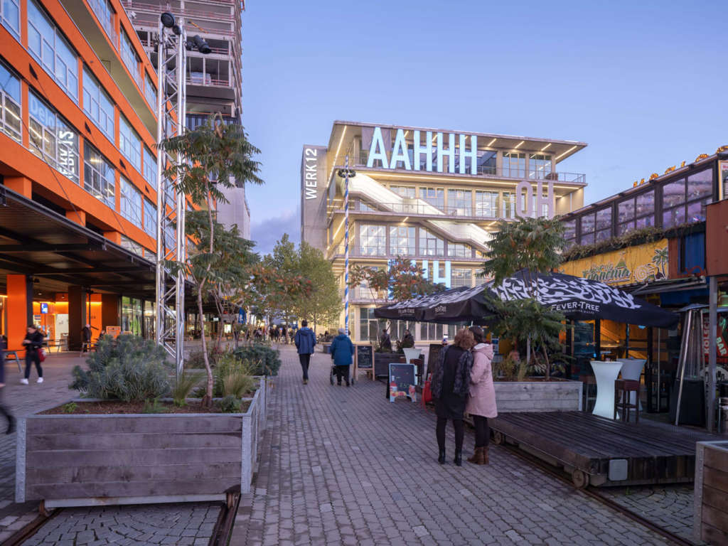
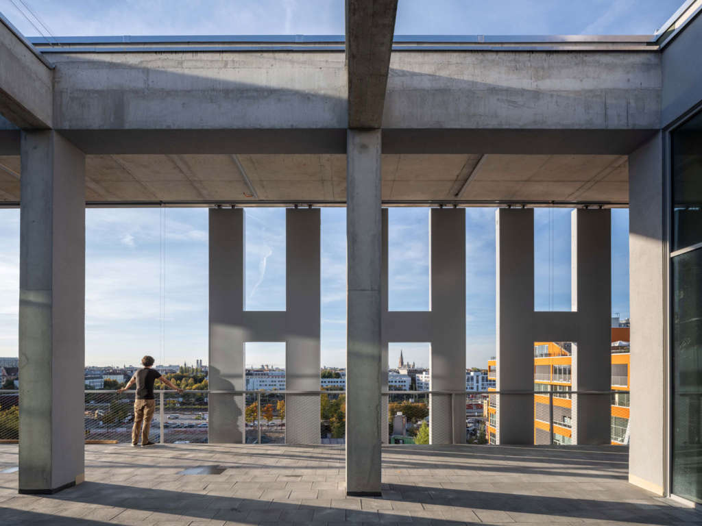
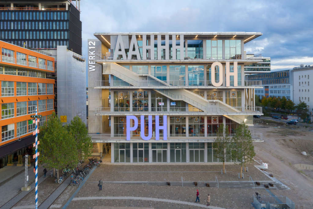
The design of WERK12 combines a simple form, honest materials, and transparent façades. Users can move around the building in multiple ways: the design’s external circulation core on the building’s northeastern side is supplemented by 3.25-metre-wide terraces that surround each floor of the building. These are connected by external staircases curling around the building to connect these generous open spaces (a playful reference to one of MVRDV’s most famous early projects, the Dutch Pavilion at the Expo2000 in Hanover). This public route up the building blurs the distinction between interior and exterior, placing the interior spaces in conversation with exterior balconies. These are additionally finished in the same material as the ground-level sidewalks to emphasise their status as part of the public area of the building.
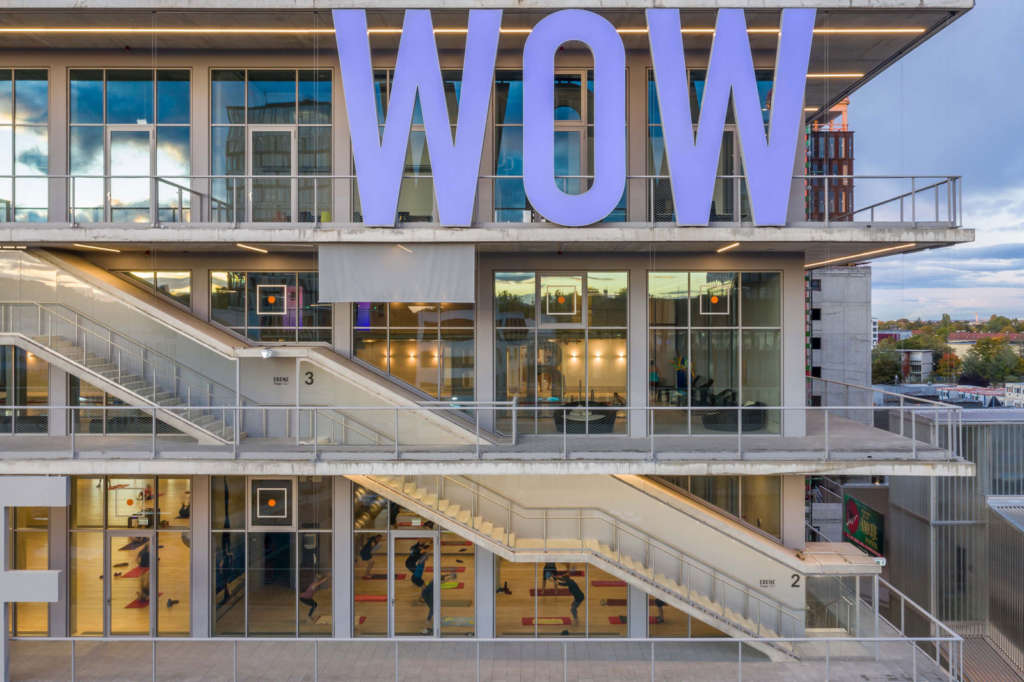
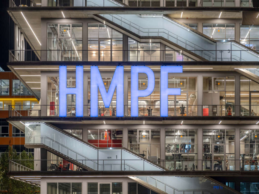
The façade is animated by an urban art piece developed in tandem with local artists Christian Engelmann and Beate Engl, comprising bold lettering spelling out common expressions taken from the German version of Donald Duck comics. This 5-metre-tall lettering, and the colloquial nature of the expressions chosen, are a tribute to the graffiti culture and extensive use of signage found on the old site. At night, the appearance of the building is transformed by its illumination strategy. Simple geometries and honest materials morph into a vibrant lightshow.
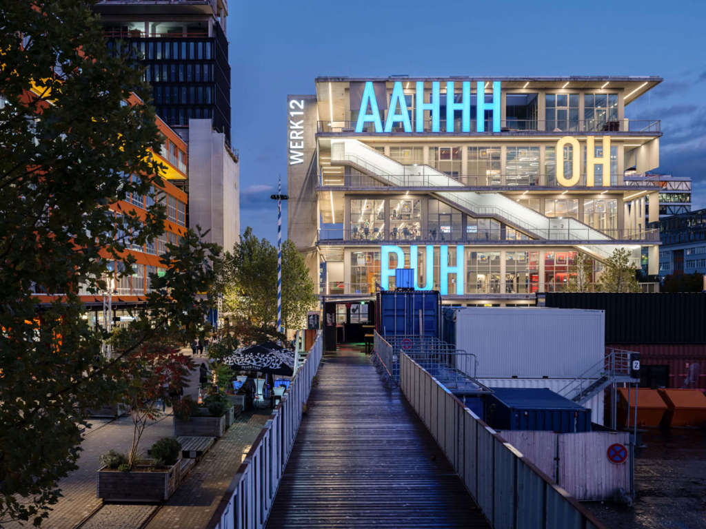

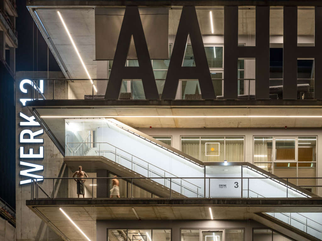
“The area of the Werksviertel-Mitte district has already undergone such interesting changes, transforming from a potato factory to a legendary entertainment district,” says founding partner of MVRDV Jacob van Rijs. “With our design, we wanted to respect and celebrate that history, while also creating a foundation for the next chapter. WERK12 is stylish and cool on one hand, but on the other it doesn’t take itself so seriously – it’s not afraid to say ‘PUH’ to passers-by!”
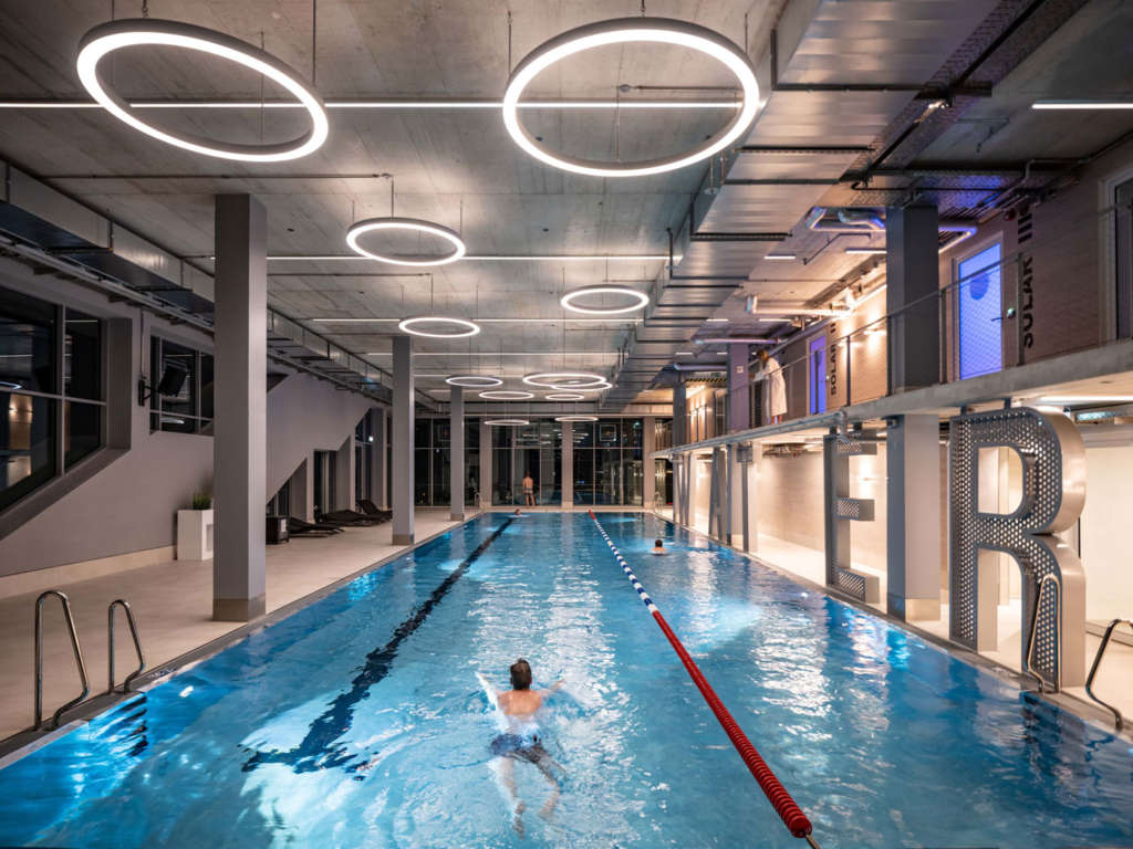
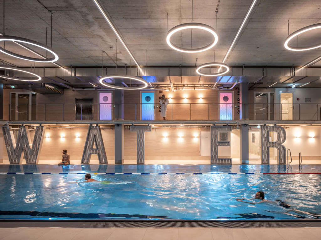
The five floors of the building are occupied by restaurants and bars on the ground floor, the offices of Audi Business Innovations on the top floor, and a three-storey gym in between that includes one storey dedicated to a swimming pool. WERK12’s floor-to-ceiling glass walls, combined with its location near to the train station, provide the upper levels with stunning views towards central Munich, punctuated in places by the lettering on the building’s terraces – many of which take on a new meaning when read in reverse.
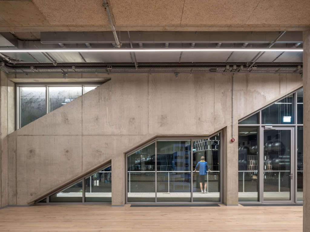
A key to the design was in the flexibility of the spaces. The building’s extra-high ceilings – with 5.5 metres between each floor – allows for mezzanines or other level changes to be added by future users. The placement of the circulation on the outside of the building means that the interiors can be easily reconfigured, while also providing structural stability through the use of the diagonal staircases.
Project Details
Design MVRDV: Winy Maas, Jacob van Rijs and Nathalie de Vries
Design Team: Jacob van Rijs, Fokke Moerel, Markus Nagler, Roy Sieljes and Jonathan Schuster
Visualization: Antonio Luca Coco, Pavlos Ventouris and Kirill Emelianov
Partners
Co-Architects: N-V-O Nuyken von Oefele Architekten BDA, Munich
Artwork commission: Christian Engelmann and Beate Engl
Images: MVRDV
Structural Engineering: Wolf +
MEP: Teuber + Viel

